Layouts
Outer layouts used.
- Layout: Tabs
- Layout: 50% 50%
- Layout: 33% 33% 33%
- Layout: 25% 25% 25% 25%
- Layout: Banner SVG Cutout Overlap
- Layout: Banner Lifestyle Badge
- Layout: Banner Image Overlap
- Layout: Banner Curved Image
- Layout: Full Page Modal
- Layout: Image Banners
- Layout: Multi Hero Slider
- Layout: In Page Slider Content
- Layout: Midpage Multi CTA Layout
- Layout: Circle image card
- Layout: Contact banner
- Layout: Call out banner layout
- Layout: Pre-footer CTA
- Layout: 100% empty
- Layout: Centre Product Feature
- Layout: Hyperlink block
- Layout: Banner SVG Product Overlap
- Layout: Banner Image Deep
- Layout: Banner Stacked Icon
- Layout: Hero 5 - Variable Columns
- Layout: Nested Empty Layout
- Layout: 100%
- Layout: Category sidebar
- Layout: Variable Columns
- Layout: Page scroll banner
- Layout: Button group layout
- Layout: Side panel layout
- Layout: Call out heading
- Field: CTA Banner layout
- Layout: Image Tabs
- Layout: Colour split
- Layout: Hero form cut-out
- Layout: Hero form product right
- Layout: Banner Image Badge
- Layout: Gradient image
- Layout: Branded Slider Image
- Layout: Submit CV Form
- Layout: Career Search Banner
- Layout: Job application footer form
- Layout: Content Card Landscape
- Layout: Cost Calculator Results
Layout: Tabs
Tabs Layout container for Tab Title and Tab Content
A layout designed for the use of creating tabbed content.
Category: Waterlogic Layouts.
Content Blocks Documentation: https://docs.modmore.com/en/ContentBlocks/v1.x/Layouts.html
NOTE: Tabs Layout is the base start for creating tabbed content within content blocks using the tab title and tab content fields. A tabbed content template has been set up called "Tabbed Content" with all settings defined and sample content to start with.

Settings
Tab Position: Should the tabs show on top of the content or to the left: Default Top.
Additional Settings
Show full width?: Should the section show full width. Using Bootstrap container and container-fluid.
Show Gutters?: Should the gutters show for this layout. Default to Yes.
Vertical Align?: Should the content within this layout show vertically aligned. Default to Yes.
Background Colour: The background colour of the layout. Default to White.
Padding Top: Padding top for the layout. Default to 45px.
Padding Bottom: Padding bottom for the layout. Default to 45px
Margin Top: Margin top for the layout. Default to 60px
Margin Bottom: Margin bottom for the layout. Default to 0px
Negative Margin: Ability to offset layout margin. Default to 0px
Mobile Style: How would you like the tabs to display on mobile, tabbed or stacked. Default tabs.
Layout: 50% 50%
Two columns 50% 50% layout at desktop
Category: Default.
Content Blocks Documentation: https://docs.modmore.com/en/ContentBlocks/v1.x/Layouts.html

Settings are available by hovering over the field and clicking the cog in the top right

Settings
Bootstrap Column 1: Classes by bootstrap for the grid. Defaults to col- https://getbootstrap.com/docs/4.0/layout/grid/
Bootstrap Column 2: Classes by bootstrap for the grid. Defaults to col-12 https://getbootstrap.com/docs/4.0/layout/grid/
Data-UID Attribute: Unique data attribute used for referencing the layout.
Show full width?: Should the section show full width. Using Bootstrap container and container-fluid.
Show Gutters?: Should the gutters show for this layout? Default to Yes.
Vertical Align?: Should the content within this layout show vertically aligned. Default to Yes.
Section background colour: The background colour of the full-width section (Edge to edge). Defaults to white
Background Colour: The background colour of the layout. Default to White.
Padding Top: Padding top for the layout. Default to 45px.
Padding Bottom: Padding bottom for the layout. Default to 45px
Margin Top: Margin top for the layout. Default to 60px
Margin Bottom: Margin bottom for the layout. Default to 0px
Negative Margin: Ability to offset layout margin. Default to 0px
Reverse Mobile Order: Should this layout be reversed on mobile? Useful for alternating 50/50 content layouts.
Layout: 33% 33% 33%
Three columns set at 33% 33% 33% on desktop.
Category: Default.
Content Blocks Documentation: https://docs.modmore.com/en/ContentBlocks/v1.x/Layouts.html

Settings are available by hovering over the field and clicking the cog in the top right

Settings
Bootstrap Column 1: Classes by bootstrap for the grid. Defaults to col- https://getbootstrap.com/docs/4.0/layout/grid/
Bootstrap Column 2: Classes by bootstrap for the grid. Defaults to col-12 https://getbootstrap.com/docs/4.0/layout/grid/
Bootstrap Column 3: Classes by bootstrap for the grid. Defaults to col-12 https://getbootstrap.com/docs/4.0/layout/grid/
Data-UID Attribute: Unique data attribute used for referencing the layout.
Show full width?: Should the section show full width. Using Bootstrap container and container-fluid.
Show Gutters?: Should the gutters show for this layout. Default to Yes.
Vertical Align?: Should the content within this layout show vertically aligned. Default to Yes.
Background Colour: The background colour of the layout. Default to White.
Padding Top: Padding top for the layout. Default to 45px.
Padding Bottom: Padding bottom for the layout. Default to 45px
Margin Top: Margin top for the layout. Default to 60px
Margin Bottom: Margin bottom for the layout. Default to 0px
Negative Margin: Ability to offset layout margin. Default to 0px
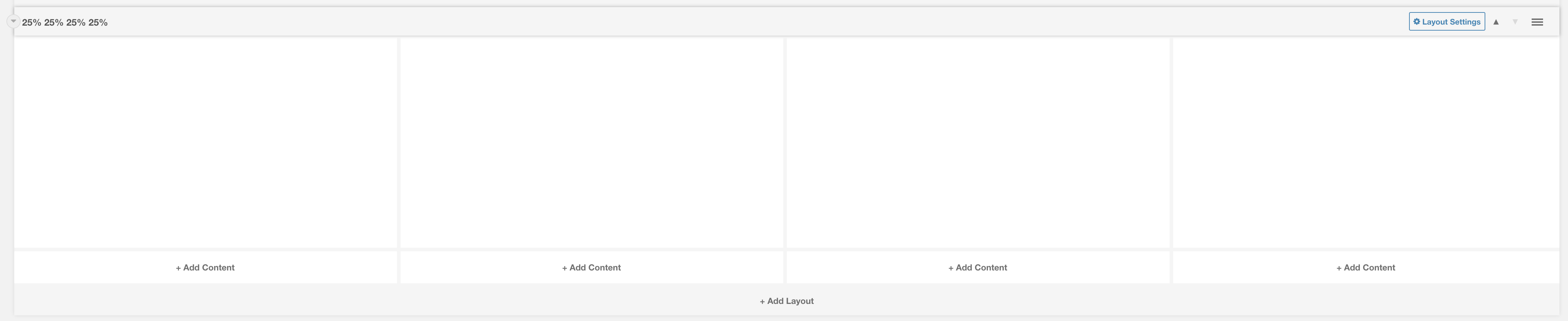
Layout: 25% 25% 25% 25%
Four columns set at 25% 25% 25% 25% on desktop.
Category: Default.
Content Blocks Documentation: https://docs.modmore.com/en/ContentBlocks/v1.x/Layouts.html
Settings are available by hovering over the field and clicking the cog in the top right
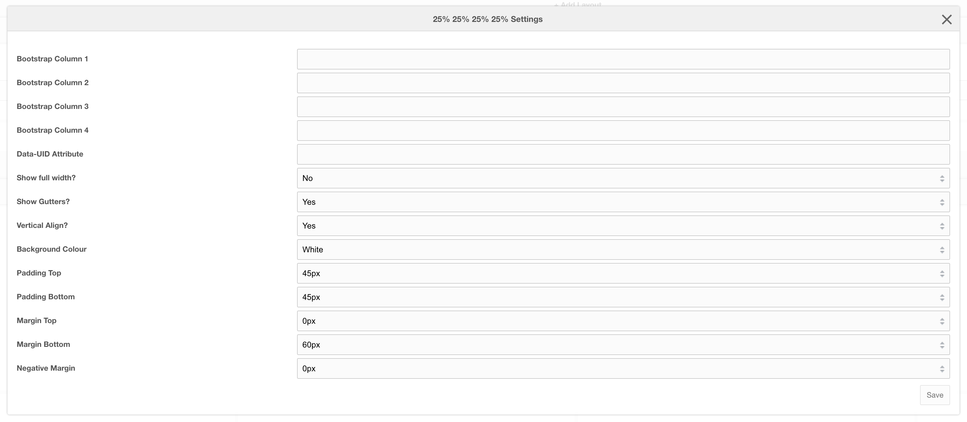
Settings
Bootstrap Column 1: Classes by bootstrap for the grid. Defaults to col- https://getbootstrap.com/docs/4.0/layout/grid/
Bootstrap Column 2: Classes by bootstrap for the grid. Defaults to col-12 https://getbootstrap.com/docs/4.0/layout/grid/
Bootstrap Column 3: Classes by bootstrap for the grid. Defaults to col-12 https://getbootstrap.com/docs/4.0/layout/grid/
Bootstrap Column 4: Classes by bootstrap for the grid. Defaults to col-12 https://getbootstrap.com/docs/4.0/layout/grid/
Data-UID Attribute: Unique data attribute used for referencing the layout.
Show full width?: Should the section show full width. Using Bootstrap container and container-fluid.
Show Gutters?: Should the gutters show for this layout. Default to Yes.
Vertical Align?: Should the content within this layout show vertically aligned. Default to Yes.
Background Colour: The background colour of the layout. Default to White.
Padding Top: Padding top for the layout. Default to 45px.
Padding Bottom: Padding bottom for the layout. Default to 45px
Margin Top: Margin top for the layout. Default to 60px
Margin Bottom: Margin bottom for the layout. Default to 0px
Negative Margin: Ability to offset layout margin. Default to 0px
Layout: Banner SVG Cutout Overlap
A single column that by default is 100%
Category: Default.
Content Blocks Documentation: https://docs.modmore.com/en/ContentBlocks/v1.x/Layouts.html
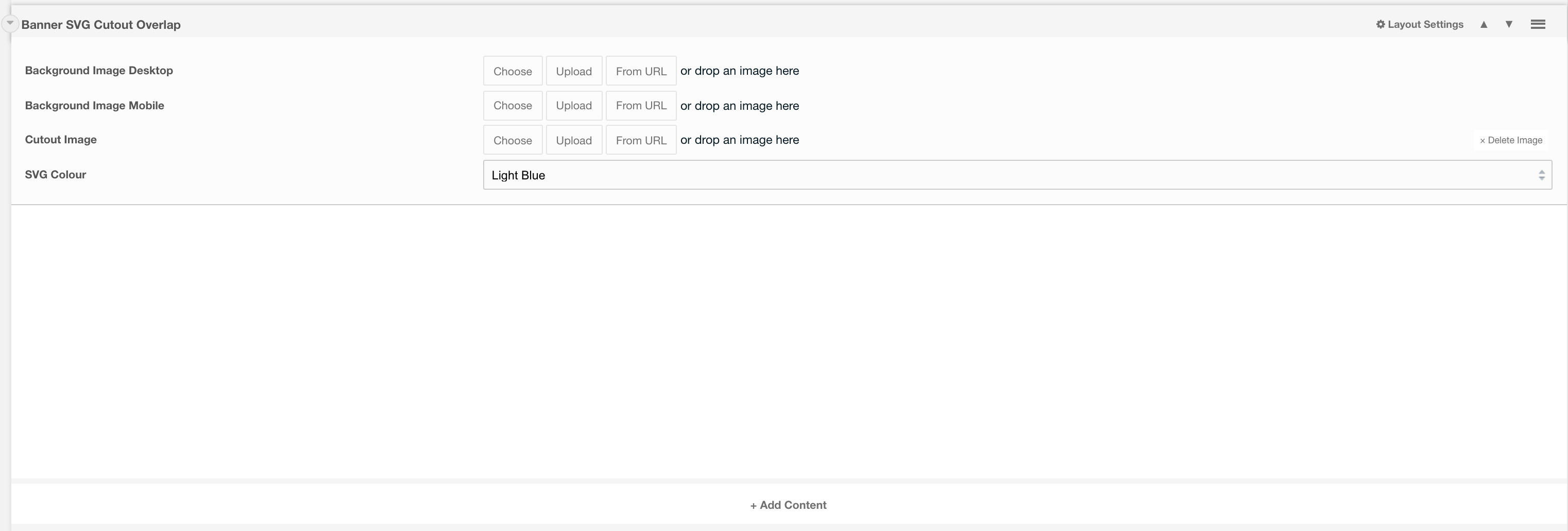
Layout Options
Background Image Desktop: The main image to fit the whole background of the layout (man in the background below).

Background Image Mobile: The image that should display on mobile. (image goes to the top of the layout, see image below ).

Cutout Image: If a cutout image is supplied then this will appear on tablet devices upwards. Should be in a .png format.
SVG Colour: The colour that you would like the SVG to be Default. to Light Blue.
Settings are available by hovering over the field and clicking the cog in the top right
Settings
Padding Top: Padding top for the layout. Default to 45px.
Padding Bottom: Padding bottom for the layout. Default to 45px
Margin Top: Margin top for the layout. Default to 60px
Margin Bottom: Margin bottom for the layout. Default to 0px
Negative Margin: Ability to offset layout margin. Default to 0px
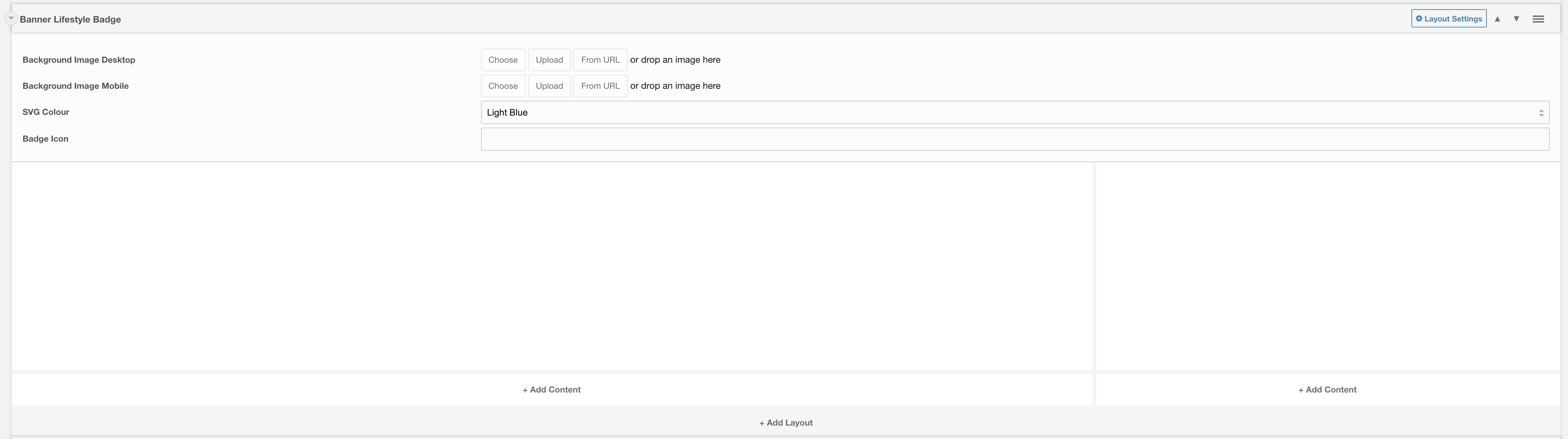
Layout: Banner Lifestyle Badge
A single column hero layout with badge, image and SVG Option
Category: Sections - Waterlogic Heros.
Content Blocks Documentation: https://docs.modmore.com/en/ContentBlocks/v1.x/Layouts.html
Content within the left layout represents the content that you would like to appear within the main part of the hero.
Content to the right of this layout represents information to appear within the badge.
Layout Options
Background Image Desktop: The main image to fit the whole background of the layout (man in the background below). Minimum width should be 1200px.
Background Image Mobile: The image that should display on mobile. (image goes to the top of the layout, see image below ).
SVG Colour: The colour that you would like the SVG to be Default. to Light Blue.
Settings are available by clicking on the layout settings in the top right of the layout.
Settings
Padding Top: Padding top for the layout. Default to 45px.
Padding Bottom: Padding bottom for the layout. Default to 45px.
Margin Top: Margin top for the layout. Default to 60px.
Margin Bottom: Margin bottom for the layout. Default to 0px.
Show Badge: Do you want the badge to appear within this hero. Default to Yes.
Mobile Alignment: Alignment of text content on mobile. Default to Center.
Layout: Banner Image Overlap
Full width layout with a background image on the right, and space for content on the left.
Category: Sections - Waterlogic Heros.
Content Blocks Documentation: https://docs.modmore.com/en/ContentBlocks/v1.x/Layouts.html

The content section allows you to select any field to put within the header. Recommended to use headers, rich text and buttons.
Layout Options
Background Image Desktop: The image to use to the right of content on desktop, default to overlap container, this should be a png image or similar for transparency.
Background Colour: The colour of the background for this layout. Default Light Grey.
Settings are available by clicking on the layout settings in the top right of the layout.
Settings
Padding Top: Padding top for the layout. Default to 45px.
Padding Bottom: Padding bottom for the layout. Default to 45px.
Margin Top: Margin top for the layout. Default to 60px.
Margin Bottom: Margin bottom for the layout. Default to 0px.
Layout: Banner Curved Image
Full width layout with a background image on the right, and space for content on the left.
Category: Sections - Waterlogic Heros.
Content Blocks Documentation: https://docs.modmore.com/en/ContentBlocks/v1.x/Layouts.html

The content section allows you to select any field to put within the header. Recommended to use headers, rich text and buttons.
Layout Options
Background Image Desktop: The image to use to the right of content on desktop.
Background Image Mobile: The image to use at the top of the content on mobile.
Background Colour: The colour of the background for this layout. Default Light Grey.
Settings are available by clicking on the layout settings in the top right of the layout.

Settings
Margin Top: Margin top for the layout. Default to 60px.
Margin Bottom: Margin bottom for the layout. Default to 0px.
Layout: Full Page Modal
Full Page Modal layout
Category: Waterlogic Layouts.
Content Blocks Documentation: https://docs.modmore.com/en/ContentBlocks/v1.x/Layouts.html

Layout Options
Modal ID: The id that is applied to this modal. Use this id to trigger this modal to open on fields such as buttons, hyperlinks etc.
Notes
Create a nested layout and use layouts such as 50%/50% or 25%/25%/25%/25%

Layout: Image Banners
Full width layout with curved image and content.
Category: Sections - Waterlogic Layout.
Content Blocks Documentation: https://docs.modmore.com/en/ContentBlocks/v1.x/Layouts.html

Layout Options
Image Position: Should the image appear to the left or right? Default to Right.
Image Size: Is the image small or large? Default to Large.
Settings are available by clicking on the layout settings in the top right of the layout.
Settings

Padding Top: Padding top for the layout. Default to 45px.
Padding Bottom: Padding bottom for the layout. Default to 45px.
Margin Top: Margin top for the layout. Default to 60px.
SVG Colour: The colour of the banner. Default to Dark Blue
Data-UID: A unique ID of the container for skip to links
Layout: Multi Hero Slider
A single column hero with multiple hero sections which slide.
Category: Sections - Sections - Waterlogic Heros.
Content Blocks Documentation: https://docs.modmore.com/en/ContentBlocks/v1.x/Layouts.html

The Multi Home Slider Areas is designed to use the the Hero Layouts only:

Adding these layouts will inherit the default settings for these as defined if they were to be used by themselves and will need to be adjusted accordingly (padding and margin mainly). Any layout added within the multi hero slider will need to be added within a nested layout.
A pre-configured template for this has already been set up for this under Templates -> Sections - Waterlogic Heros -> Multi Hero Slider. Documentation Can be found here.
Settings:
Data-UID Attribute: Unique data attribute used for referencing the layout.
Padding Top: Padding top for the layout. Default to 0px.
Padding Bottom: Padding bottom for the layout. Default to 0px
Margin Top: Margin top for the layout. Default to 60px
Margin Bottom: Margin bottom for the layout. Default to 0px
Negative Margin: Ability to offset layout margin. Default to 0px
Layout: In Page Slider Content
In Page Media Slider Layout
Category: Sections - Sections - Waterlogic Gallery and Sliders.
Content Blocks Documentation: https://docs.modmore.com/en/ContentBlocks/v1.x/Layouts.html

This layout should act only as a "Container" for the In Page Media Slider Items:
Adding these layouts will inherit the default settings for these as defined if they were to be used by themselves and will need to be adjusted accordingly (padding and margin mainly).
A pre-configured template for this has already been set up for this under Templates -> Sections - Waterlogic Gallery and Sliders -> In Page Slider. Documentation Can be found here.
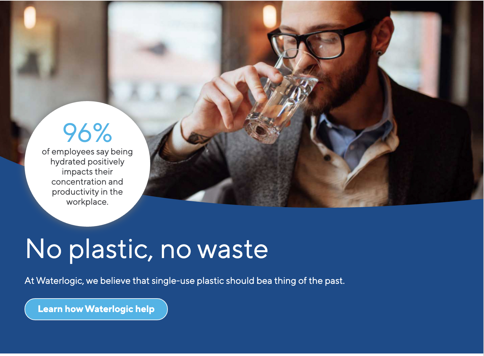
Layout: Midpage Multi CTA Layout
Default layout for Midpage Multi CTA Banner
Category: Sections - Waterlogic Call to action banners.
Usage: Used specifically with Midpage Multi CTA Links field in Midpage multi CTA Banner template.
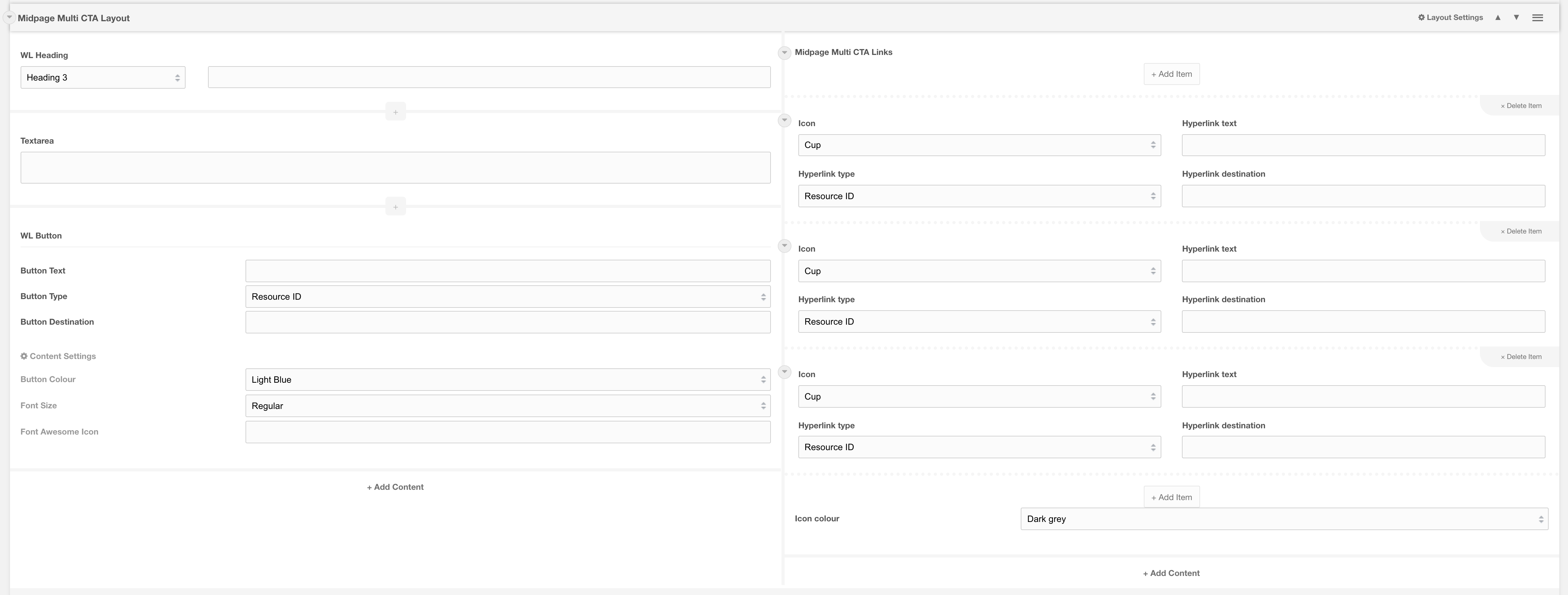
Layout options
| Background colour: | Change the background colour of the banner, by default it is light grey. When selecting Dark blue text colour automatically changes to white. |
| Margin top | Space between the top of the layout and the bottom of the layout above |
| Margin bottom |
Space between the bottom of the layout and the top of the layout below |
|
Data-UID: |
A unique ID of the container for skip to links |
Related
Field: Midpage Multi CTA Links
Template: Midpage multi CTA Banner
Layout: Circle image card
Card with content and a circular image on the right
Category: Sections - Waterlogic Call to action banners.
Usage: Used specifically with Circle image card right template
Notes: Must be used as a nested template as the layout does not contain container/ rows or columns

Layout Options
| Image | Select an image for the card. Ideally, you should use a square image as the layout will zoom crop the chosen image to 640x640. |
| Image alt text | Alternative text for image |
| Image location | Option to display the image on top when viewing layout on a tablet device. Defaults to right |
| Data-UID | A unique ID of the container for skip to links |
Related
Template: Circle image card right
Layout: Contact banner
Styling layout for Contact banner
Category: Default.
Content Blocks Documentation: https://docs.modmore.com/en/ContentBlocks/v1.x/Layouts.html
Note: Must be used with a nested layout. This layout does not container containers/ rows or columns.
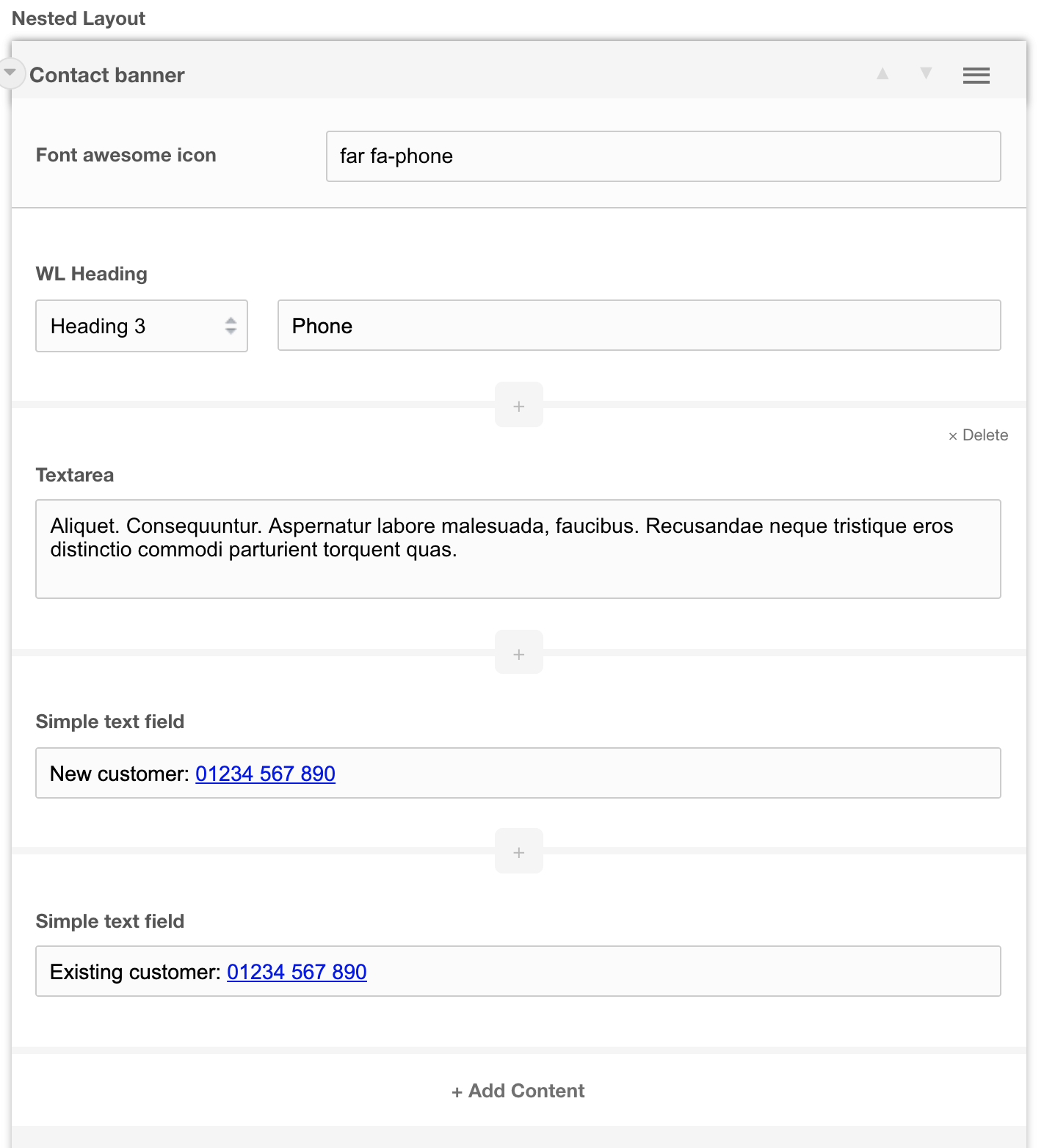
IMPORTANT
This layout must be included as a nested layout within a 100, 50/50, 33/33/33 or 25/25/25/25 layout for it to work correctly.
Layout options
| Font Awesome icon | Insert a font awesome icon from https://fontawesome.com/cheatsheet. Be sure to include the icon type. For example far fa-phone. FAR is the icon type. See the cheat sheet for different types. |
| Data-UID | A unique ID of the container for skip to links |
Related pages
Template: Contact banner
Layout: Call out banner layout
A call to action banner that grabs user attention with uniquely cropped SVG and image design
Category: Waterlogic Call to action banners.
Content Blocks Documentation: https://docs.modmore.com/en/ContentBlocks/v1.x/Layouts.html
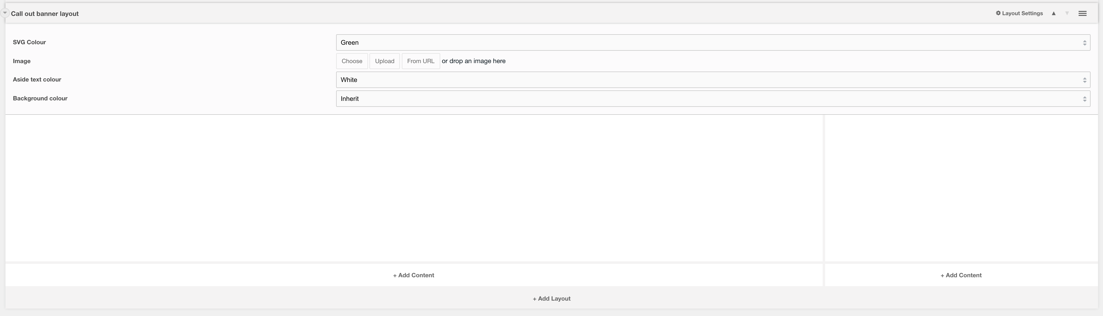

Layout options
| Margin top | Space between the top of the layout and the bottom of the layout above |
| Margin bottom | Space between the bottom of the layout and the top of the layout below |
| Padding top | Space between the top of the section and the inside component. Unset by default, if you apply a Section background colour it will add 60px padding-top |
| Padding bottom | Space between the bottom of the section and the inside component. Unset by default, if you apply a Section background colour it will add 60px padding-bottom |
| SVG colour | Colour of the SVG mask |
| Image | Background image of the component |
| Aside text colour | Colour of aside text that resides in the SVG |
| Section background colour: | Change the background colour of the banner, by default it is transparent |
| Data-UID | A unique ID of the container for skip to links |
Related pages
Template: Call out banner
Layout: Pre-footer CTA
A call to action banner that sits just above the site footer and used to direct users to take additional actions
Category: Waterlogic Layouts
Content Blocks Documentation: https://docs.modmore.com/en/ContentBlocks/v1.x/Layouts.html
This layout has two columns, typically the left-hand column is used for a rich text field while the right-hand column is used for the call to action buttons.

Layout options
| Setting | Description | Default |
| Section background colour | Change the background colour of the banner, by default it is transparent | Blue dark |
| Text colour | Font color | White |
| Padding top | Space between the top of the section and the inside component. Unset by default, if you apply a Section background colour it will add 60px padding-top | 45px |
| Padding bottom | Space between the bottom of the section and the inside component. Unset by default, if you apply a Section background colour it will add 60px padding-bottom | 45px |
| Data-UID | A unique ID of the container for skip to links |
Related pages
Layout: 100% empty
An empty layout with a wrapper for additional Bootstrap classes
Category: Default.
Content Blocks Documentation: https://docs.modmore.com/en/ContentBlocks/v1.x/Layouts.html

The 100% empty layout is designed to be used within Nester layouts. It removes all columns, containers and rows and provides an empty layout. This should not be used on its own as it will not align elements correctly.
Settings
| Setting | Description | Default |
| Section classes | Add Bootstrap classes to the section wrapper i.e. mb-5 bg-light etc | |
| Data-UID | A unique ID of the container for skip to links |
Layout: Centre Product Feature
Layout with featured image in middle with content to left and right.
Category: Sections - Waterlogic Layouts.
Content Blocks Documentation: https://docs.modmore.com/en/ContentBlocks/v1.x/Layouts.html

The content section allows you to select any field to put within each area. Recommended to use headers, rich text and buttons.
Layout Options
Settings are available by clicking on the layout settings in the top right of the layout.
Data-UID Attribute: Unique data attribute used for referencing the layout.
Vertical Align?: Should the content within this layout show vertically aligned. Default to Yes.
Margin Top: Margin top for the layout. Default to 60px.
Margin Bottom: Margin bottom for the layout. Default to 0px.
SVG Colour: The Colour of the SVG area (content in area one/top left on the layout).
Layout: Hyperlink block
A layout with 3 columns which produces 3 shadow boxes on the front end
Category: Waterlogic Layouts
Content Blocks Documentation: https://docs.modmore.com/en/ContentBlocks/v1.x/Layouts.html


Layout options
| Setting | Description | Default |
| Bootstrap Column 1 | Adjust the size of the column using bootstrap classes | col-lg-4 |
| Bootstrap Column 2 | Adjust the size of the column using bootstrap classes | col-lg-4 |
| Bootstrap Column 3 | Adjust the size of the column using bootstrap classes | col-lg-4 |
| Data-UID | A unique ID of the container for skip to links | |
| Show full width? | Element stretches full width of the page | No |
| Show Gutters? | Show Bootstrap gutters | Yes |
| Vertical Align? | Vertically align the columns | No |
| Text colour | Font colour | White |
| Background Colour | Section background colour | Transparent |
| Block background | Background colour if each individual block | None |
| Padding top | Section padding-top - Use if you have background colour set | |
| Padding bottom | Section padding-bottom - Use if you have background colour set | |
| Margin top | Add margin to the top of the container for vertical alignment adjust | |
| Margin bottom | Add margin to the bottom of the container for vertical alignment adjust | 60px |
| Section classes | Add additional classes to the section | |
| Additional container classes | Add additional classes to the container | |
| Justify content | Justify the columns horizontally on the page |
Usage
We recommend that this layout is used with the following fields:
- Richtext
- Hyperlink repeater
- Spacer
- With 30px margin-bottom
- Hyperlink
- With link colour dark grey
Related pages
Template: Hyperlink Blocks
Layout: Banner SVG Product Overlap
A single column set to 100 of column width with product images above.
Category: Default.
Content Blocks Documentation: https://docs.modmore.com/en/ContentBlocks/v1.x/Layouts.html

Layout Options
Image 1: The main image to fit above within the banner.
Image 2: Secondary image that sits beside Image on If supplied.
Content area allows you to add any field to this section. Designed initially to use headings and buttons. See example below:

Settings are available by hovering over the field and clicking the cog in the top right
Settings
Padding Top: Padding top for the layout. Default to 45px.
Padding Bottom: Padding bottom for the layout. Default to 45px
Margin Top: Margin top for the layout. Default to 60px
Margin Bottom: Margin bottom for the layout. Default to 0px
Data-UID: A unique ID of the container for skip to links
Layout: Banner Image Deep
A single column banner with image to right or left.
Category: Waterlogic Layouts.
Content Blocks Documentation: https://docs.modmore.com/en/ContentBlocks/v1.x/Layouts.html

Layout Options
Background Image Desktop: The image to display on desktop.
Background Image Mobile: The image to display on mobile.
Image Position: Should the image on desktop display to the left of the content or right? Default right.
Content area allows you to add any field to this section. Designed initially to use headings and buttons and WL Dashed Icon List. See example below:
Settings are available by hovering over the field and clicking the cog in the top right
Settings
Padding Top: Padding top for the layout. Default to 45px.
Padding Bottom: Padding bottom for the layout. Default to 45px
Margin Top: Margin top for the layout. Default to 60px
Margin Bottom: Margin bottom for the layout. Default to 0px
Section Background Colour: The colour of the outer section for this full width layout. Default Light Grey.
Data-UID: A unique ID of the container for skip to links
Layout: Banner Stacked Icon
A single column banner with image to right or left.
Category: Waterlogic Layouts.
Content Blocks Documentation: https://docs.modmore.com/en/ContentBlocks/v1.x/Layouts.html
Layout Options
Background Image Desktop: The image to display on desktop.
Background Image Mobile: The image to display on mobile.
Image Position: Should the image on desktop display to the left of the content or right? Default right.
Content area allows you to add any field to this section. Designed initially to use headings and buttons and WL Dashed Icon List. See example below:
Settings are available by hovering over the field and clicking the cog in the top right
Settings
Padding Top: Padding top for the layout. Default to 45px.
Padding Bottom: Padding bottom for the layout. Default to 45px
Margin Top: Margin top for the layout. Default to 60px
Margin Bottom: Margin bottom for the layout. Default to 0px
Section Background Colour: The colour of the outer section for this full width layout. Default Light Grey.
Layout: Hero 5 - Variable Columns
Hero 5 - Variable column layout for heros.
Category: Templates - Sections - Waterlogic Heros.
Content Blocks Documentation: https://docs.modmore.com/en/ContentBlocks/v1.x/Layouts.html
You can create a hero area with variable column widths. By default the column widths are 50/50 in width but can be changed using the Bootstrap Column 1 and Bootstrap Column 2 settings. For documentation on changing column widths using Bootstrap classes see http://websitedocs.waterlogic.com/books/content-blocks/page/grid-layout

Settings
Bootstrap Column 1: Classes by bootstrap for the grid. Defaults to col- https://getbootstrap.com/docs/4.0/layout/grid/
Bootstrap Column 2: Classes by bootstrap for the grid. Defaults to col-12 https://getbootstrap.com/docs/4.0/layout/grid/
Data-UID Attribute: Unique data attribute used for referencing the layout.
Show full width?: Should the section show full width. Using Bootstrap container and container-fluid.
Show Gutters?: Should the gutters show for this layout. Default to Yes.
Vertical Align?: Should the content within this layout show vertically aligned. Default to Yes.
Background Colour: The background colour of the layout. Default to White.
Padding Top: Padding top for the layout. Default to 45px.
Padding Bottom: Padding bottom for the layout. Default to 45px
Margin Top: Margin top for the layout. Default to 60px
Margin Bottom: Margin bottom for the layout. Default to 0px
Reverse Mobile Order: Should this layout be reversed on mobile? Useful for alternating 50/50 content layouts.
Layout: Nested Empty Layout
An empty layout with a wrapper for additional Bootstrap classes
Category: Default.
Content Blocks Documentation: https://docs.modmore.com/en/ContentBlocks/v1.x/Layouts.html
The Nested Empty Layout is designed to be used within only Nester layouts. It removes all markup and allows you to add nested fields. This should not be used on its own as it will not align elements correctly.
Layout: 100%
Single column layout
Category: Default.
Content Blocks Documentation: https://docs.modmore.com/en/ContentBlocks/v1.x/Layouts.html
Settings are available by hovering over the field and clicking the cog in the top right
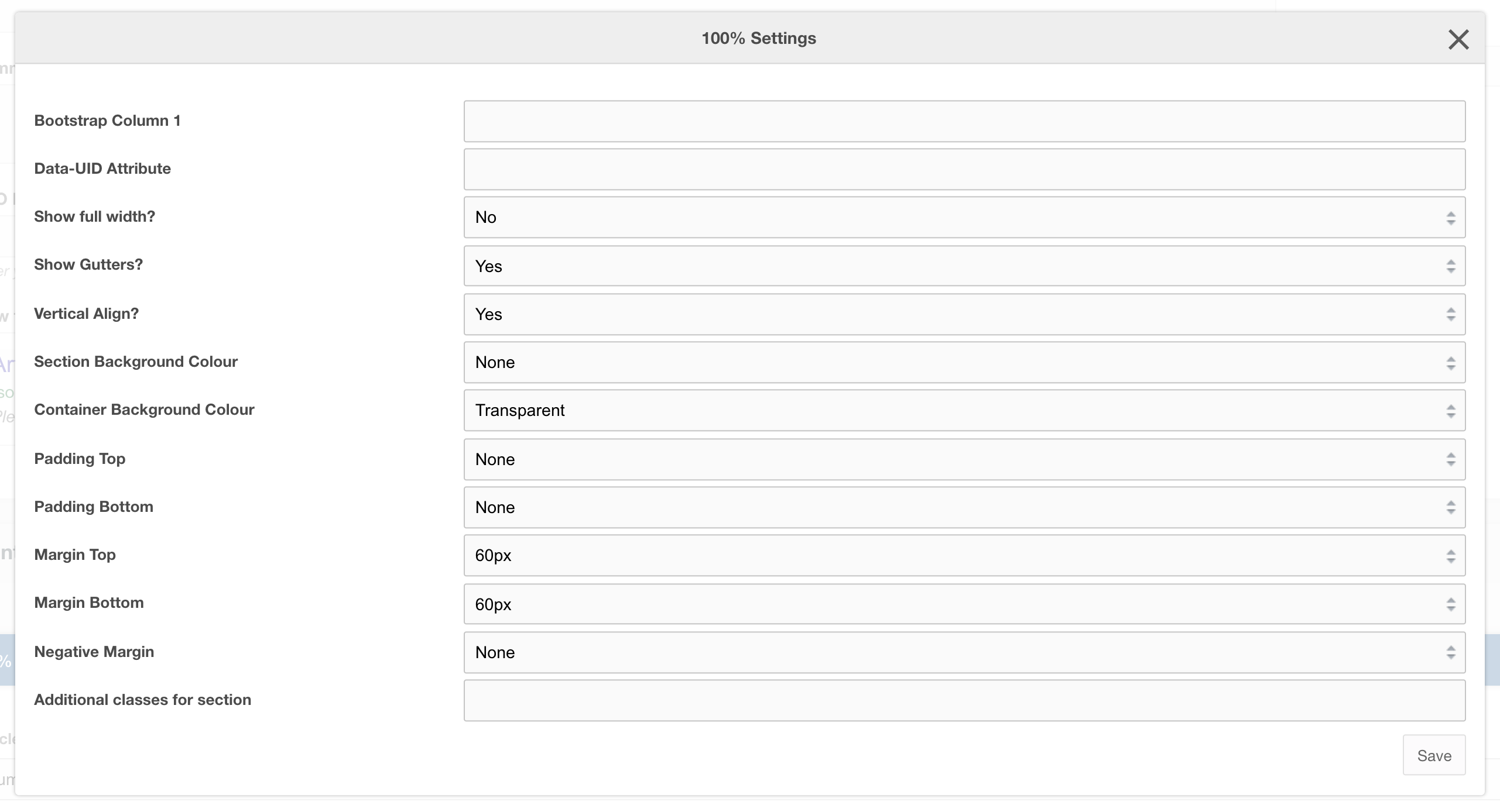
Settings
| Setting | Description | Default |
| Bootstrap Column | Adjust the size of the column using bootstrap classes | col-12 |
| Data-UID | A unique ID of the container for skip to links | |
| Show full width? | Element stretches full width of the page | No |
| Show Gutters? | Show Bootstrap gutters | Yes |
| Vertical Align? | Vertically align the columns | Yes |
| Section background colour | Background colour of the full-width section | Transparent |
| Container background Colour | Section background colour | Transparent |
| Padding top | Section padding-top - Use if you have background colour set | |
| Padding bottom | Section padding-bottom - Use if you have background colour set | |
| Margin top | Add margin to the top of the container for vertical alignment adjust | |
| Margin bottom | Add margin to the bottom of the container for vertical alignment adjust | 60px |
| Negative margin | Add a negative margin to the bottom of the section, useful for adjusting the base padding when using background colours | |
| Remove container and row | Add additional classes to the section | |
| Additional Section classes | Add additional classes to the section | |
| Justify content | Justify the columns horizontally on the page |
Usage
Use this layout for full-width section
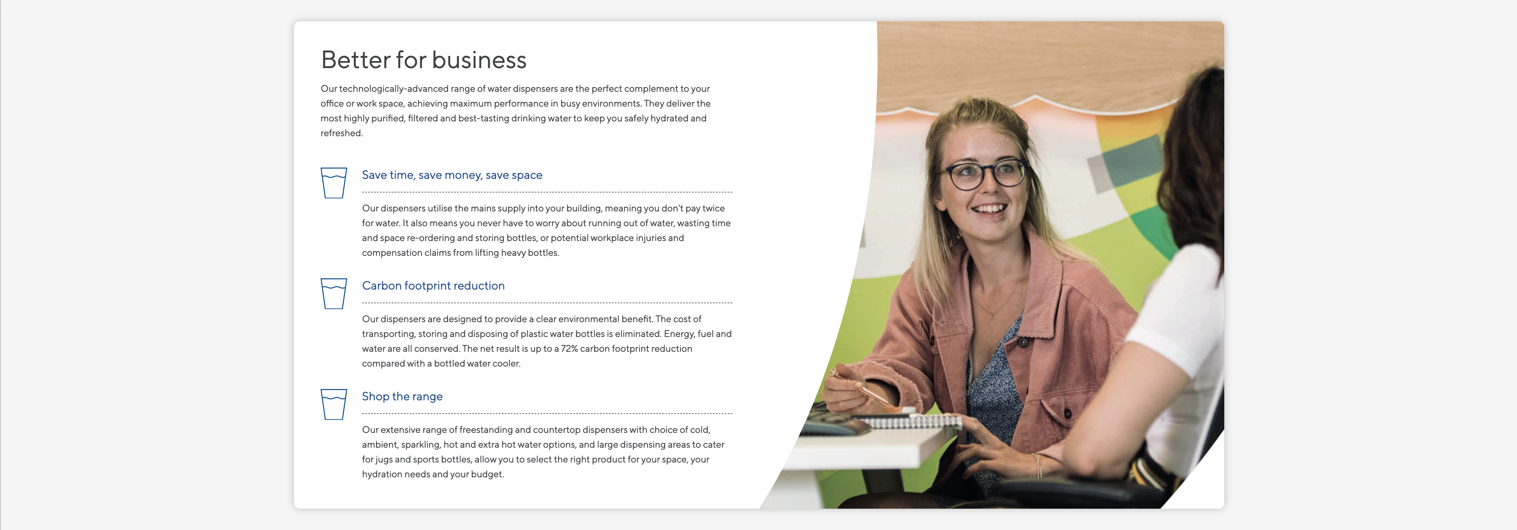
Layout: Category sidebar
A layout with a dynamically generated category link list and content/ sidebar sections
Category: Waterlogic Layouts.
Content Blocks Documentation: https://docs.modmore.com/en/ContentBlocks/v1.x/Layouts.html
Figure 1
The smaller section on the left is the sidebar section, here you can add in Product filters, sidebar call to actions and sidebar help text. On the right is the main content area where you'd typically add product collection fields and image banners.
The Category links are automatically created based on parent, sibling and neighbouring resources so you don't have to add any additional fields in the sidebar section, it can be left blank.
Layout Settings
Data-UID: A unique ID of the container for skip to links
Parent ID to build category menu: For the category menu to work correctly on nested pages, it is important to enter the parent ID to generate the links. For example, using Figure 3, if this layout was being used on the Cups resource then the parent ID of the cups resource is required to build a menu that contains related categories.
Working example

Figure 2

Figure 3
In the working example above you can see that we are using sidebar filters and a hero to produce a simple category page with sidebar links.
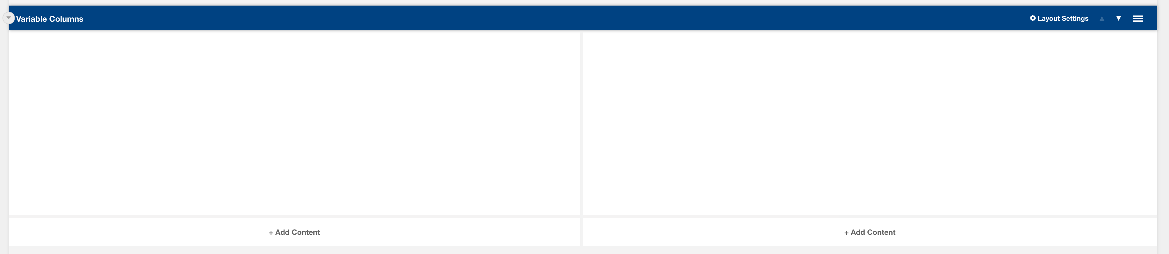
Layout: Variable Columns
Variable column layout
Category: Templates - Sections - Waterlogic Layout.
Content Blocks Documentation: https://docs.modmore.com/en/ContentBlocks/v1.x/Layouts.html
By default, the column widths are 50/50 in width but can be changed using the Bootstrap Column 1 and Bootstrap Column 2 settings. For documentation on changing column widths using Bootstrap classes see http://websitedocs.waterlogic.com/books/content-blocks/page/grid-layout
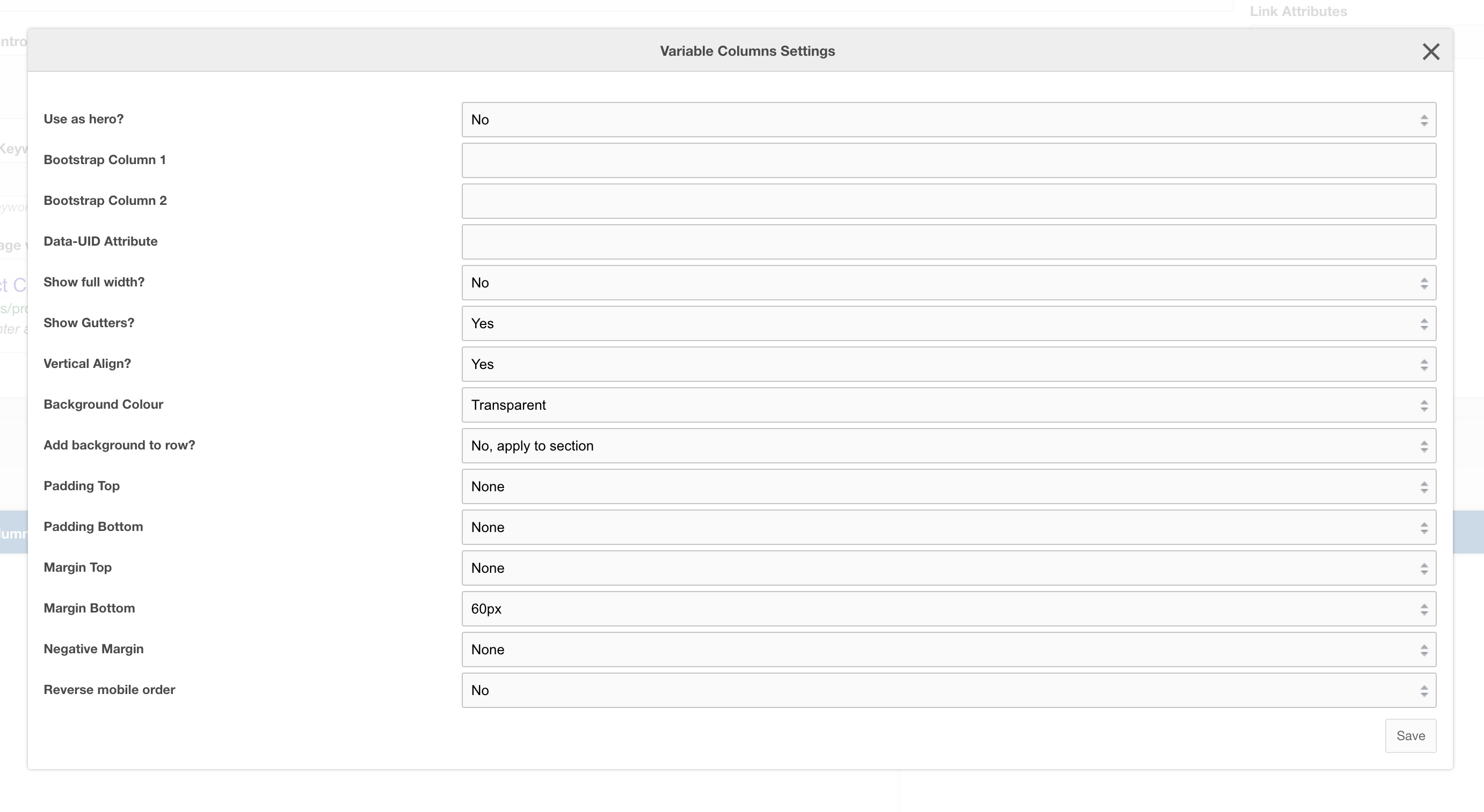
Settings
|
Use as hero?
|
Use this variable column layout as a Hero section, this adds in-hero classes which adjust the look of the layout across mobile and desktop. |
|
Bootstrap Column 1
|
Classes by bootstrap for the grid. Defaults to col- https://getbootstrap.com/docs/4.0/layout/grid/ |
| Bootstrap Column 2 | Classes by bootstrap for the grid. Defaults to col-12 https://getbootstrap.com/docs/4.0/layout/grid/ |
| Data-UID Attribute | Unique data attribute used for referencing the layout. |
| Show full width? | Should the section show full width. Using Bootstrap container and container-fluid. |
| Show Gutters? | Should the gutters show for this layout? Default to Yes. |
| Vertical Align? | Should the content within this layout show vertically aligned. Default to Yes. |
| Background Colour | The background colour of the layout. Default to White. |
| Add background to row? | Add the background colour to the section or to the row, if added to the row then rounded corners are added to the section for a stylised effect |
| Padding Top | Padding top for the layout. Default to 45px. |
| Padding Bottom | Padding bottom for the layout. Default to 45px |
| Margin Top | Margin top for the layout. Default to 60px |
| Margin Bottom |
Margin bottom for the layout. Default to 0px |
| Reverse Mobile Order | Should this layout be reversed on mobile? Useful for alternating 50/50 content layouts. |
Layout: Page scroll banner
A blue background floating 4 column layout to be used with WL Icon CTA scroll links
Category: Waterlogic layouts
Content Blocks Documentation: https://docs.modmore.com/en/ContentBlocks/v1.x/Layouts.html

The page scroll banner is specifically designed to float above the previous section on the page, for example, in the image below the Page scroll banner floats over the hero making the links standout and helps draw users attention to different sections within the resource.

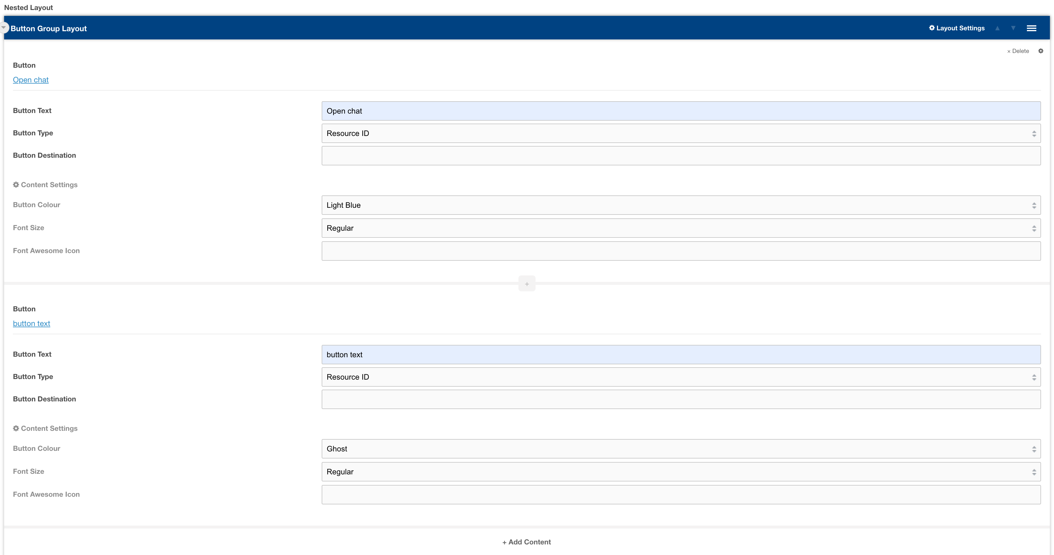
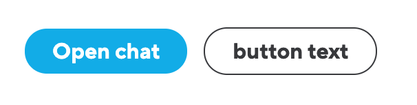
Layout: Button group layout
Group buttons together inline on desktop and block on mobile
Category: Waterlogic fields
Content Blocks Documentation: https://docs.modmore.com/en/ContentBlocks/v1.x/Layouts.html
To use this layout, first, insert a nested layout field in your layout, then selected Button group layout. YOu can then enter buttons into this layout On the frontend Javascript will determine if the buttons should be inline or stacked depending on screen width.
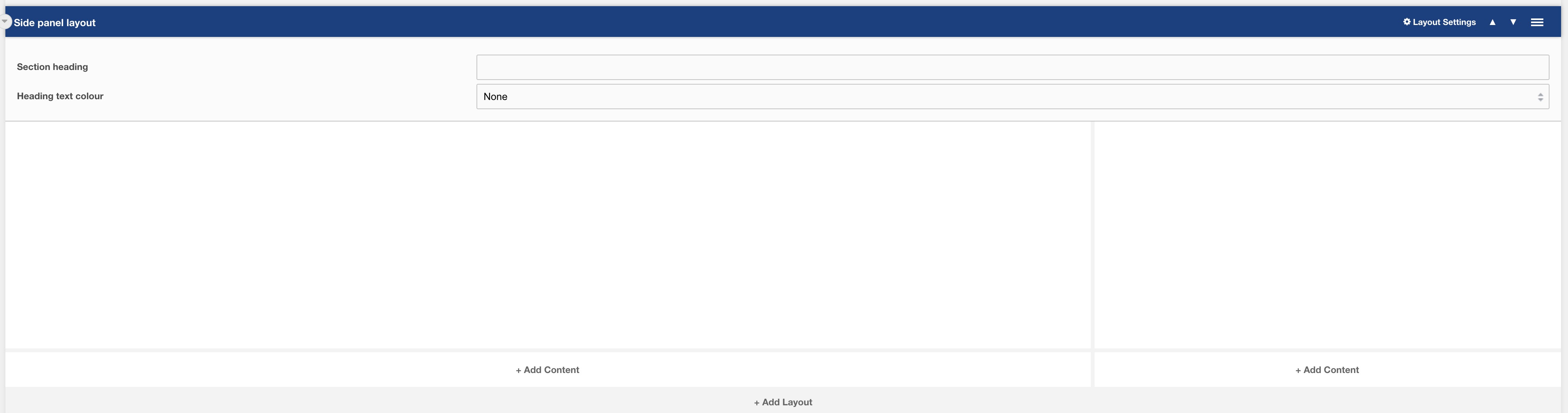
Layout: Side panel layout
Side panel layout
Category: Waterlogic Articles.
Content Blocks Documentation: https://docs.modmore.com/en/ContentBlocks/v1.x/Layouts.html
This layout is typically only used for an Article Resource Section, the layout provides two columns for adding fields and nested layouts. The smaller column on the right is specifically designed to hold the Side Panel field.
Settings are available by hovering over the field and clicking the cog in the top right
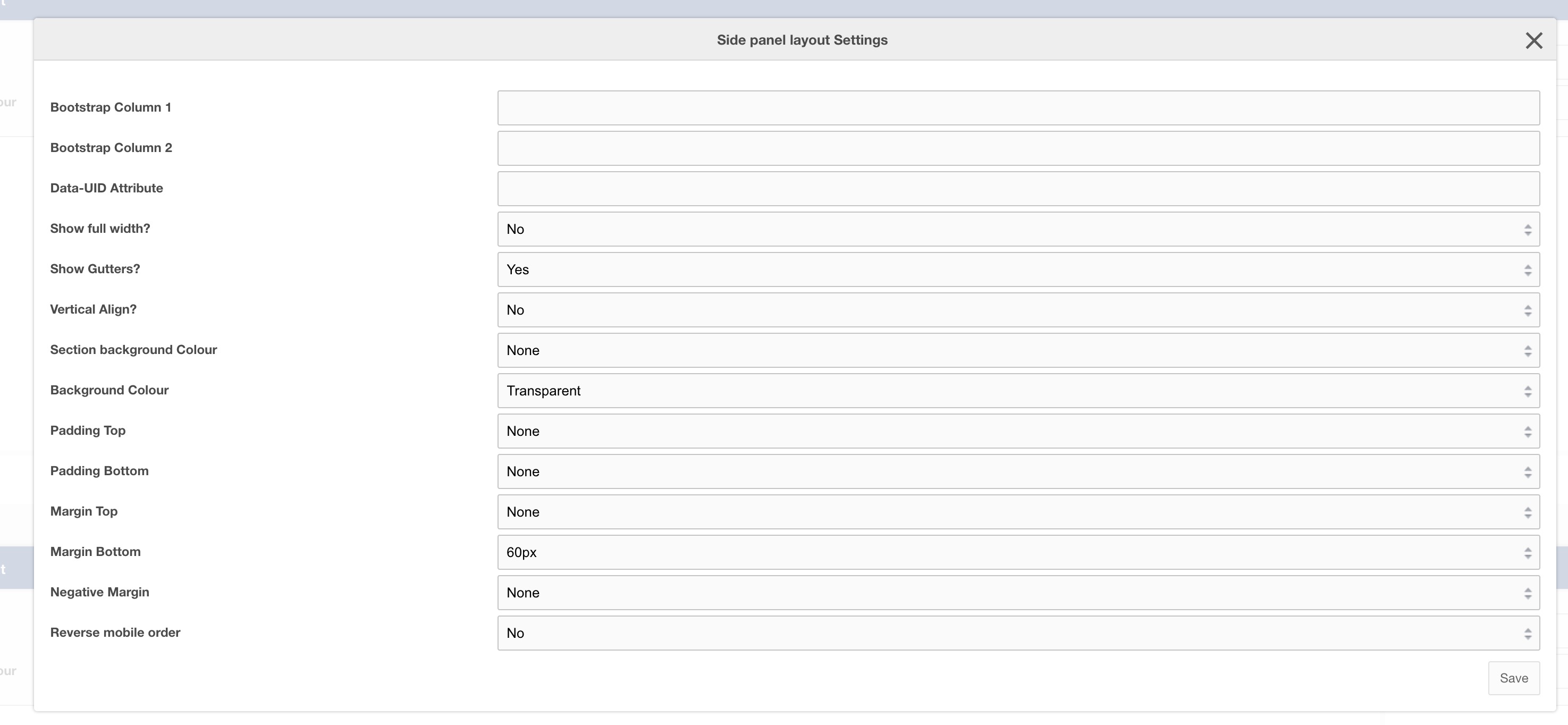
Settings
| Setting | Description | Default |
| Bootstrap Column 1 | Adjust the size of the column using bootstrap classes | col-12 col-lg-9 |
| Bootstrap Column 2 | Adjust the size of the column using bootstrap classes | col-12 col-lg-3 |
| Data-UID | A unique ID of the container for skip to links | |
| Show full width? | Element stretches full width of the page | No |
| Show Gutters? | Show Bootstrap gutters | Yes |
| Vertical Align? | Vertically align the columns | Yes |
| Section background colour | Background colour of the full-width section | Transparent |
| Container background Colour | Section background colour | Transparent |
| Padding top | Section padding-top - Use if you have background colour set | |
| Padding bottom | Section padding-bottom - Use if you have background colour set | |
| Margin top | Add margin to the top of the container for vertical alignment adjust | |
| Margin bottom | Add margin to the bottom of the container for vertical alignment adjust | 60px |
| Negative margin | Add a negative margin to the bottom of the section, useful for adjusting the base padding when using background colours | |
| Reverse mobile order | Reverse the order of the columns on mobile | No |
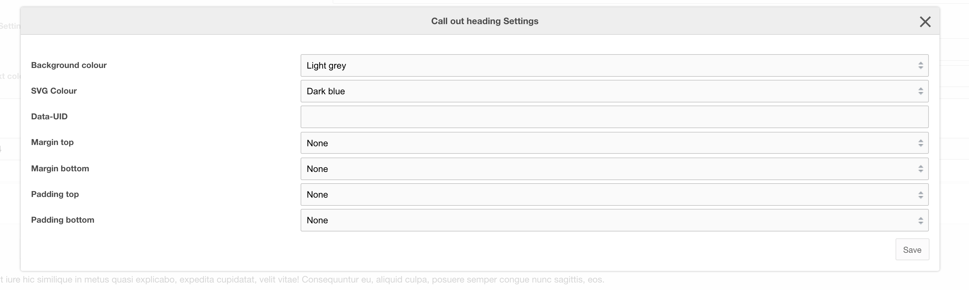
Layout: Call out heading
A layout that adds a coloured SVG and eye-catching heading on the left with rich text content on the right
Category: Waterlogic Heros.
Content Blocks Documentation: https://docs.modmore.com/en/ContentBlocks/v1.x/Layouts.html
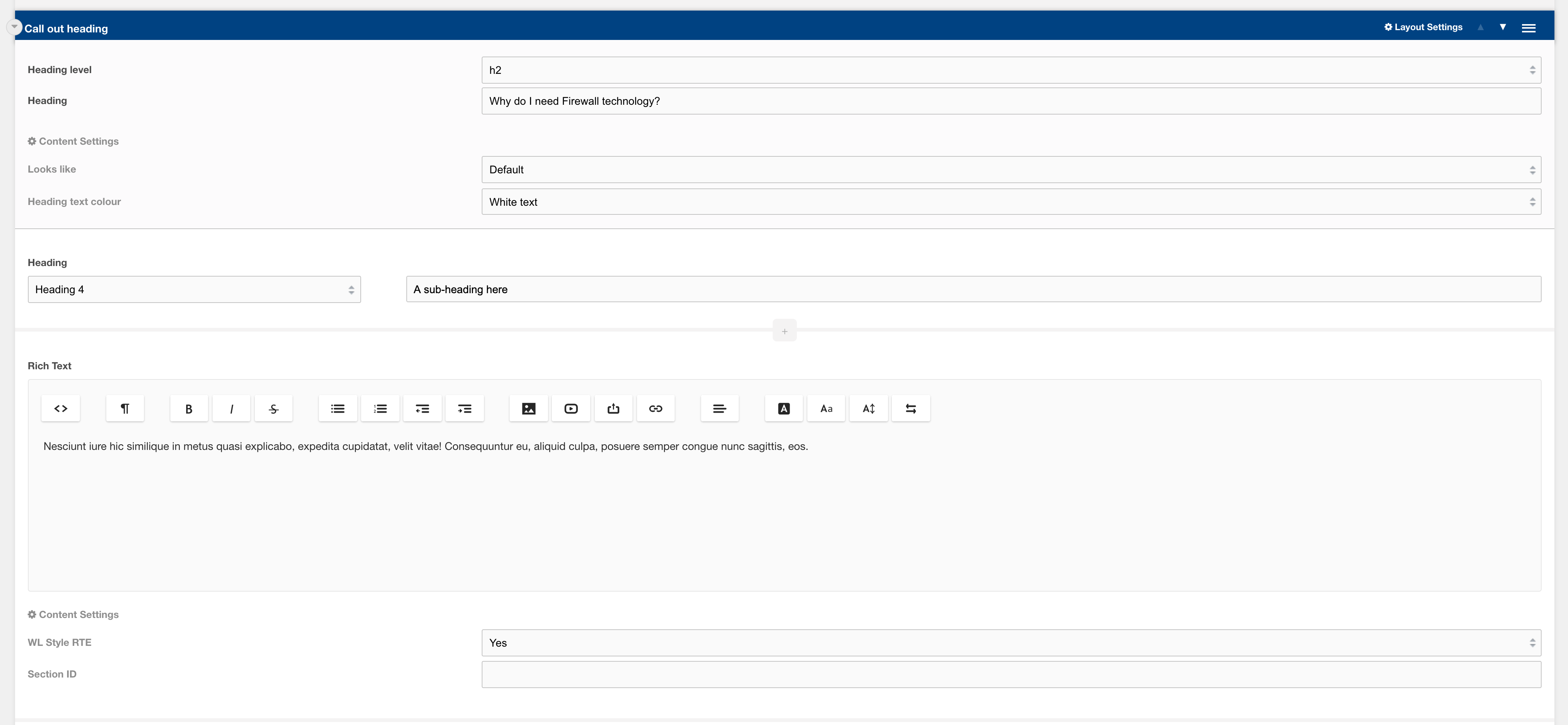
Settings are available by hovering over the field and clicking the cog in the top right
Options
| Setting | Description | Default |
| Heading level | Heading level of heading text | h1-h5 | h2 |
| Heading | Text that will reside in the SVG as a heading |
Settings
| Setting | Description | Default |
| Looks like | Adjust the size of the heading level | Default |
| Heading text colour | Text colour of the heading text In the SVG | White text |
| Background Colour | Background colour of the layout | Transparent |
| SVG Colour | Colour of the SVG | Dark Blue |
| Data-UID | A unique ID of the container for skip to links | |
| Padding top | Section padding-top - Use if you have background colour set | |
| Padding bottom | Section padding-bottom - Use if you have background colour set | |
| Margin top | Add margin to the top of the container for vertical alignment adjust | |
| Margin bottom | Add margin to the bottom of the container for vertical alignment adjust |
Field: CTA Banner layout
A pre-built call to action banner
Category: Waterlogic - Call to action banners
This layout is a pre-built CTA Banner with heading, richtext and a button added to the nested layout field.

Related pages
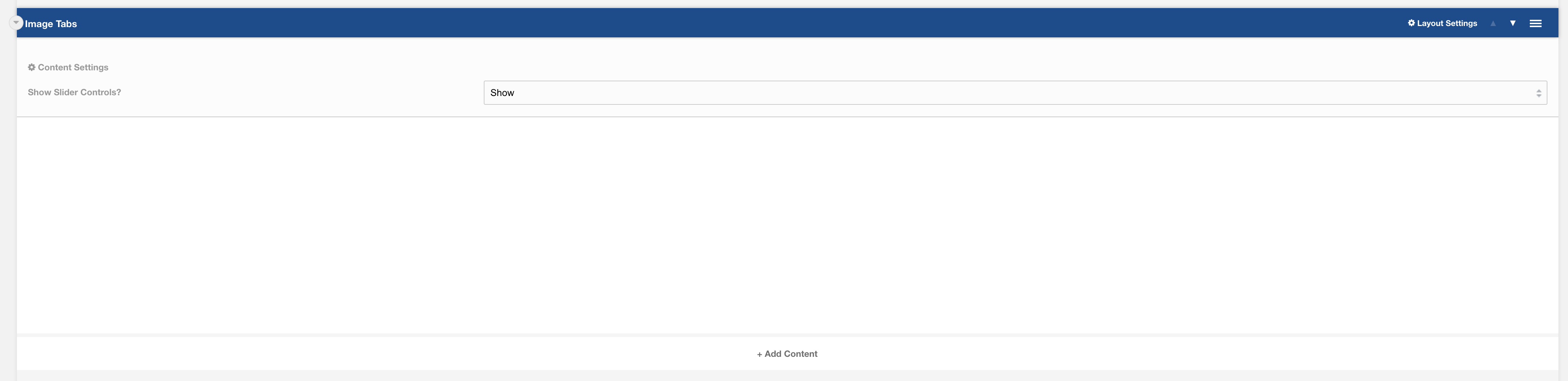
Layout: Image Tabs
Single column layout used with "Image Tab Logos" and "Image Tab Content" field.
Category: Default.
Content Blocks Documentation: https://docs.modmore.com/en/ContentBlocks/v1.x/Layouts.html
Settings
Show Slider Controls? Should the slider controls show within the layout when sliding content? Default to Show.
Additional settings are available by hovering over the field and clicking the cog in the top right
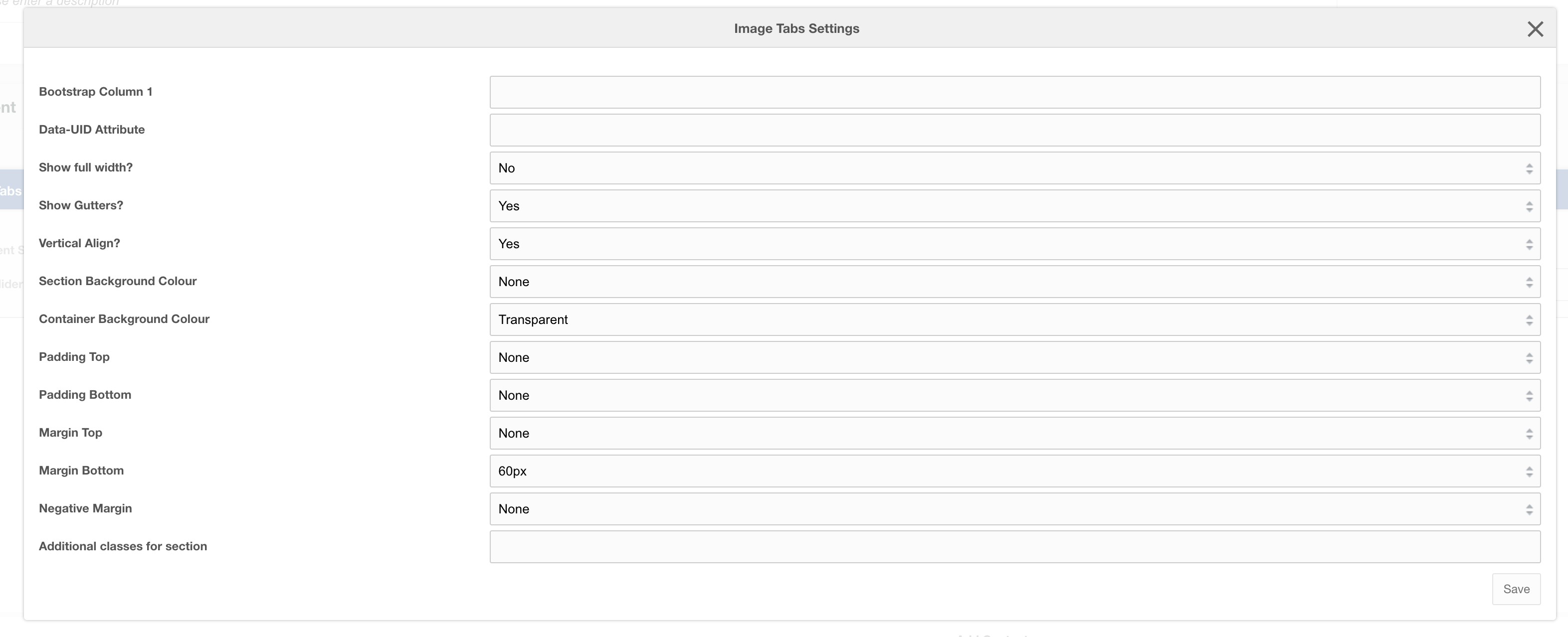
Settings
| Setting | Description | Default |
| Bootstrap Column | Adjust the size of the column using bootstrap classes | col-12 |
| Data-UID | A unique ID of the container for skip to links | |
| Show full width? | Element stretches full width of the page | No |
| Show Gutters? | Show Bootstrap gutters | Yes |
| Vertical Align? | Vertically align the columns | Yes |
| Section background colour | Background colour of the full-width section | Transparent |
| Container background Colour | Section background colour | Transparent |
| Padding top | Section padding-top - Use if you have background colour set | |
| Padding bottom | Section padding-bottom - Use if you have background colour set | |
| Margin top | Add margin to the top of the container for vertical alignment adjust | |
| Margin bottom | Add margin to the bottom of the container for vertical alignment adjust | 60px |
| Negative margin | Add a negative margin to the bottom of the section, useful for adjusting the base padding when using background colours | |
| Remove container and row | Add additional classes to the section | |
| Additional Section classes | Add additional classes to the section | |
| Justify content | Justify the columns horizontally on the page |
Usage
This layout is only designed to work with:
- Field: Image Tab Logos
- Field: Image Tab Content
Layout: Colour split
Two-column layout with a dark blue background colour on the right column and light grey background on left column
Category: Default.
Content Blocks Documentation: https://docs.modmore.com/en/ContentBlocks/v1.x/Layouts.html

Additional settings are available by hovering over the field and clicking the cog in the top right

Settings
| Setting | Description | Default |
| Data-UID | A unique ID of the container for skip to links | |
| Show full width? | Element stretches full width of the page | No |
| Margin top | Add margin to the top of the container for vertical alignment adjust | |
| Margin bottom | Add margin to the bottom of the container for vertical alignment adjust | 60px |
Layout: Hero form cut-out
Three column layout for use as a hero with a form and trusted logos
Category: Waterlogic Heros.
Content Blocks Documentation: https://docs.modmore.com/en/ContentBlocks/v1.x/Layouts.html

Additional settings are available by hovering over the field and clicking the cog in the top right

How to use
To use this template it is important that the different layout content areas contain the right content. The first (top left) should contain Headings, text, and content related fields. Second (top right) should only have a trusted logos field. And the third (bottom left) should only contain a form. This form will also be added to a mobile modal and a button will automatically show below the content area allowing users to open that form modal.
Options
| Option | Description | Default |
| Hero image | Image to use for Hero | |
| Hero image alt | Alt text for hero image |
Settings
| Setting | Description | Default |
| Form columns | Bootstrap columns for the desktop form | col-12 col-xxl-10 col-xl-9 |
| Image size | Size of the image and the trusted logos bar below. Changes the width/ height of image slightly to adjust for image type | Larger |
| Data-UID | A unique ID of the container for skip to links | |
| Margin top | Add margin to the top of the container for vertical alignment adjust | |
| Margin bottom | Add margin to the bottom of the container for vertical alignment adjust | 60px |
| Form modal button colour | On mobile/ tablet a button will show that will trigger the modal containing the form. The button is lexiconed - Request a quote. You can select the colour of the button | Orange |
Layout: Hero form product right
Three column layout for use as a hero with a form and trusted logos
Category: Waterlogic Heros.
Content Blocks Documentation: https://docs.modmore.com/en/ContentBlocks/v1.x/Layouts.html

Additional settings are available by hovering over the field and clicking the cog in the top right

How to use
To use this template it is important that the different layout content areas contain the right content. The first (top left) should contain Headings, text, and content related fields. Second (top right) should only have a trusted logos field. And the third (bottom left) should only contain a form. This form will also be added to a mobile modal and a button will automatically show below the content area allowing users to open that form modal.
Options
| Option | Description | Default |
| Hero product image | Product Image to use for Hero | |
| Hero product image alt | Alt text for hero product image | |
| Second product image | A second image to use in the hero | |
| Second product image alt | Alt text for second image |
Settings
| Setting | Description | Default |
| Form columns | Bootstrap columns for the desktop form | col-12 col-xxl-10 col-xl-9 |
| Data-UID | A unique ID of the container for skip to links | |
| Margin top | Add margin to the top of the container for vertical alignment adjust | |
| Margin bottom | Add margin to the bottom of the container for vertical alignment adjust | 60px |
| Form modal button colour | On mobile/ tablet a button will show that will trigger the modal containing the form. The button is lexiconed - Request a quote. You can select the colour of the button | Orange |
Layout: Banner Image Badge
Four column layout for use as a hero with a form and trusted logos and feature badge
Category: Waterlogic Heros.
Content Blocks Documentation: https://docs.modmore.com/en/ContentBlocks/v1.x/Layouts.html
Additional settings are available by hovering over the field and clicking the cog in the top right
How to use
To use this template it is important that the different layout content areas contain the right content. The first (top left) should contain Headings, text, and content related fields. Second (top moiddle) should only contain a form. The third (top right) should be content for the badge and should contain only rich text. Fourth (bottom), should contain only trusted logos.
Options
| Option | Description | Default |
| Background Image | Background Image to use for Hero |
Settings
| Setting | Description | Default |
| Show Badge? | Should the badge show on this hero banner? | Yes |
| Badge Colour | Background colour of the badge if "show badge" is set to Yes. | Green |
| Image Position | The position of the image within the banner (right or left) | Left |
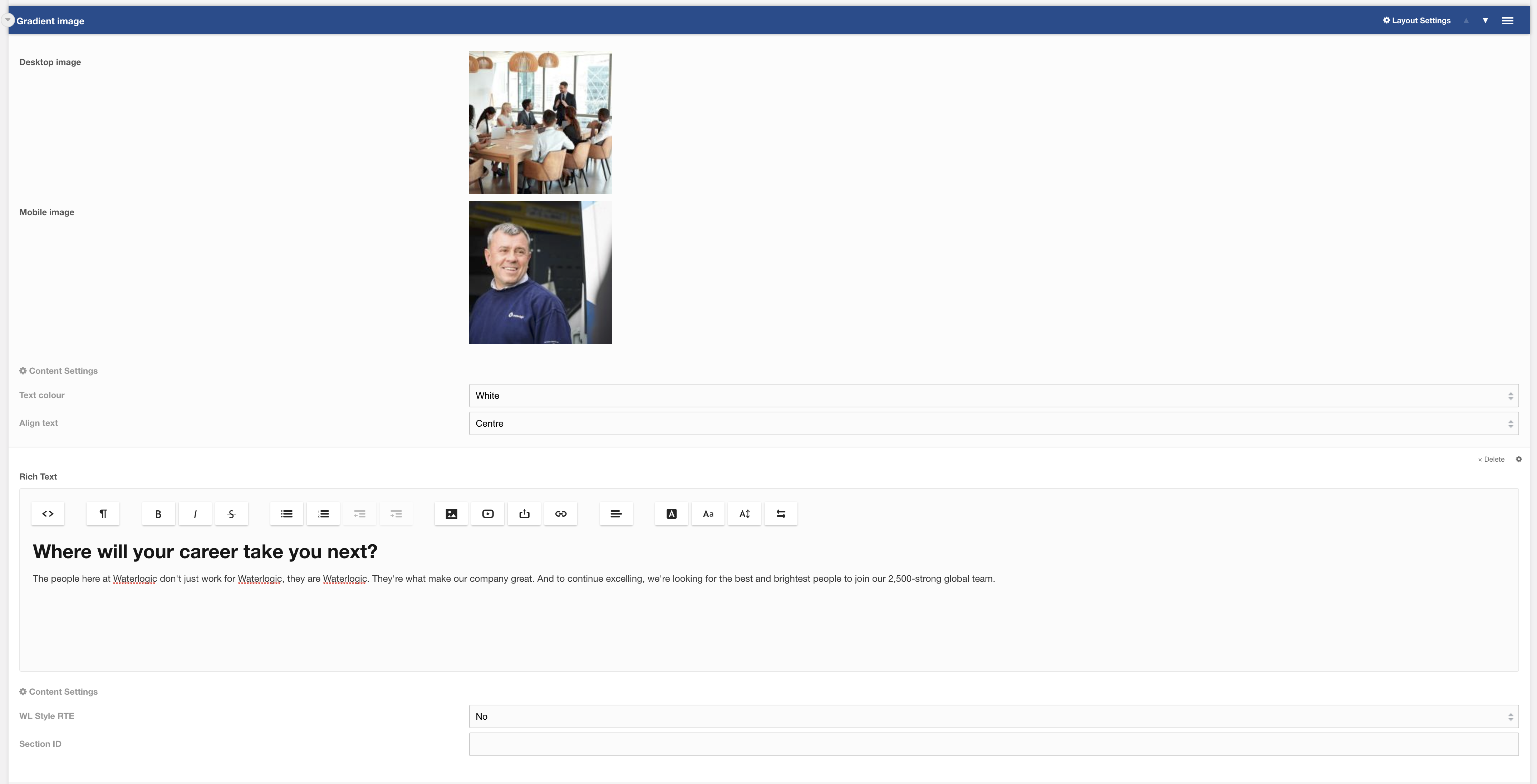
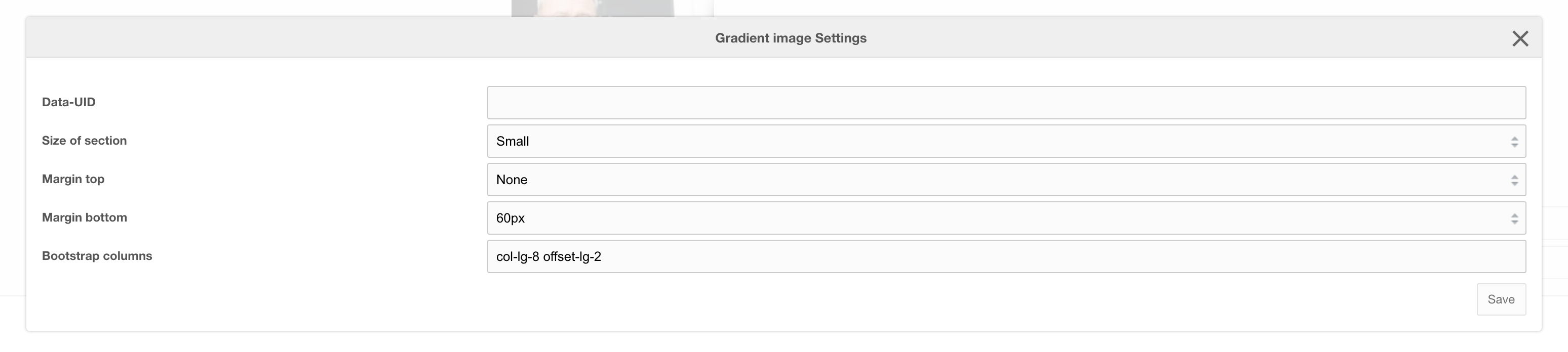
Layout: Gradient image
Single column layout with a background image and a dark gradient overlay
Category: Waterlogic Layouts.
Content Blocks Documentation: https://docs.modmore.com/en/ContentBlocks/v1.x/Layouts.html
Additional settings are available by hovering over the field and clicking the cog in the top right
Options
| Option | Description | Default |
| Desktop image | Background Image to use for desktop | |
| Mobile image | Background Image to use for mobile |
Settings
| Setting | Description | Default |
| Text colour | Colour of text | White |
| Align text | Align content (Can be overridden on RTE) | Centre |
| Data-UID | A unique ID of the container for skip to links | |
| Size of section | Adjust the height of the background image: Small | Medium | large | Small |
| Margin top | Add margin to the top of the container for vertical alignment adjust | |
| Margin bottom | Add margin to the bottom of the container for vertical alignment adjust | |
| Bootstrap Column | Adjust the size of the column using bootstrap classes | col-lg-8 offset-lg-2 |
Layout: Branded Slider Image
Branded slider layout. Building layout using branded slider image and branded slider content field.
Category: Waterlogic Layouts
This layout is the outer container for creating the branded slider image content, By default the slider layout contains the Branded Slider Image field to the left and Branded Slider Content to the right; see screenshot:

You can add as many slider items that you need. Each Image on the left required content on the right and needs to be in the same order. If there is only one item then the slider navigation does not show.
Layout Settings
| Setting | Description | Default |
| Data-UID | A unique ID of the container for skip to links | |
| Padding top | Section padding-top - Use if you have background colour set | |
| Padding bottom | Section padding-bottom - Use if you have background colour set | |
| Margin top | Add margin to the top of the container for vertical alignment adjust | 60px |
| Margin bottom | Add margin to the bottom of the container for vertical alignment adjust | 60px |
| Additional classes for section | Add additional classes to the section |
Layout: Submit CV Form
Layout: Submit CV Form
Full width search banner layout, can be used within careers area of WL sites
Category: Waterlogic Layouts.
Content Blocks Documentation: https://docs.modmore.com/en/ContentBlocks/v1.x/Layouts.html
Example output:

Defining the direct of global search
You can configure the search type for careers within context settings for each context. Direct search uses only department and global search uses every context and shows the country selector.
Setting Name -> career_show_global (Show Global Search, Default No)
Namespace -> Waterlogic
Topic -> Career
This needs be set to this resource within this context.
Settings are available by hovering over the field and clicking the cog in the top right

Settings
|
Setting |
Description |
Default |
|
Padding top |
Section padding-top - Use if you have background colour set |
|
|
Padding bottom |
Section padding-bottom - Use if you have background colour set |
|
|
Margin top |
Add margin to the top of the container for vertical alignment adjust |
|
|
Margin bottom |
Add margin to the bottom of the container for vertical alignment adjust |
60px |
|
Additional classes |
Add additional classes to the section |
|
Layout: Career Search Banner
Layout: Career Search Banner
Full width search banner layout, can be used within careers area of WL sites
Category: Waterlogic Layouts.
Content Blocks Documentation: https://docs.modmore.com/en/ContentBlocks/v1.x/Layouts.html
Example output:
Defining the direct of global search
You can configure the search type for careers within context settings for each context. Direct search uses only department and global search uses every context and shows the country selector.
Setting Name -> career_show_global (Show Global Search, Default No)
Namespace -> Waterlogic
Topic -> Career
This needs be set to this resource within this context.
Settings are available by hovering over the field and clicking the cog in the top right
Settings
|
Setting |
Description |
Default |
|
Padding top |
Section padding-top - Use if you have background colour set |
|
|
Padding bottom |
Section padding-bottom - Use if you have background colour set |
|
|
Margin top |
Add margin to the top of the container for vertical alignment adjust |
|
|
Margin bottom |
Add margin to the bottom of the container for vertical alignment adjust |
60px |
|
Additional classes |
Add additional classes to the section |
|
Layout: Job application footer form
Single column layout with a background image
Category: Sections.
Content Blocks Documentation: https://docs.modmore.com/en/ContentBlocks/v1.x/Layouts.html
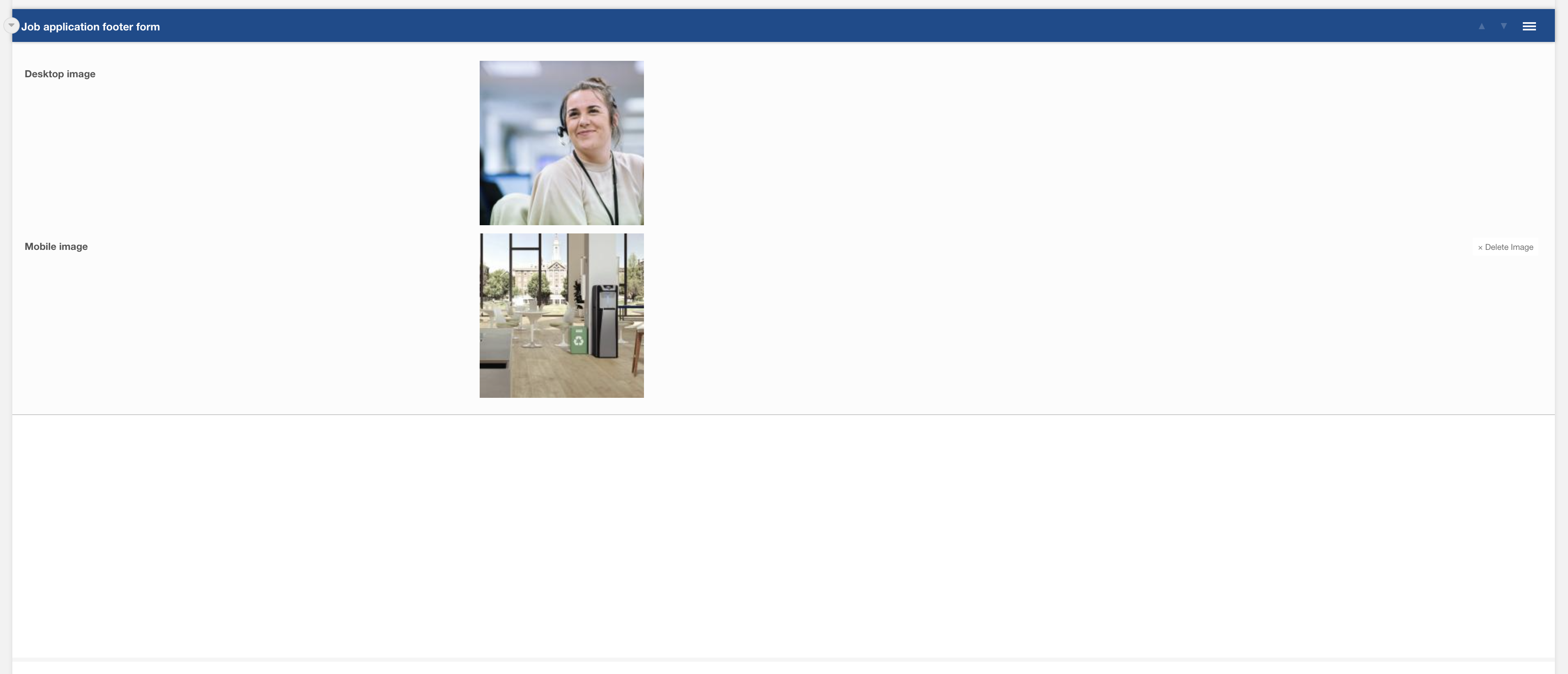
Figure 1
Options
| Option | Description | Default |
| Desktop image | Background Image to use for desktop | |
| Mobile image | Background Image to use for mobile |
Layout: Content Card Landscape
Content Card Landscape
Category: Waterlogic Layouts.
Content Blocks Documentation: https://docs.modmore.com/en/ContentBlocks/v1.x/Layouts.html
Content card landscape is available to use within a nested layout. You can add content such as rich text, tooltip, lists and images within the content card.

Settings are available by hovering over the field and clicking the cog in the top right

Settings
| Setting | Description | Default |
| Heading | Title heading for the content card | |
| Right Heading | Supporting right heading | |
| SVG Icon | SVG icon selector. Icon appears next to heading when selected. | none |
| SVG Icon Colour | Colour of the SVG Icon | Blue Light |
Example Output:
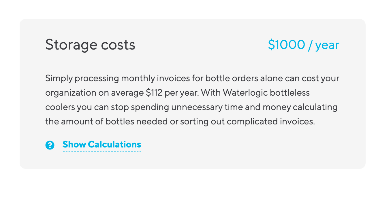
Layout: Cost Calculator Results
Cost Calculator Results
Category: Waterlogic Layouts.
Content Blocks Documentation: https://docs.modmore.com/en/ContentBlocks/v1.x/Layouts.html
Cost calculator results layout is intended to be used on a resource that the Cost Calculator Field points to. The results from the form submission appear within this layout.

figure 1
Settings are available by hovering over the field and clicking the cog in the top right
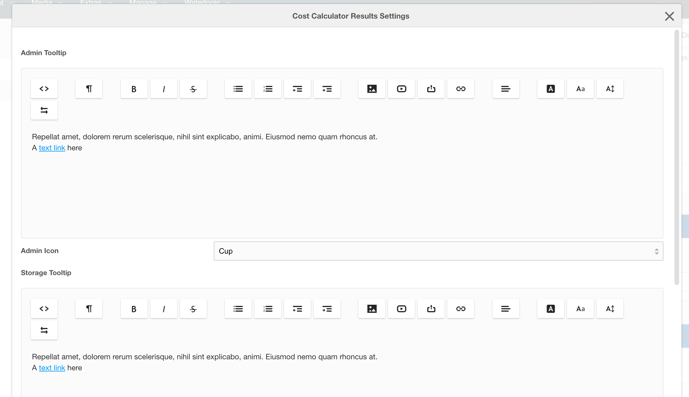
figure 2
Settings
| Setting | Description | Default |
| Form Resource ID | The returning URL the user goes to this page without submitting the form. This should be the ID of the resource where the form sits on the context. | |
| Admin Tooltip | Tooltip content for "showing" admin calculations | |
| Admin Icon | Icon that displays beside the admin title block in the results. |
|
| Storage Tooltip | Tooltip content for "showing" storage calculations | |
| Storage Icon | Icon that displays beside the storage title block in the results. | |
| Security Tooltip | Tooltip content for "showing" security calculations | |
| Security Icon | Icon that displays beside the security title block in the results. | |
| Productivity Tooltip | Tooltip content for "showing" productivity calculations | |
| Productivity Icon | Icon that displays beside the productivity title block in the results. |
Example Output:

Global Settings for the calculator (context based and lexicons)
This is a preconfigured form and uses settings and variables in:
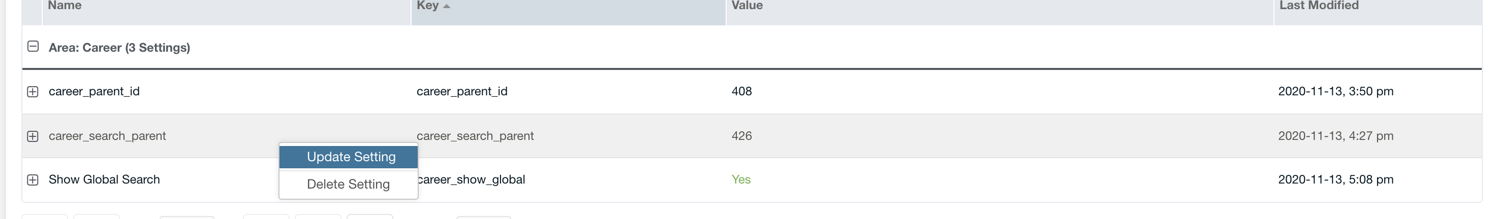
Website Settings (found on the Modx dashboard, see figure 3)

figure 3
Under website settings go to Cost Calculator:

figure 4
To manage settings for other contexts, select context under the Choose Context dropdown. (seen in image above).
Lexicons
Tooltips, placeholders and general content for this form and the results fully use lexicons. To access lexicons go to the "cog" icon at the top right of the Modx dashboard and select Lexicons.

figure 5
To find lexicon values for cost calculator, select Waterlogic -> cost_calculator -> en (namespace -> topic -> language) where "en" is the language to are going to edit.

figure 6