Overview
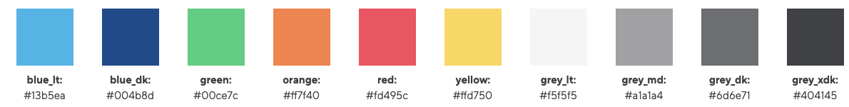
Colours
Dark Blue
Light Blue
Green
Orange
Red
Yellow
Light Grey
Med Grey
Dark Grey
Extra Dark Grey
Headings
Spacing
Bootstrap spacing classes for margin and padding can be applied to any element.
https://getbootstrap.com/docs/4.0/utilities/spacing/
We use the spacing methods on inner columns to achieve spacing vertically. This is specifically helpful when trying to achieve vertical spacing between elements when contents stack on responsive devices.
Grid Layout
Bootstrap grid layout information that can be applied to layout areas where column settings are available.
https://getbootstrap.com/docs/4.0/layout/grid/
By default, layouts and templates are pre-configured to achieve what is required for the design. These can be overwritten by bootstrap classes as required.
When to use Bootstrap columns
Each layout has a setting which allows you to customise the Bootstrap columns, for example on the 100% layout, you can update the Bootstrap column to col-12 (12 columns on mobile) col-md-10 (10 columns on tablet) col-lg-8 (8 columns on desktop). You can then centre/ offset the columns at each breakpoint to customise the design. For example offset-md-1 offset-lg-2, would move the layout 1 column left on tablet and 2 columns left on desktop.
Breakpoints
Waterlogic design has more breakpoints that Bootstrap which means you have finer grain control over screen widths:
|
breakpoint-xs: 0; |
eg: col-xs-12 |
|
breakpoint-sm: 576px; |
eg: col-sm-12 |
|
breakpoint-md: 768px; |
eg: col-md-12 |
|
breakpoint-lg: 992px; |
eg: col-lg-12 |
|
breakpoint-xl: 1200px; |
eg: col-xl-12 |
|
breakpoint-xxl: 1350px; |
eg: col-xxl-12 |
|
breakpoint-wl: 1600px; |
eg: col-wl-12 |
| All breakpoints: | eg: col-12 |
This means you can use additional classes such as col-wl-2 for 2 columns at 1600px and up screen widths.