Section Templates
Pre-designed, and configured sections for you to add into pages with a single click.
- Template: Multi Hero Slider
- Template: In Page Media Slider
- Template: Midpage multi CTA Banner
- Template: Circle image card right
- Template: Contact banner
- Template: Call out banner
- Template: Pre-footer CTA Template
- Template: Tabbed Content
- Template: Icon List Banner
- Template: Centre Product Feature
- Template: Product Hero
- Template: Hyperlink Blocks
- Template: Sidebar Help
- Template: Sidebar CTA
- Template: Sidebar section
- Template: Product CTA
- Template: Stacked Icon Banner
- Template: Hero 1 - Banner SVG Cutout Overlap
- Template: Hero 2 - Banner Lifestyle Badge
- Template: Hero 3 - Banner Image Overlap
- Template: Hero 4 - Banner Curved Image
- Template: Hero 5 - Variable Columns
- Template: Form Modal
- Template: WL Icon Banner
- Template: Banner Image
- Template: Alternating Content
- Template: Repeated image banner
- Template: FAQ Banner
- Template: Page Scroll Banner
- Template: Global Offices
- Template: Regioinal Offices
- Template: Featured resources side panel
- Template: Feature panel template
- Template: Related articles slider
- Template: Video Text
- Template: Content cards
- Template: Image Tabs
- Template: Form with USPs
- Template: Hero Form Cut-out Right
- Template: Hero Form Product Right
- Template: Hero Form Lifestyle
- Template: Branded Slider
- Template: Testimonial Card Slider
- Template: Job application footer form
- Template: Sidebar CTA - Lexicon
- Template: Sidebar Helper - FAQ
Template: Multi Hero Slider
A preconfigured template using the layout Multi Hero Slider and multiple individual heros.
Category: Templates - Sections - Waterlogic Heros.
Content Blocks Documentation: https://docs.modmore.com/en/ContentBlocks/v1.x/Templates.html

This Template consists of the following layouts:
Settings are preconfigured to designs set out. Once added you can amend each of the layouts and settings. For information on each of the fields and layout settings see the layout and field specific documentation.
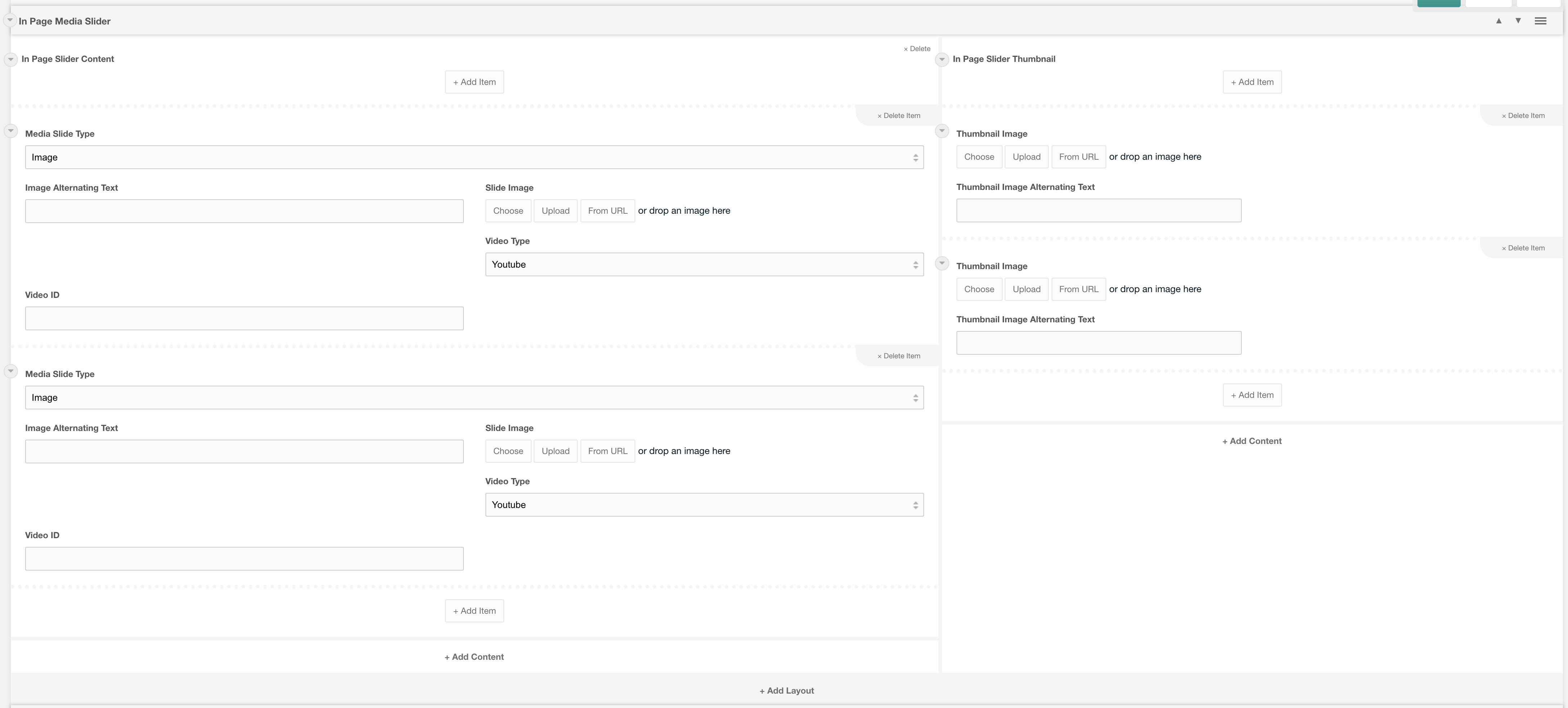
Template: In Page Media Slider
A preconfigured template using the layout In Page Media Slider
preconfigured template using the layout "In Page Media Slider". This then used the fields "In Page Slider Content" and In Page Slider Thumbnail" fields
Category: Templates - Sections - Waterlogic Gallery and Sliders.
Content Blocks Documentation: https://docs.modmore.com/en/ContentBlocks/v1.x/Templates.html
This Template consists of the following layouts:
This Template consists of the following fields:
- In Page Slider Content
- In Page Slider Thumbnail
Settings are preconfigured to designs set out. Once added you can amend each of the layouts and settings. For information on each of the fields and layout settings see the layout and field specific documentation.
Template: Midpage multi CTA Banner
Displays a call to action banner prepopulated with content and icon fields
Category: Sections - Waterlogic Call to action banners
Content Blocks Documentation: https://docs.modmore.com/en/ContentBlocks/v1.x/Templates.html
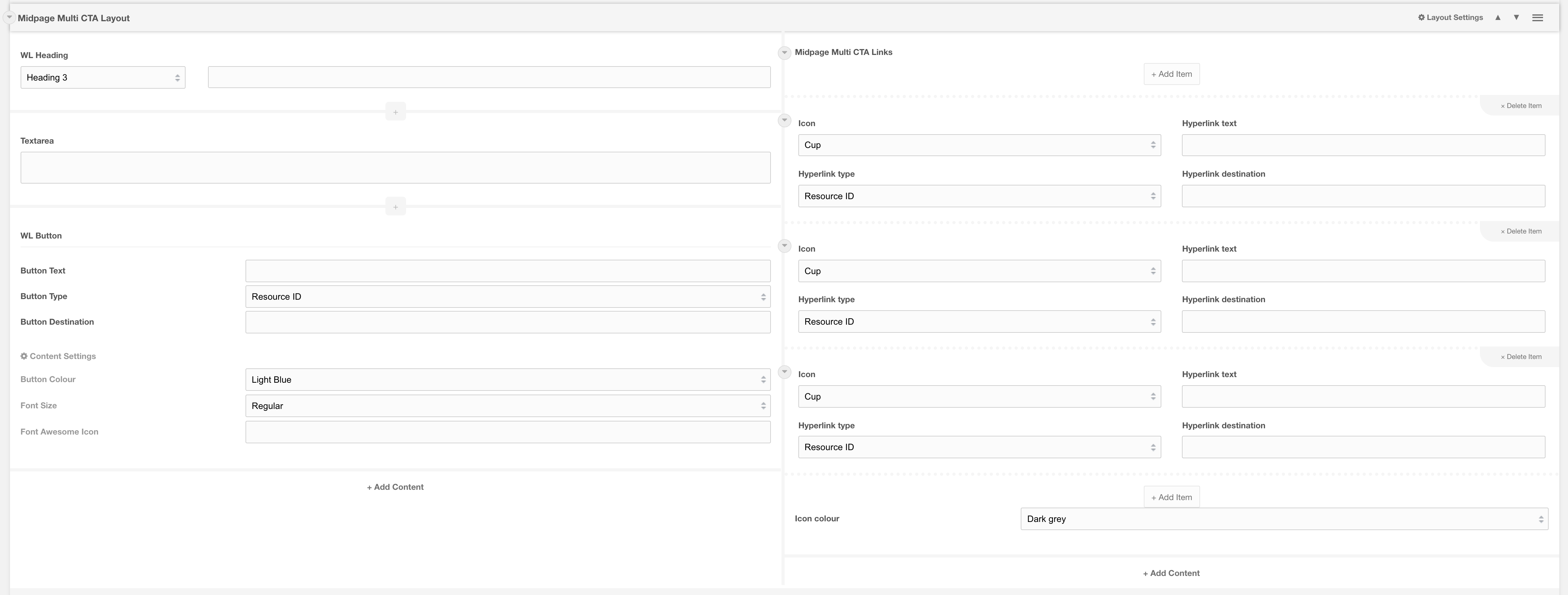
This template contains the following fields
| Field type | Usage | Options | Required |
| Heading | Enter banner heading | Default H3 | Required |
| Textarea | Enter call to action content that grabs users attention and clearly tells them what action you want them to make | Required | |
| WL Button | By default, there is a button added to the banner to give users additional options. This field is optional and can be removed or changed. | Optional | |
| Midpage Multi CTA Links | Repeated icon fields. At least 1 is required. Recommend no more than 4 items are used | Required |
Related
Field: Midpage Multi CTA Links
Layout: Midpage Multi CTA Layout
Template: Circle image card right
50/50 Template for Circle Image Card with default content fields added
Category: Sections - Waterlogic Call to action banners
Content Blocks Documentation: https://docs.modmore.com/en/ContentBlocks/v1.x/Templates.html

This template contains the following fields
| Field type | Usage | Options | Required |
| WL Heading | Subheading for card | Default H4 | Optional |
| WL Heading | Main heading for card | Default H2 | Required |
| Textarea | Body content for card | Recommended | |
| WL Button | Button for card call to action. Recommended to have a call to action on this item, however, you are free to use different button types and link fields. | Recommended |
Design
To change the background colour of the section, update the section background setting on the main layout setting. For example on the default template using 50/50 layout, update those settings.
Related
Layout: Circle image card
Template: Contact banner
3 Column contact banner design using contact banner nested layout
Category: Sections - Waterlogic Call to action banners
Content Blocks Documentation: https://docs.modmore.com/en/ContentBlocks/v1.x/Templates.html
The basic template uses lexicons and website config settings to preset the content.

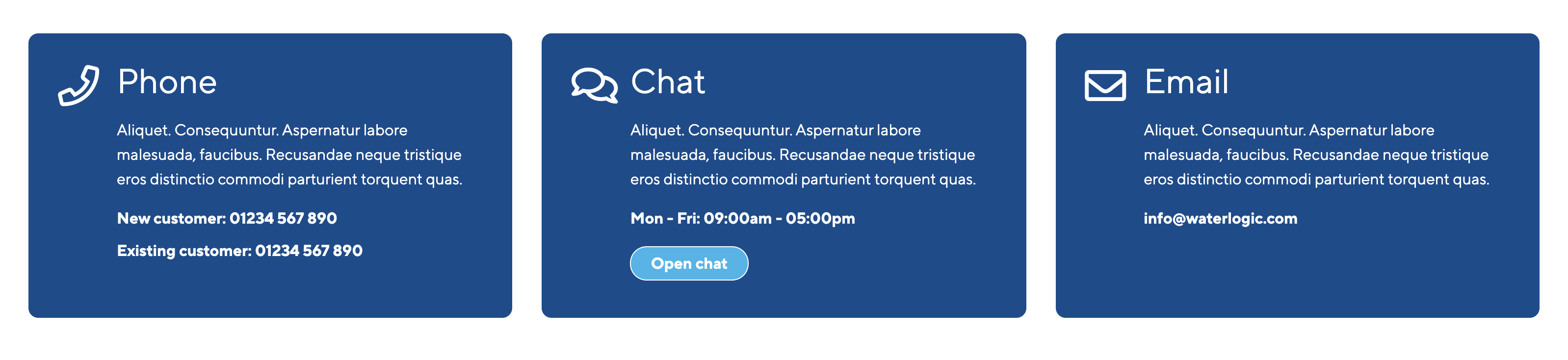
This template contains the following fields
| Field type | Usage | Options | Required |
| WL Heading | Heading title | Default H3 | Required |
| Textarea | Banner section content | Recommended | |
| Simple text field | Additional information that should be taken note of | A wrapper class of dynamic_phone is applied to this field | Recommended |
| WL button | A call to action button | Optional |
Related pages
Layout: Contact banner layout
Template: Call out banner
Prebuilt call out banner component
Category: Sections - Waterlogic Call to action banners
Content Blocks Documentation: https://docs.modmore.com/en/ContentBlocks/v1.x/Templates.html

This template allows you to quickly create a section like the image below. Simply update the image, add in your content and make changes to the colours as you see fit.

Adding your own content
You can update the banner to meet your needs by adding different fields into each area, thereby creating a whole new design to capture user attention.
Related pages
Layout: Call out banner layout
Template: Pre-footer CTA Template
Call to action banner above footer with links and content area
Category: Sections - Waterlogic Call to action banners
Content Blocks Documentation: https://docs.modmore.com/en/ContentBlocks/v1.x/Templates.html
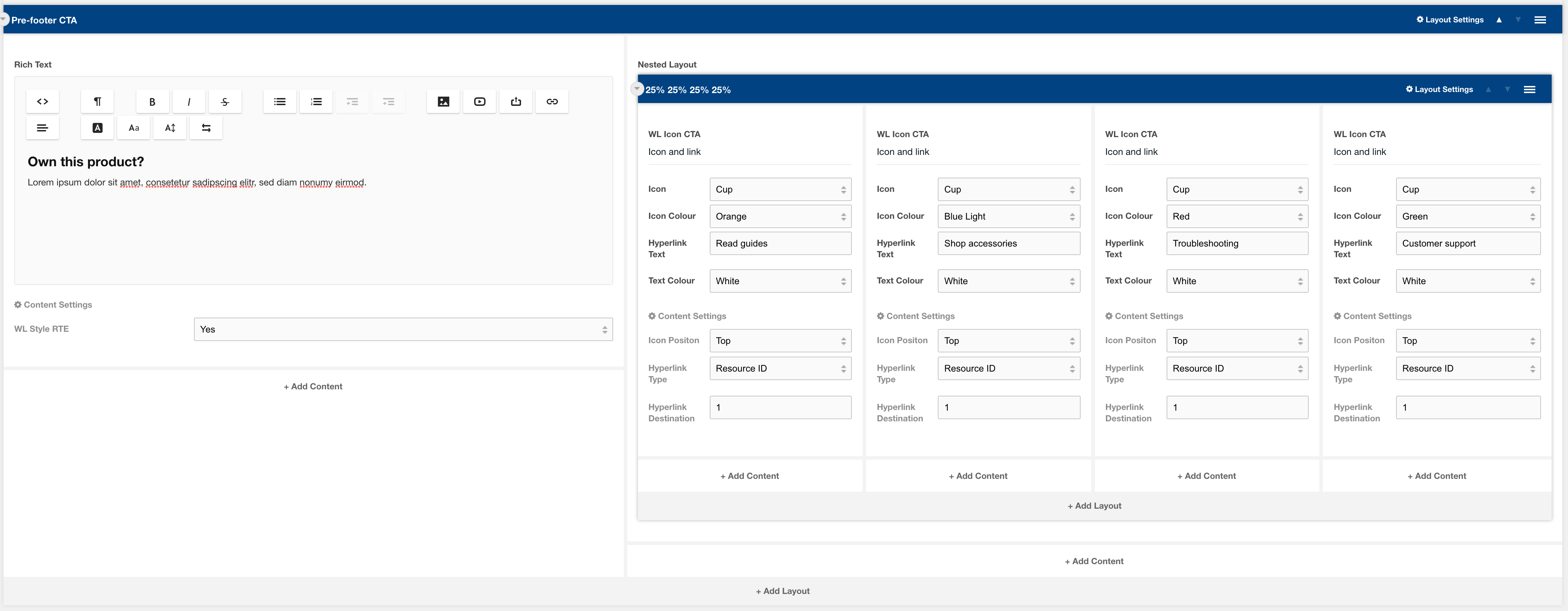

This template contains the following fields
| Field type | Usage | Options | Required |
| Rich text | Banner section content | Required | |
| WL Icon CTA | Call to action buttons with Waterlogic icons | Required |
Related pages
Template: Tabbed Content
A preconfigured template using the Tabs and fields Tab Title and Tab Content
Category: Templates - Sections - Waterlogic Layouts.
Content Blocks Documentation: https://docs.modmore.com/en/ContentBlocks/v1.x/Templates.html
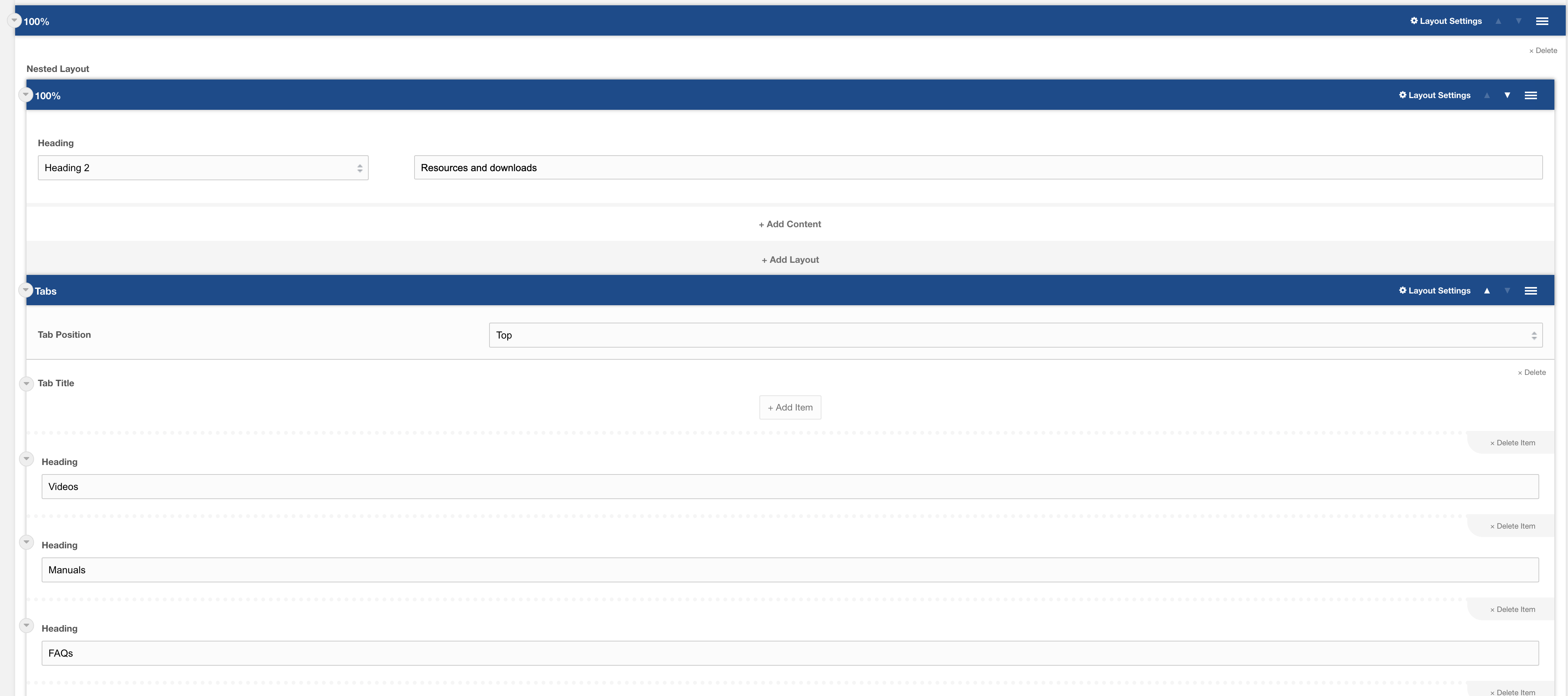
This Template consists of the following layouts:
This template consists of the following fields
- Tab Title
- Tab Content
Settings are preconfigured to designs set out. Once added you can amend each of the layouts and settings. For information on each of the fields and layout settings see the layout and field specific documentation.
Template: Icon List Banner
A preconfigured template using the Banner Image Deep and WL Dashed Icon List
Category: Templates - Sections
Content Blocks Documentation: https://docs.modmore.com/en/ContentBlocks/v1.x/Templates.html
This Template consists of the following layouts:
This template consists of the following fields
- Heading
- WL Dashed Icon List
Settings are preconfigured to designs set out. Once added you can amend each of the layouts and settings. For information on each of the fields and layout settings see the layout and field specific documentation.
Template: Centre Product Feature
A preconfigured template using the Centre Product Feature Layout
Category: Templates - Sections.
Content Blocks Documentation: https://docs.modmore.com/en/ContentBlocks/v1.x/Templates.html

This Template consists of the following layouts:
This template consists of the following fields
- Rich Text
Settings are preconfigured to designs set out. Once added you can amend each of the layouts and settings. For information on each of the fields and layout settings see the layout and field specific documentation.
Template: Product Hero
Product Hero - Consisting of Brand Product Layout
Category: Templates - Sections - Waterlogic Layouts.
Content Blocks Documentation: https://docs.modmore.com/en/ContentBlocks/v1.x/Templates.html

Image: The main image to display on top of the SVG. Should be a PNG image with transparent background.
Image Alt text: Alt text to display on the main image.
Image 2: Optional second image that sits beside Image 1. Should be a PNG image with transparent background.
Secondary Image Alt: Alt text to display on image 2.
Content area allows you to add any field to this section. Designed initially to use headings and buttons. See example below:

Settings are available by hovering over the field and clicking the cog in the top right

Bootstrap Column 1: Classes by bootstrap for the grid. Defaults to col- https://getbootstrap.com/docs/4.0/layout/grid/
Bootstrap Column 2: Classes by bootstrap for the grid. Defaults to col-12 https://getbootstrap.com/docs/4.0/layout/grid/
Padding Top: Padding top for the layout. Default to 45px.
Padding Bottom: Padding bottom for the layout. Default to 45px
Margin Top: Margin top for the layout. Default to 60px
Margin Bottom: Margin bottom for the layout. Default to 0px
SVG Colour: The SVG Colour Default to Light Blue.
Add breadcrumbs to section: Should breadcrumbs appear within this product hero? Default to Yes
Template: Hyperlink Blocks
A layout with 3 columns which produces 3 shadow boxes on the front end with fields predefined
Category: Sections
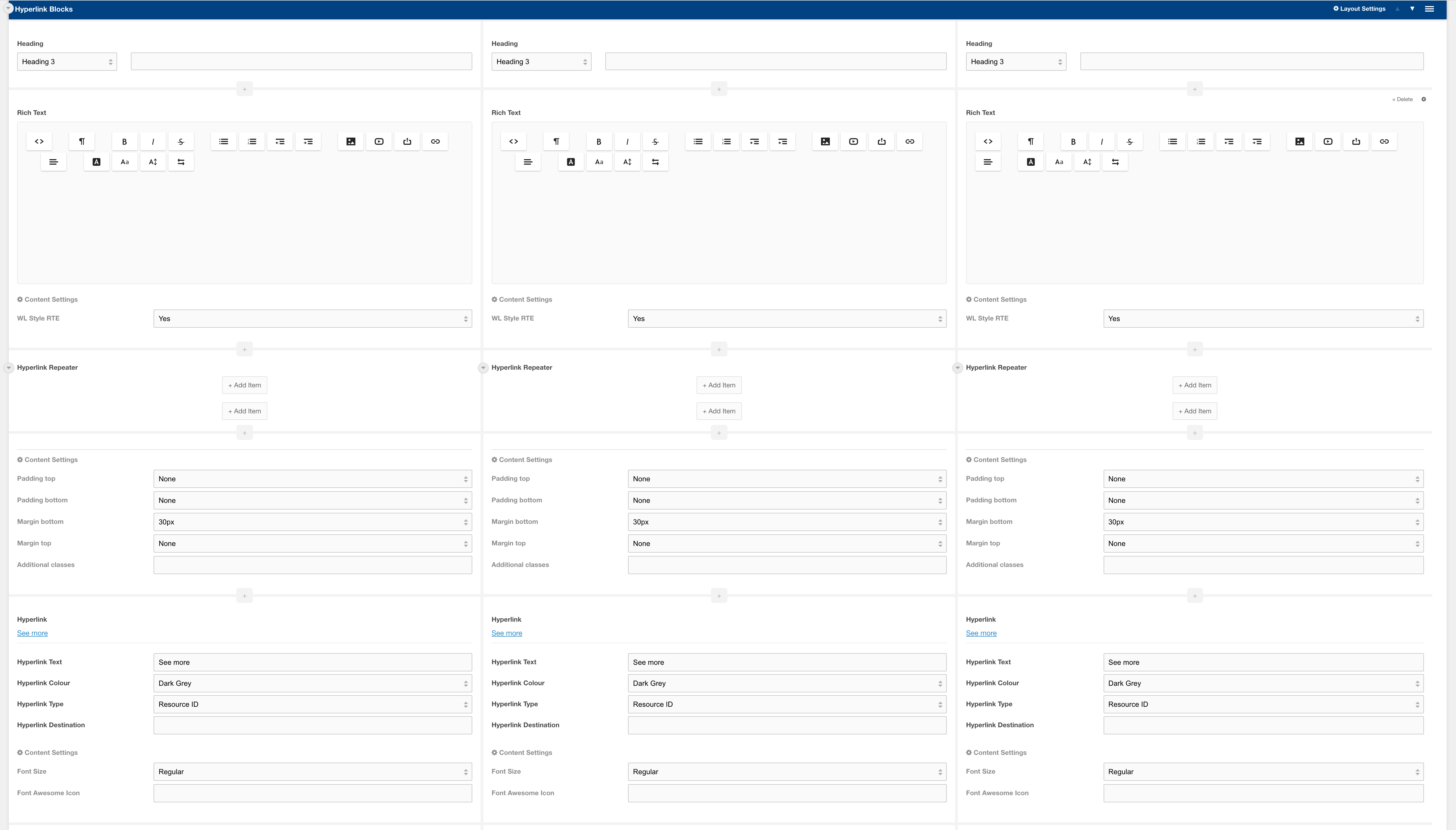
Usage
This template prefills a Hyperlink blocks layout with default fields. The hyperlink repeater field is empty to allow you to add your own links. If the repeater is left empty then it will show the top 5 links of the resource's parent.
Related pages
Layout: Hyperlink blocks
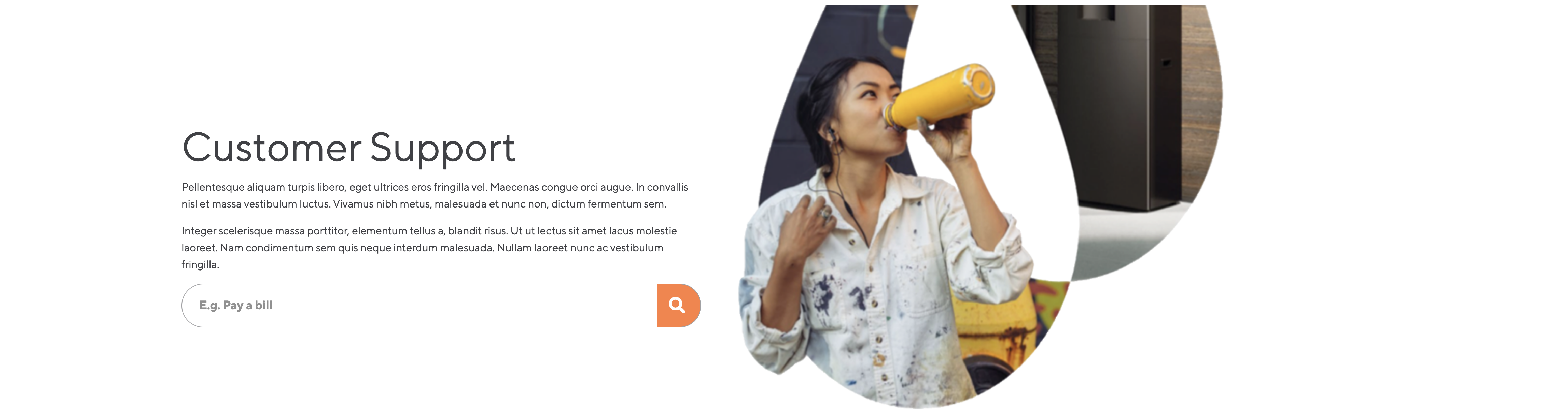
Template: Sidebar Help
A sidebar block predesigned to direct users to additional help resources
Category: Sections - Sidebar
Content Blocks Documentation: https://docs.modmore.com/en/ContentBlocks/v1.x/Templates.html

Usage
This template is prefilled with a header, content area and a button section with options to open the website chat or redirect to FAQs. By default this content will have lexicons for each use and predefined links to FAQs.
Template: Sidebar CTA
A sidebar block predesigned as a standout call to action
Category: Sections - Sidebar
Content Blocks Documentation: https://docs.modmore.com/en/ContentBlocks/v1.x/Templates.html


Usage
This template is prefilled with a header, content area and a call to action button. The blue background and white text set it apart from other elements on the page to direct user attention. By default, this block has lexicons and redirects users to predefined form page.
Template: Sidebar section
A predesigned layout with a sidebar on the righthand side of the page
Category: Sections - Sidebar
Content Blocks Documentation: https://docs.modmore.com/en/ContentBlocks/v1.x/Templates.html


Usage
This template is a fully predesigned layout section with a content area and prefilled sidebar area with links, helper blocks and call to action blocks.
Template: Product CTA
A preconfigured layout using Banner SVG Product Overlap
Category: Default.
Content Blocks Documentation: https://docs.modmore.com/en/ContentBlocks/v1.x/Layouts.html

Usage
This template is prefilled with a rich text and button, with both left and main image. To See available settings view Banner SVG Product Overlap Documentation.
Template: Stacked Icon Banner
Prebuilt call out banner component using Banner Image Deep Layout
Category: Sections.
Content Blocks Documentation: https://docs.modmore.com/en/ContentBlocks/v1.x/Layouts.html
Layout Options
This template allows you to quickly create a section like the image below. Simply update the images for background (on desktop and mobile), add in your content and make changes to the colours as you see fit.
Adding your own content
You can update the banner to meet your needs by adding different fields into each area, thereby creating a whole new design to capture user attention.
Related pages
Layout: Banner Image Deep
Template: Hero 1 - Banner SVG Cutout Overlap
Hero 1 - Consisting of Banner SVG Cutout Overlap
Category: Templates - Sections - Waterlogic Heros.
Content Blocks Documentation: https://docs.modmore.com/en/ContentBlocks/v1.x/Templates.html

This Template is a preconfigured version of the Banner SVG Cutout Overlap layout.
Adding your own content
You can update the hero to meet your needs by adding different fields the content area. Headings, rich text and Buttons are recommended for this area.
Related pages
Template: Hero 2 - Banner Lifestyle Badge
Hero 2 - Consisting of Banner Lifestyle Badge
Category: Templates - Sections - Waterlogic Heros.
Content Blocks Documentation: https://docs.modmore.com/en/ContentBlocks/v1.x/Templates.html

This Template is a preconfigured version of the Banner Lifestyle Badge layout.

Adding your own content
You can update the hero to meet your needs by adding different fields the content area. Headings, rich text and Buttons are recommended for this area.
Related pages
Template: Hero 3 - Banner Image Overlap
Hero 3 - Consisting of Banner Image Overlap Layout
Category: Templates - Sections - Waterlogic Heros.
Content Blocks Documentation: https://docs.modmore.com/en/ContentBlocks/v1.x/Templates.html

This Template is a preconfigured version of the Banner Image Overlap layout.

Adding your own content
You can update the hero to meet your needs by adding different fields the content area. Headings, rich text and Buttons are recommended for this area.
Related pages
Template: Hero 4 - Banner Curved Image
Hero 4 - Consisting of Banner Curved Image Layout
Category: Templates - Sections - Waterlogic Heros.
Content Blocks Documentation: https://docs.modmore.com/en/ContentBlocks/v1.x/Templates.html
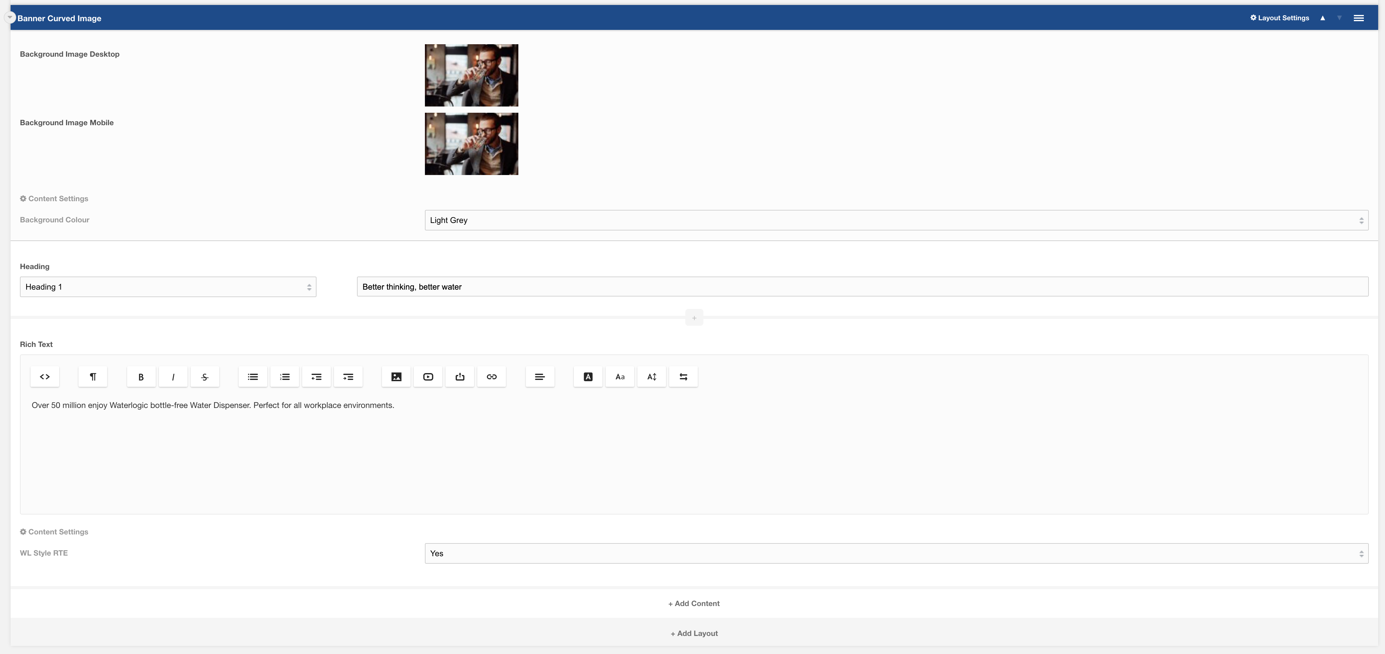
This Template is a preconfigured version of the Banner Curved Image layout.

Adding your own content
You can update the hero to meet your needs by adding different fields the content area. Headings, rich text and Buttons are recommended for this area.
Related pages
Template: Hero 5 - Variable Columns
Hero 5 - Consisting of Hero 5 Layout
Category: Templates - Sections - Waterlogic Heros.
Content Blocks Documentation: https://docs.modmore.com/en/ContentBlocks/v1.x/Templates.html

This Template is a preconfigured version of the Hero 5 (TBC) layout.
Adding your own content
You can update the hero to meet your needs by adding different fields the content area. Headings, rich text and Buttons are recommended for this area.
Related pages
Template: Form Modal
A preconfigured template using Full Page Modal Layout.
Category: Sections.
Content Blocks Documentation: https://docs.modmore.com/en/ContentBlocks/v1.x/Templates.html
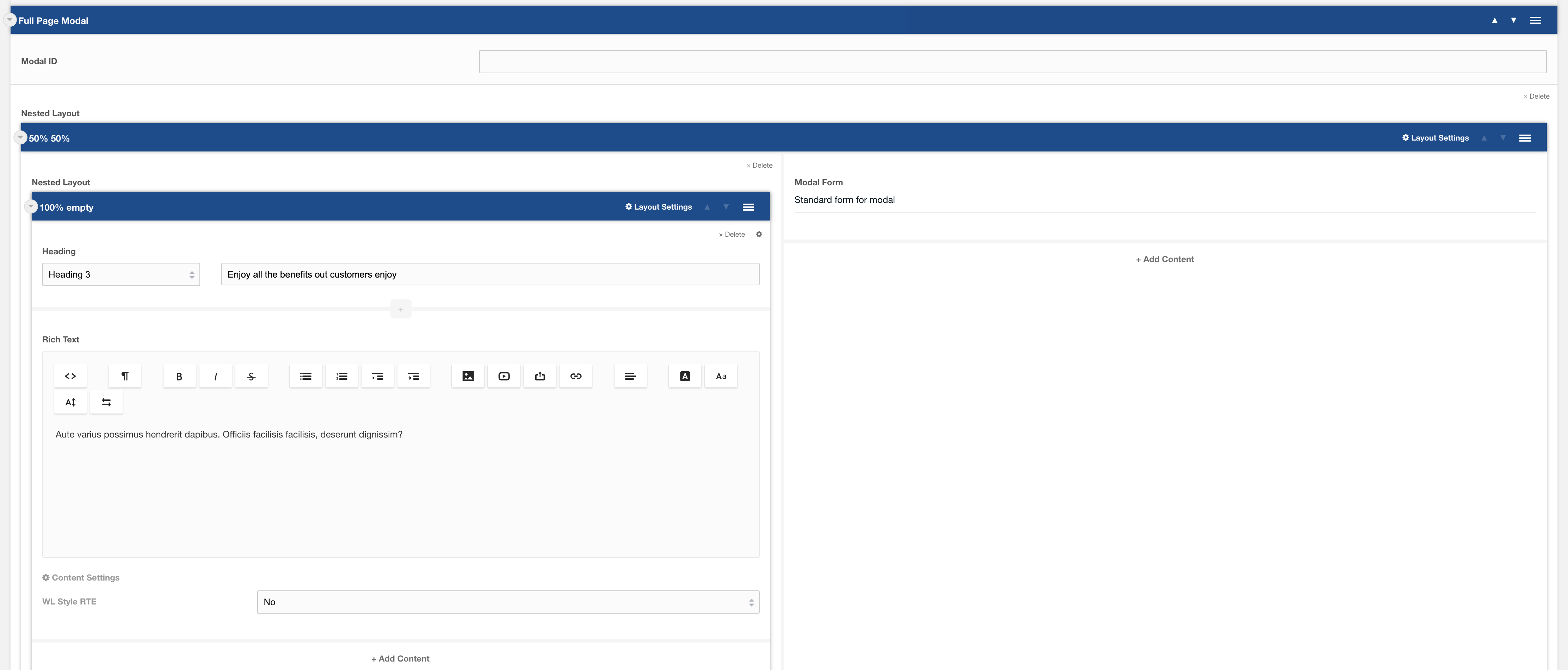
Usage
Full page modal can be used anywhere within the site. To active the modal to open use a button or hyperlink setting the "Type" to Modal and the "Destination" to the ID of the Modal ID set within the Full page modal settings e.g:

Example visual on modal as per template:
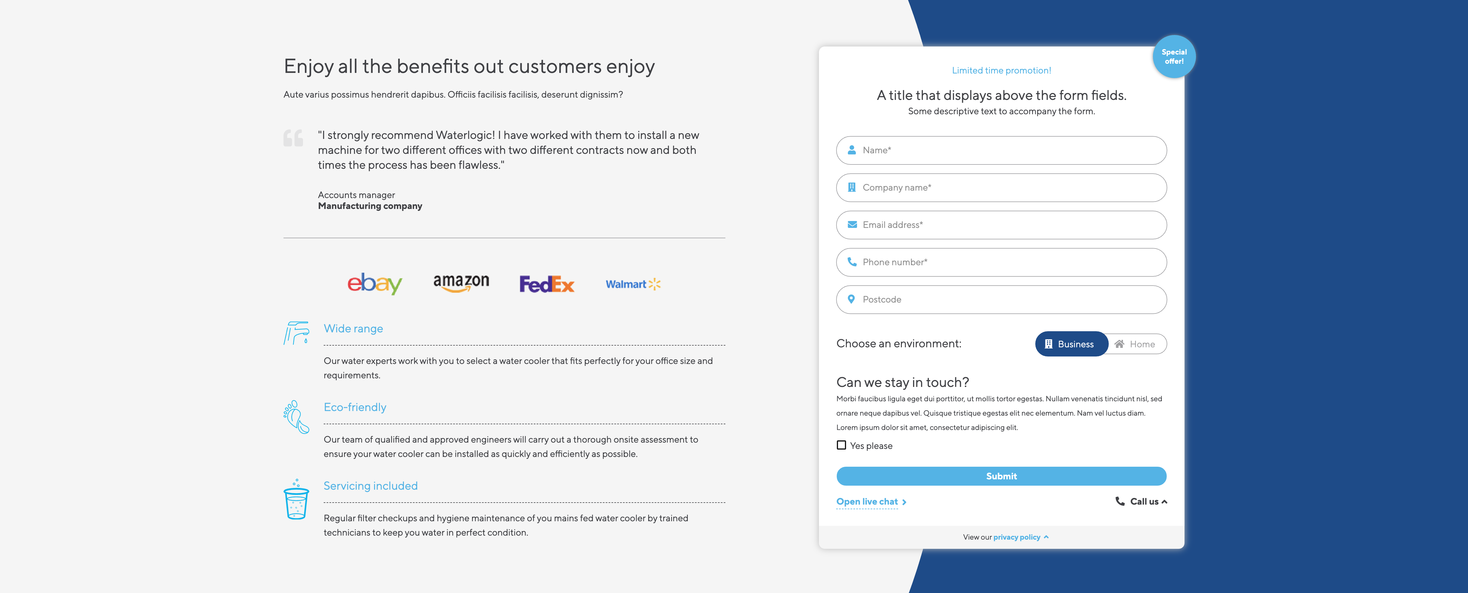
Form Modal is set up using:
Layouts
Fields
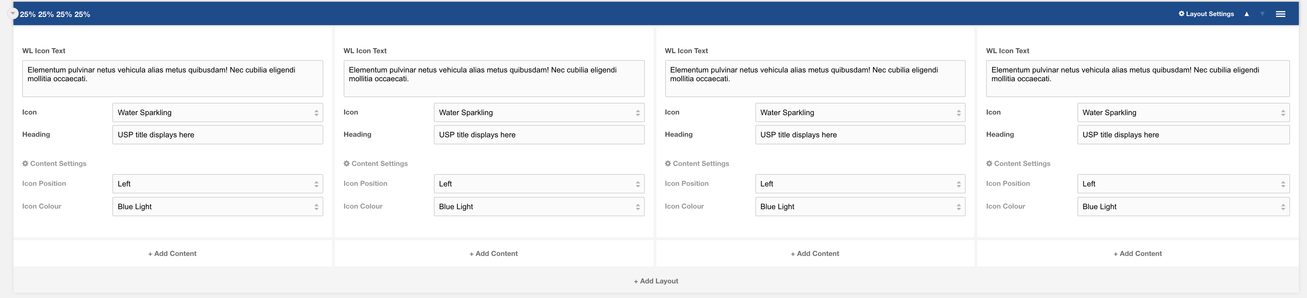
Template: WL Icon Banner
WL Icon Banner.
Template containing WL Icon Text within a 25/25/25/25/ layout.
Category: Sections.
Content Blocks Documentation: https://docs.modmore.com/en/ContentBlocks/v1.x/Input_Types/Repeater.html
Example of front end view:
This Template consists of the following layouts:
Fields
Settings are preconfigured to designs set out. Once added you can amend each of the layouts and settings. For information on each of the fields and layout settings see the layout and field specific documentation.
Template: Banner Image
Full width layout with curved image and content.
Category: Sections - Waterlogic Layout.
Content Blocks Documentation: https://docs.modmore.com/en/ContentBlocks/v1.x/Layouts.html
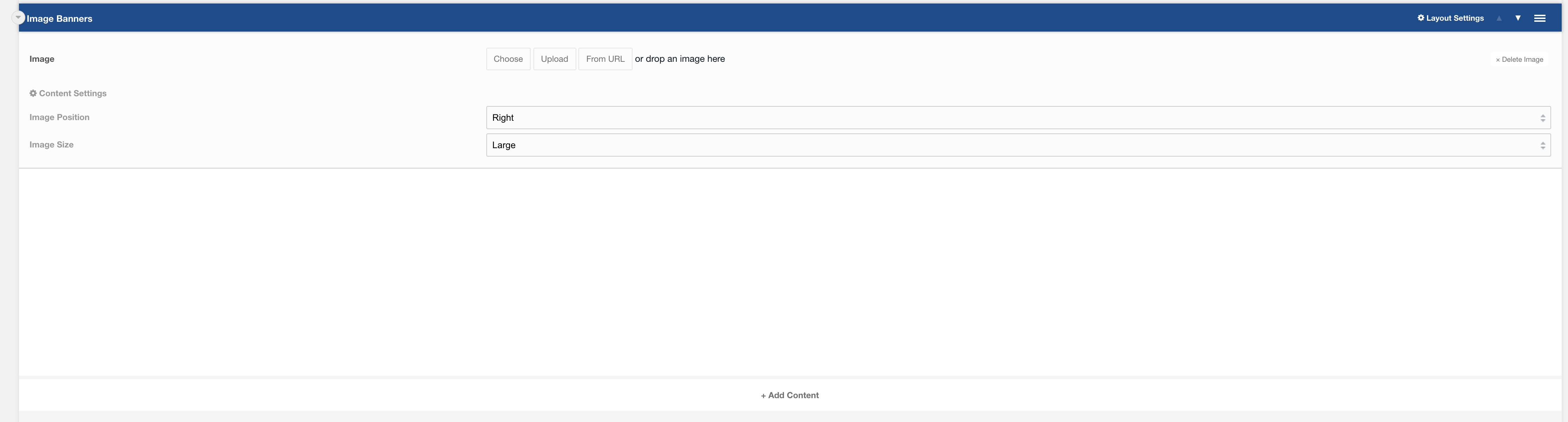
Layout Options
Image Position: Should the image appear to the left or right? Default to Right.
Image Size: Is the image small or large? Default to Large.
Settings are available by clicking on the layout settings in the top right of the layout.
Settings

Padding Top: Padding top for the layout. Default to 45px.
Padding Bottom: Padding bottom for the layout. Default to 45px.
Margin Top: Margin top for the layout. Default to 60px.
SVG Colour: The colour of the banner. Default to Dark Blue
Fields
Fields can then be added to the content area. Recommended headings with a small amount of text and a button.
Output:
The below has image position: right and image size: large.

Template: Alternating Content
Alternating Content.
A section template containing side by side rich text and image fields, within a variable column layout.
Category: Templates - Sections.
Content Blocks Documentation: https://docs.modmore.com/en/ContentBlocks/v1.x/Templates.html

Example of front end view:

This Template consists of the following layouts:
Fields
Settings are preconfigured to designs set out. Once added you can amend each of the layouts and settings. For information on each of the fields and layout settings see the layout and field specific documentation.
Template: Repeated image banner
A template containing content and a repeated logo section
Category: Sections
Content Blocks Documentation: https://docs.modmore.com/en/ContentBlocks/v1.x/Templates.html

Usage
This template is best used to display logos or awards alongside related content. By default, it has a grey background and 45px padding on the Y-axis.
Related
Field: Heading
Field: Rich text
Field: Logo Repeater
Layout: Variable columns
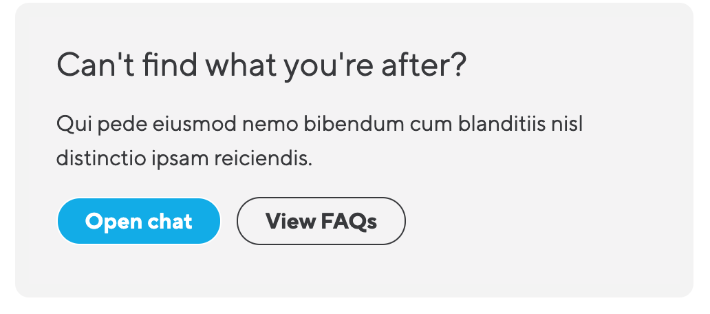
Template: FAQ Banner
A template containing content and lexicon FAQs
Category: Sections
Content Blocks Documentation: https://docs.modmore.com/en/ContentBlocks/v1.x/Templates.html
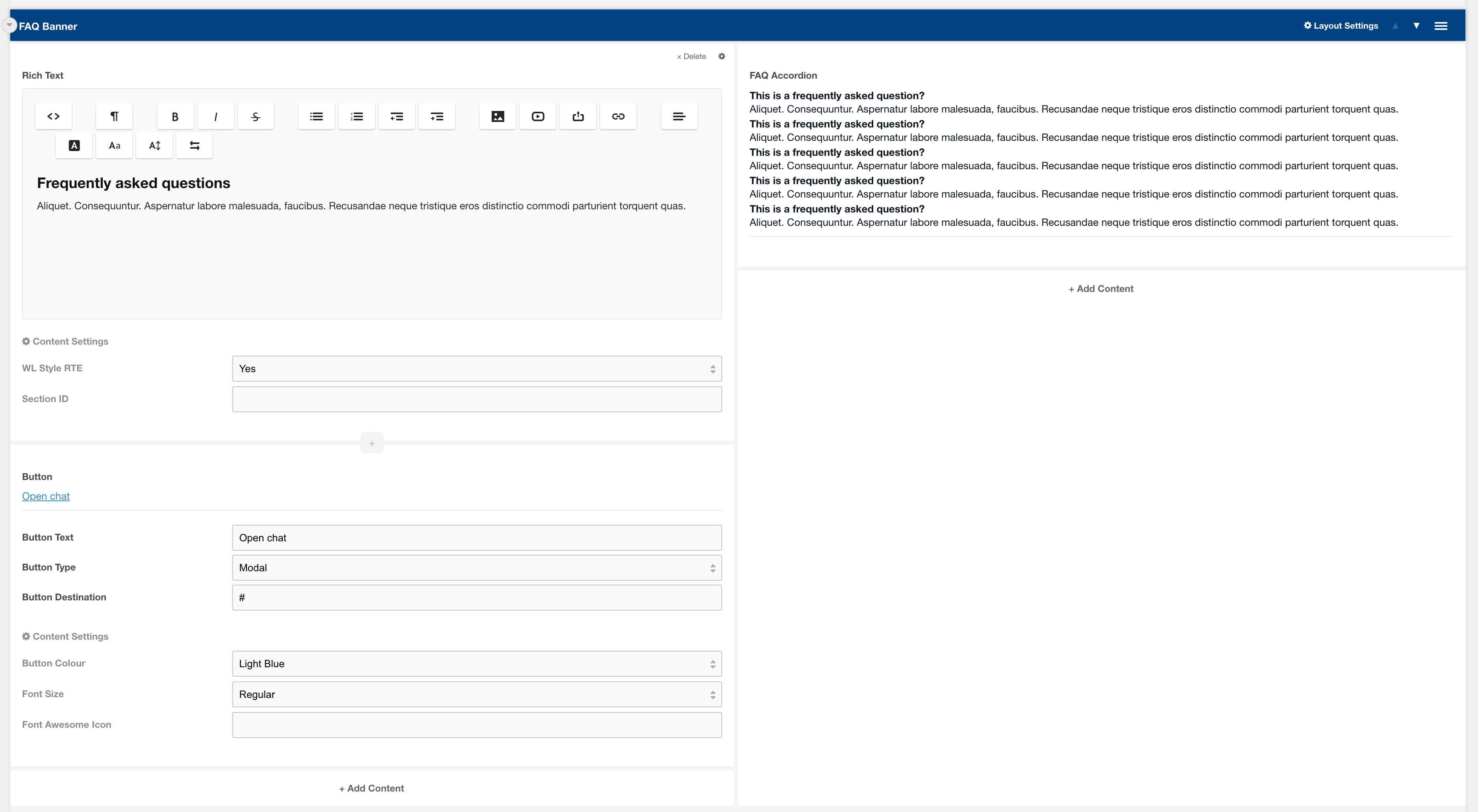
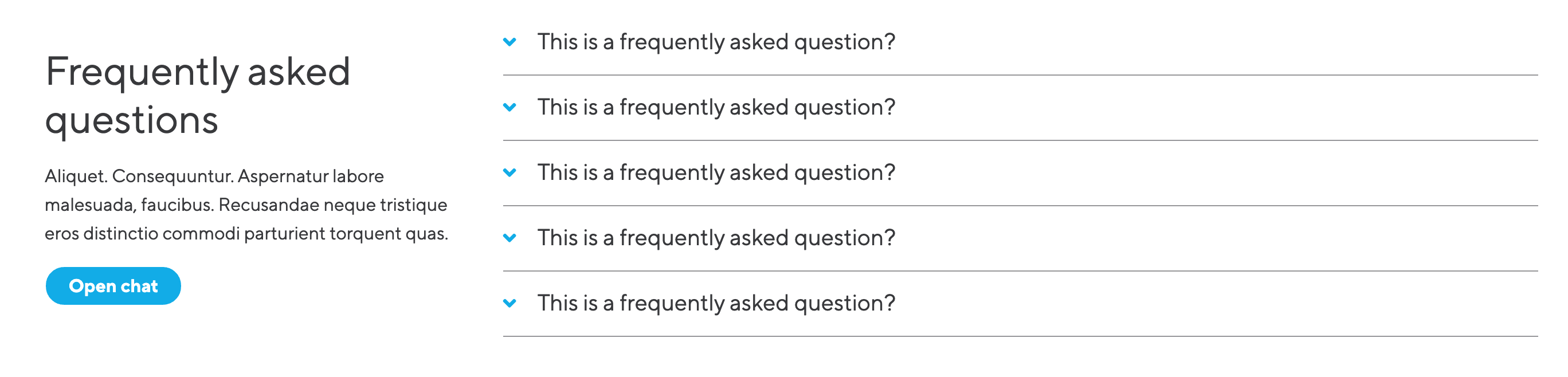
Usage
This template is used often across many different templates to help answer users questions. The template inserts a heading, rich text and an open chat button which can be customised. The FAQs are added using system configurations and have lexicons to work across languages.
Related
Field: Heading
Field: Rich text
Field: FAQ Accordion
Template: Page Scroll Banner
Page Scroll Banner.
A section template containing a Page Scroll Banner layout with 4 columns, and 4 WL Icon CTA fields.
Category: Templates - Sections.
Content Blocks Documentation: https://docs.modmore.com/en/ContentBlocks/v1.x/Templates.html

Example of front end view:

This Template consists of the following layouts:
Fields
Template: Global Offices
Global Offices
Tabbed Content template showing all offices globally separated by region, set up in 100% layout.
Category: Sections
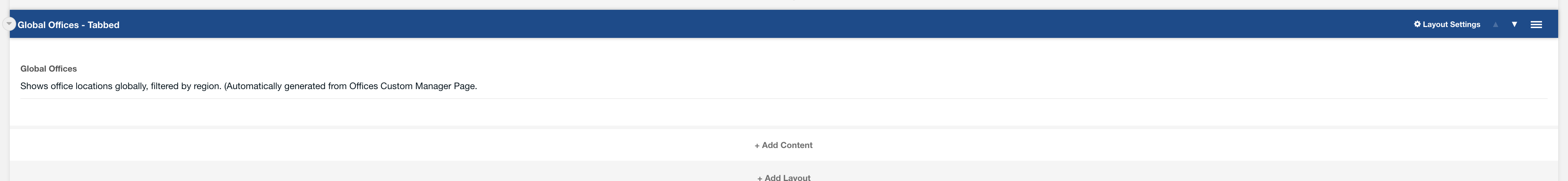
This template uses:
- Layout - 100% empty
- Field - Global Offices
There are additional settings for this layout. All are configured by the 100% layout and Global offices field.
Output:

Template: Regioinal Offices
Regional Offices
Regional office template showing all offices within the context region (e.g. for UK context will show all UK offices), set up in 100% layout.
Category: Sections

This template uses:
- Layout - 100% Layout
- Field - Regional Offices
There are additional settings for this layout. All are configured by the 100% layout and regional offices field.
Output:
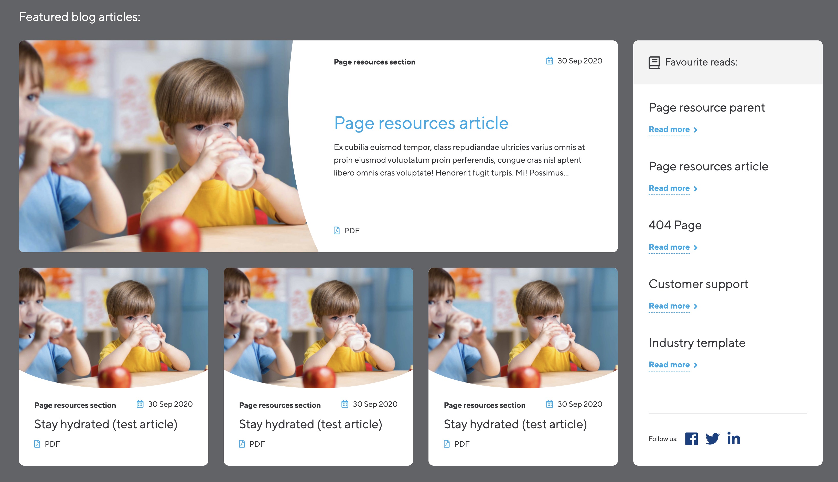
Template: Featured resources side panel
Section template that contains a side panel layout with featured articles and a side panel field.
A two column layout using the side panel layout, side panel field and nested layouts with featured article fields for displaying featured articles.
Category: Waterlogic layouts - Articles
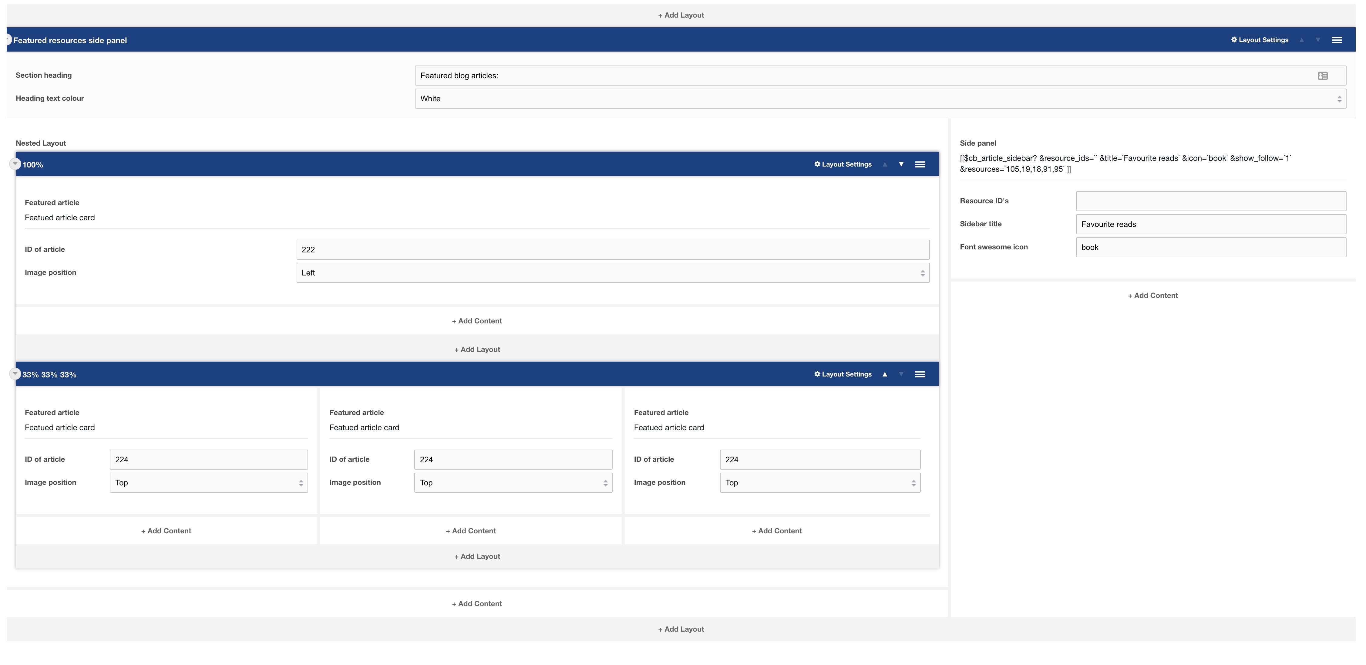
This template uses:
- Layout: Side panel
- Layout: Nested layout
- Layout: 100% layout
- Layout: 33% layout
- Field: Featured article
- Field: Side panel
Output:
Template: Feature panel template
Section template that a call out heading and feature fields
A section template with a call out heading and feature fields on a grey background.
Category: Waterlogic layouts - Articles

This template uses:
- Layout: Call out heading
- Layout: 33%
- Layout: 25%
- Field: Feature field
Output:

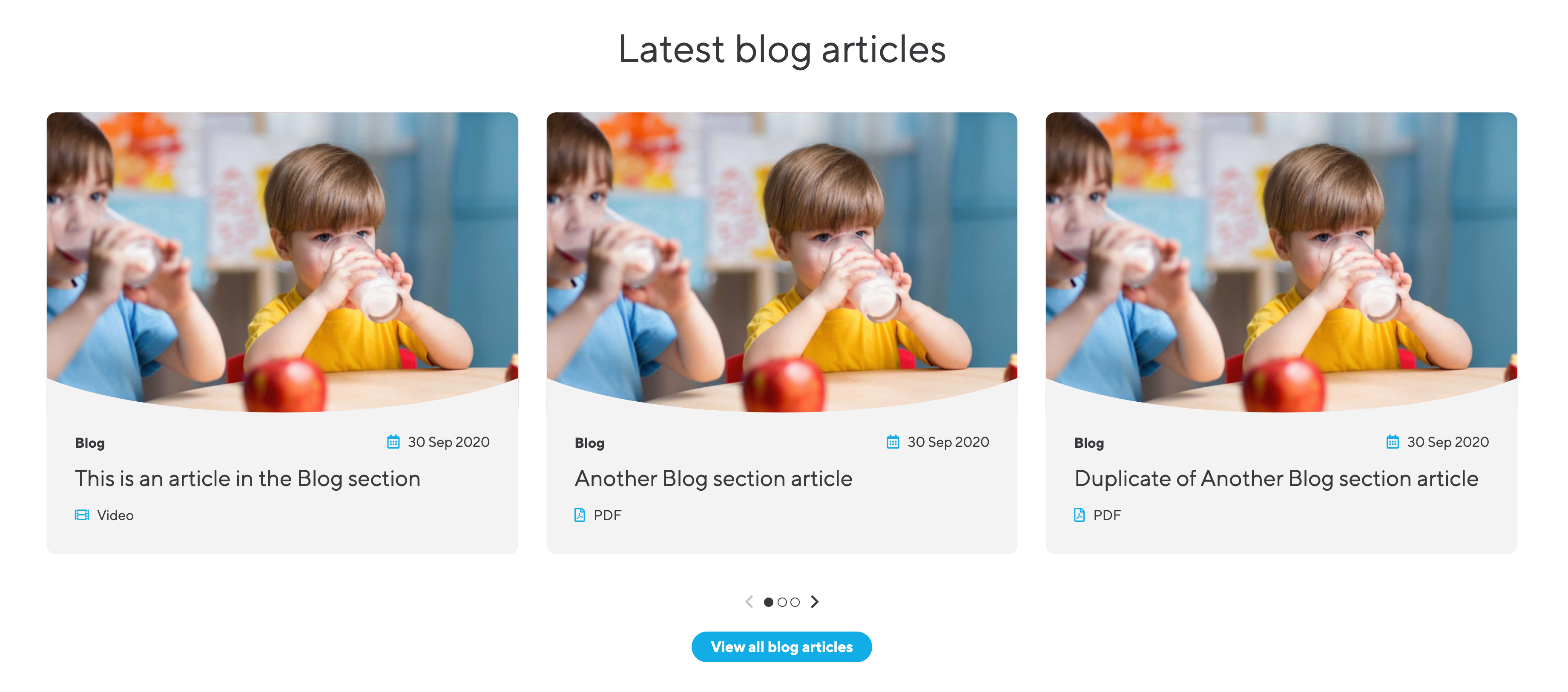
Template: Related articles slider
Section template that builds a related articles slider with headings and buttons
This Section Template is normally used at the end of a blog article or on the article parent section. When setting a limit on the featured article slider, if the number is greater than 3, a slider will be used to organise the articles.
Category: Waterlogic layouts - Articles

This template uses:
- Layout: 100%
- Field: Heading
- Field: Featured article slider
- Field: Spacer
- Field: Button
Output:
Template: Video Text
Section template consisting of Video Text field, with content area using heading, rich text and button.
100% layout with Video text field.
Category: Waterlogic layouts - Articles

This template uses:
- Layout: 100% layout
- Layout: 100% empty
- Field: Video Text
- Field: Rich Text
- Field: Button
Output:

Template: Content cards
Section template consisting of 3 content cards
Category: Waterlogic layouts - Fields

This template uses:
- Layout: 33/ 33/ 33 layout
- Field: Content card
Output:

Template: Image Tabs
Section template consisting of image tab logos and image tab content
Category: Waterlogic layouts - Sections
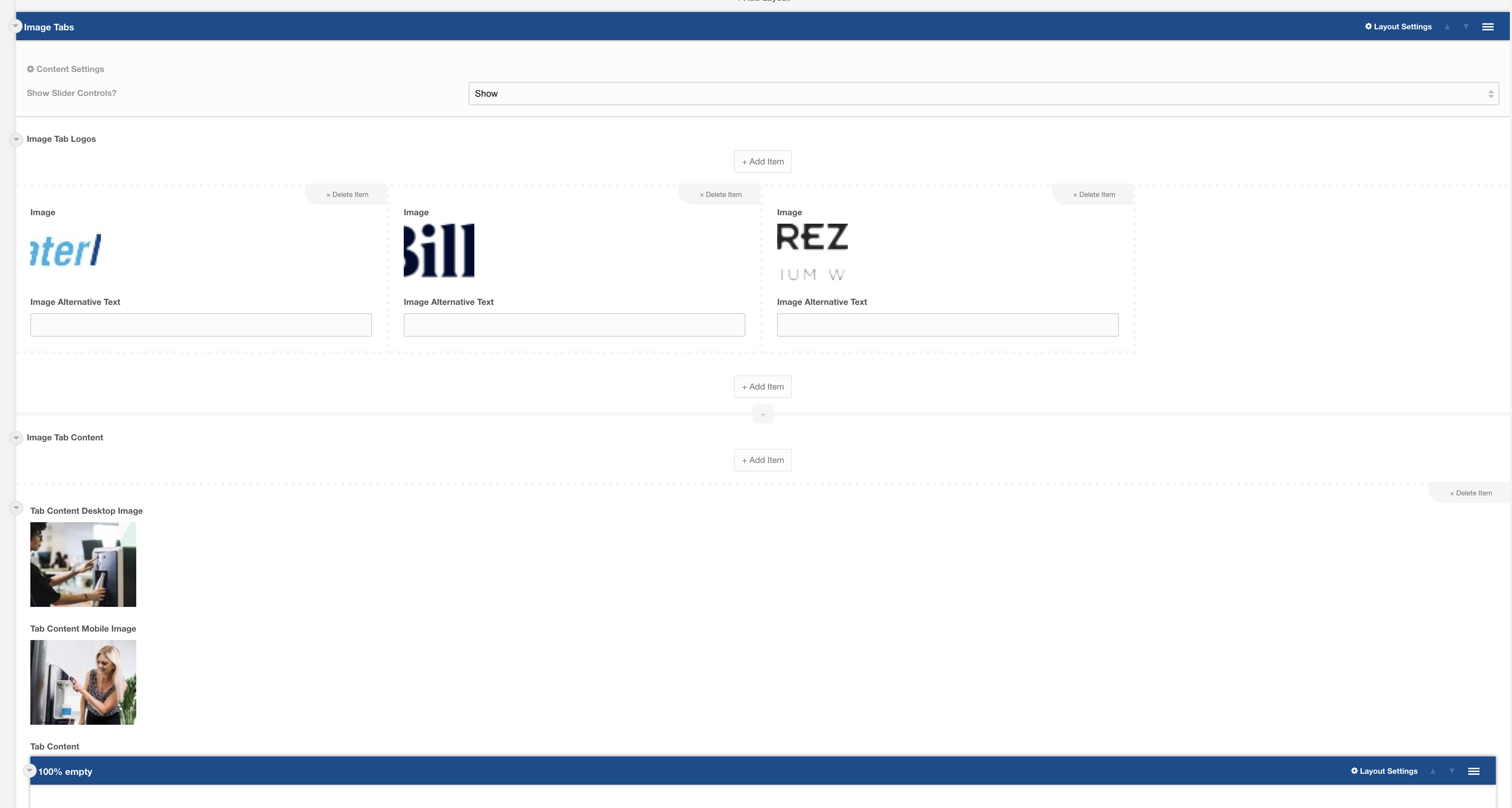
This template uses:
- Layout: 100% Empty
- Layout: Image Tabs
- Field: Image Tab Logos
- Field: Image Tab Content
Output:

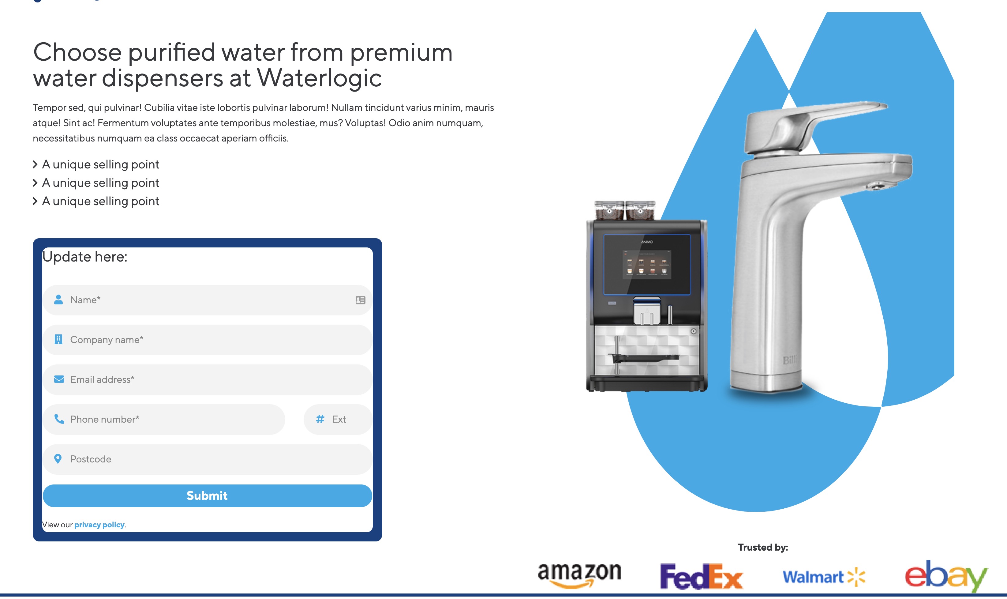
Template: Form with USPs
Section template consisting of image tab logos and image tab content
Category: Waterlogic - Forms

This template uses:
- Layout: Colour Split
- Layout: Nested layout
- Field: Heading
- Field: WL Dashed Icon List
- Field: Textarea
- Field: Split phone
- Field: Form (TBC)
Output:

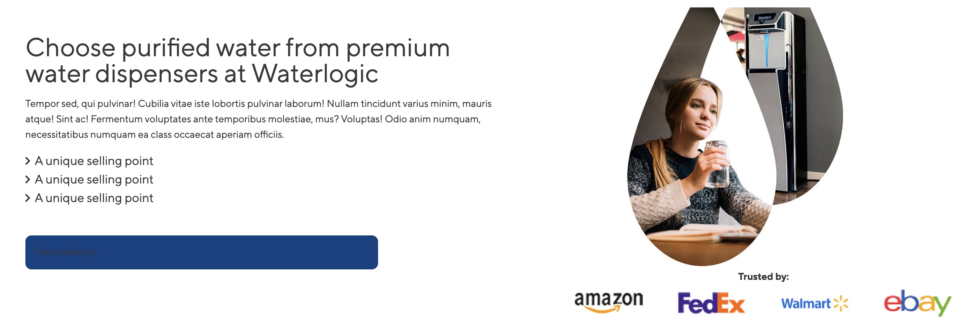
Template: Hero Form Cut-out Right
Section Hero template containing a form, image and trusted by logos
Category: Waterlogic - Forms
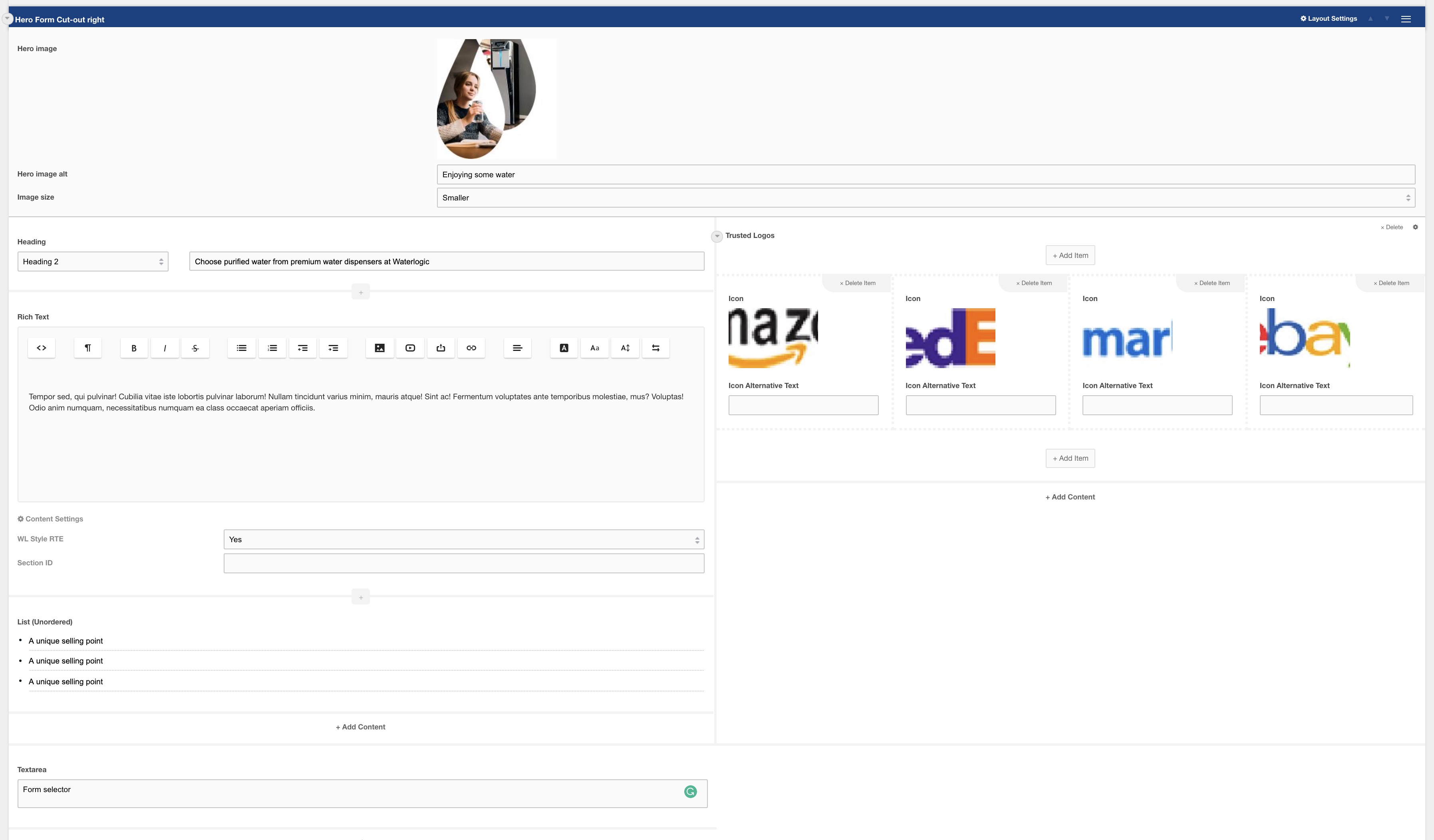
This template uses:
- Layout: Hero Form Cut-out
- Field: Heading
- Field: Rich text
- Field: Form (TDB)
- Field: Trusted logos
Output:
Template: Hero Form Product Right
Section Hero template containing a form, image and trusted by logos
Category: Waterlogic - Forms
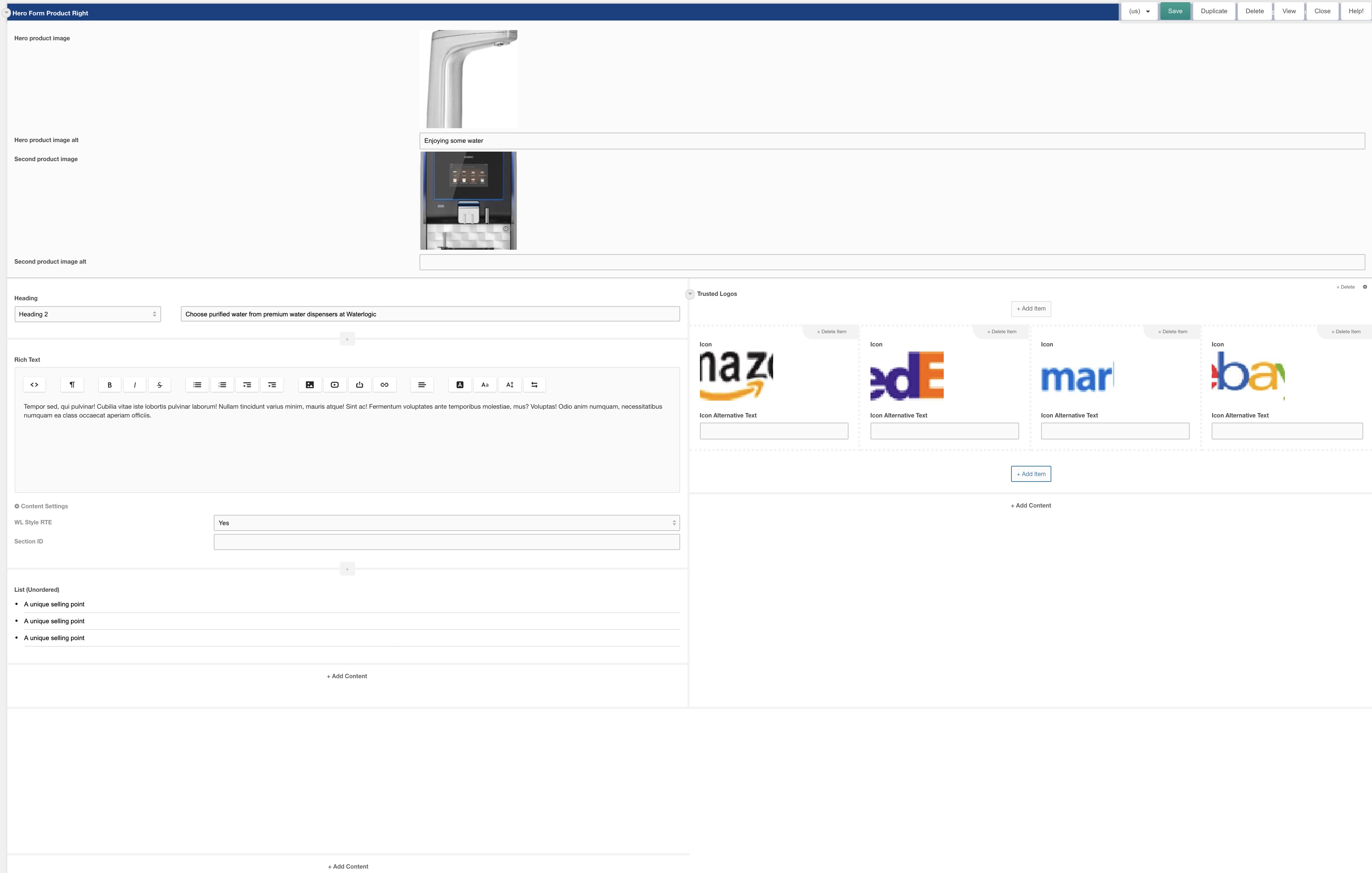
This template uses:
- Layout: Hero Form Product Right
- Field: Heading
- Field: Rich text
- Field: Form (TDB)
- Field: Trusted logos
Output:
Template: Hero Form Lifestyle
Four column layout for use as a hero with a form and trusted logos and feature badge
Category: Waterlogic Heros.
Content Blocks Documentation: https://docs.modmore.com/en/ContentBlocks/v1.x/Layouts.html
Note: This Template has been created using a button with additional classes to show on mobile/tablet. This will hide the form and show the button. When selected this will open the Full page modal Layout with the same form within.
Sample Hero Banner:
Layout view within Modx:

Additional settings are available by hovering over the field and clicking the cog in the top right.
Note: Switching Image Position from Left to right changes the design output on the front end:
Left Example:
Right Example:
Layouts and Fields used:
Template: Branded Slider
Two column layout for Branded Slider
Category: Waterlogic Sections.
Content Blocks Documentation: https://docs.modmore.com/en/ContentBlocks/v1.x/Layouts.html
A Preconfigured layout ("Branded Slider Image") for Branded Slider containing "Branded Slider Image" field and "Branded Slider Content" field.

Layout view within Modx:
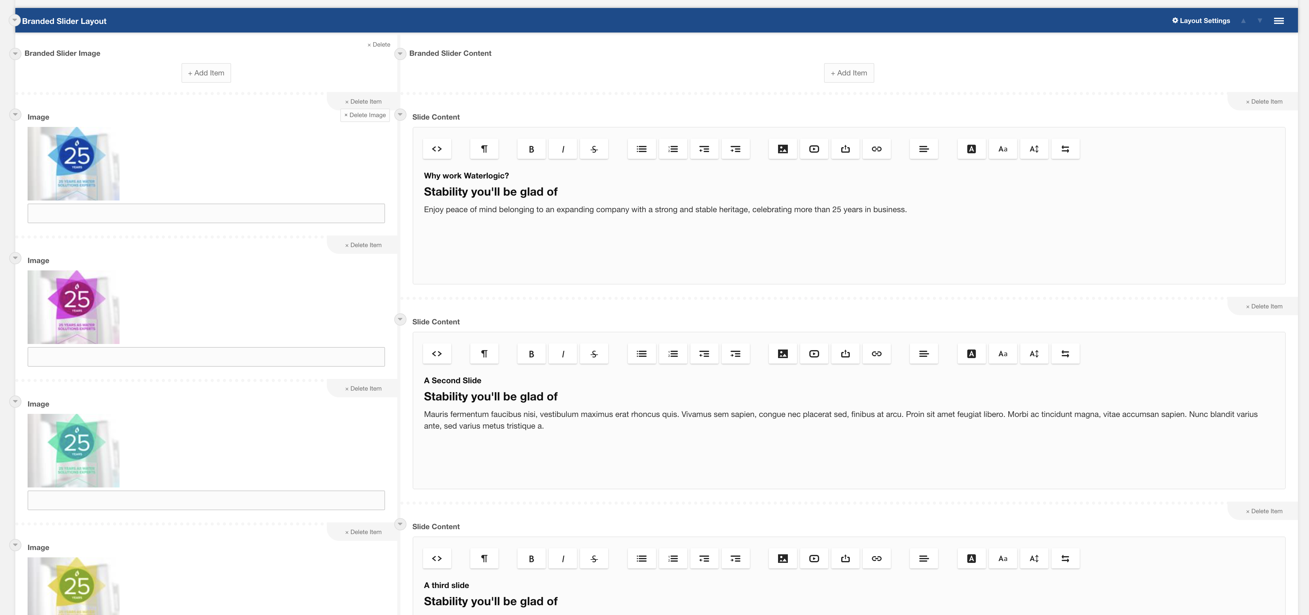
Layouts and Fields used:
Template: Testimonial Card Slider
Preconfigured 100% layout with testimonial card slider field.
Category: Waterlogic Fields.
Content Blocks Documentation: https://docs.modmore.com/en/ContentBlocks/v1.x/Fields/index.html
Sample card slider:
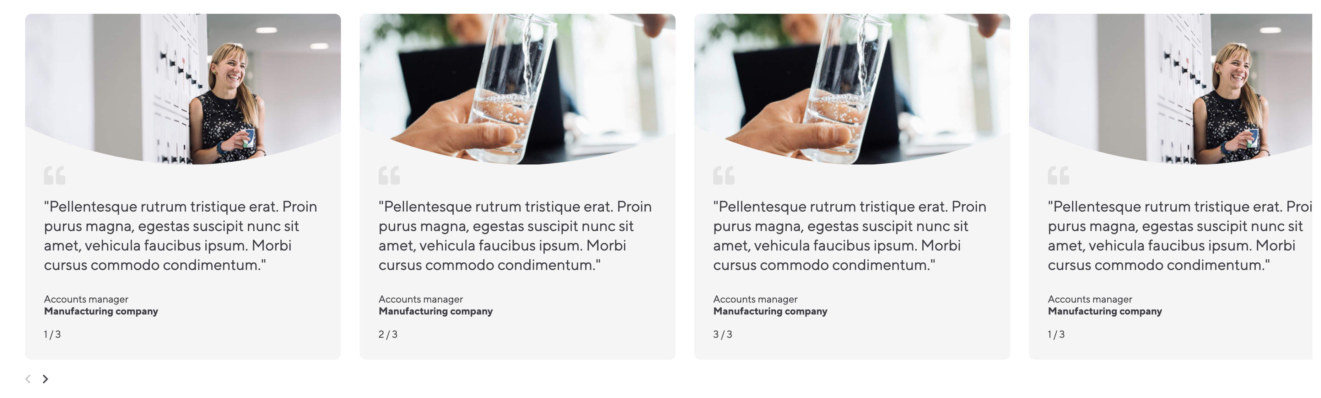
Sample card slider within Modx:

Layouts and Fields used:
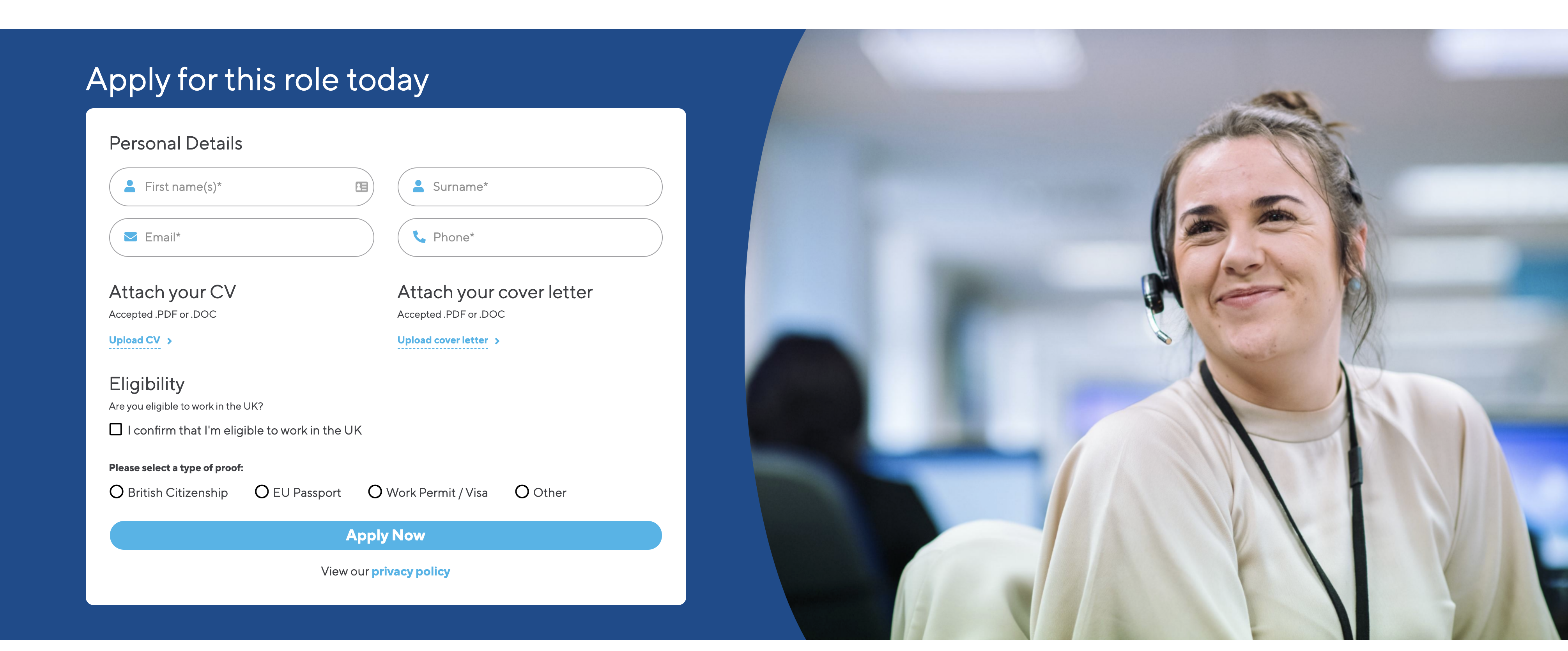
Template: Job application footer form
Section Hero template containing a form and background image
Category: Waterlogic - Forms
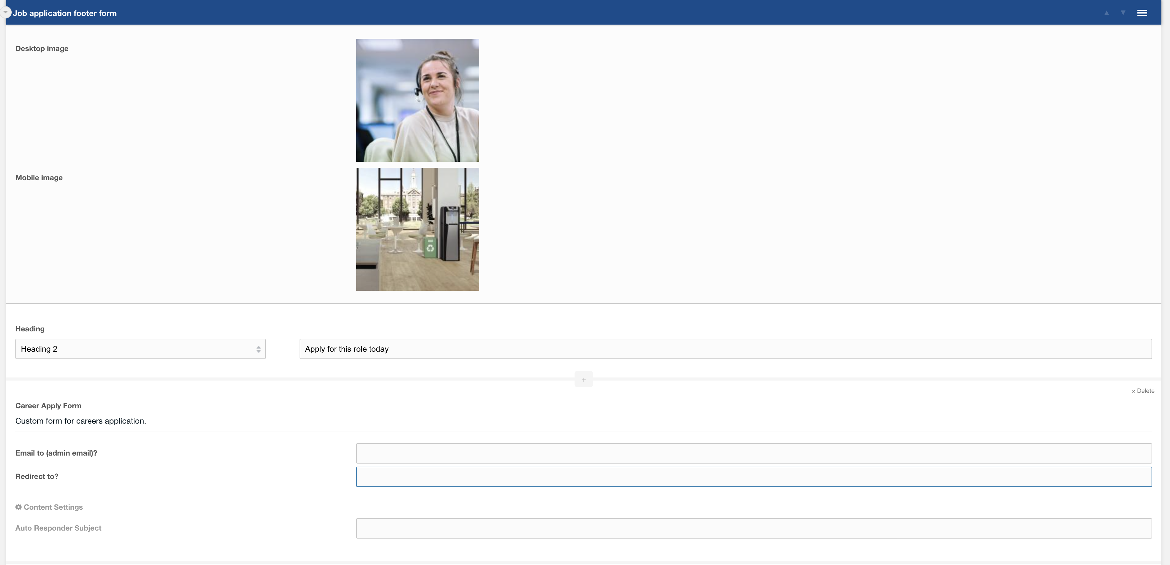
This template uses:
- Layout: Job application footer form
- Field: Heading
- Field: Career apply form
Output:
Template: Sidebar CTA - Lexicon
A sidebar block predesigned as a standout call to action
Category: Sections - Sidebar
Content Blocks Documentation: https://docs.modmore.com/en/ContentBlocks/v1.x/Templates.html
This template uses Lexicons and website config settings for reusability across different languages and articles.
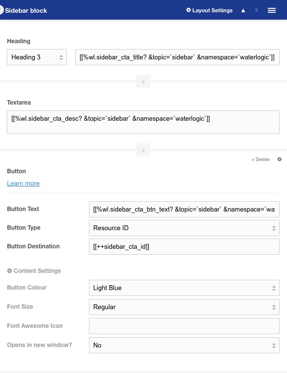
Usage
This template is prefilled with a header, content area and a call to action button. The blue background and white text set it apart from other elements on the page to direct user attention. By default, this block has lexicons and redirects users to predefined form page.
Template: Sidebar Helper - FAQ
A sidebar block predesigned to direct users to additional help resources
Category: Sections - Sidebar
Content Blocks Documentation: https://docs.modmore.com/en/ContentBlocks/v1.x/Templates.html
This template uses Lexicons and website config settings for reusability across different languages and articles.
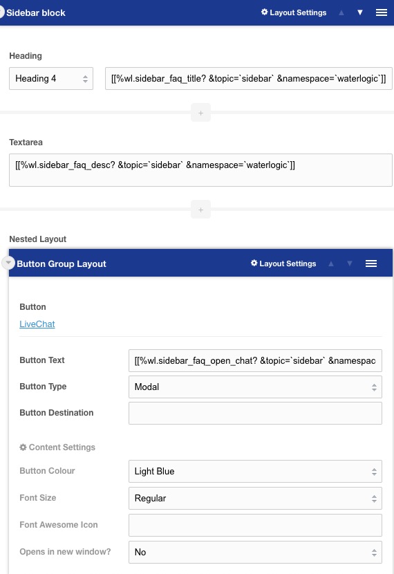
Usage
This template is prefilled with a header, content area and a button section with options to open the website chat or redirect to FAQs. By default this content will have lexicons for each use and predefined links to FAQs.