Layout: Image Tabs
Single column layout used with "Image Tab Logos" and "Image Tab Content" field.
Category: Default.
Content Blocks Documentation: https://docs.modmore.com/en/ContentBlocks/v1.x/Layouts.html
Settings
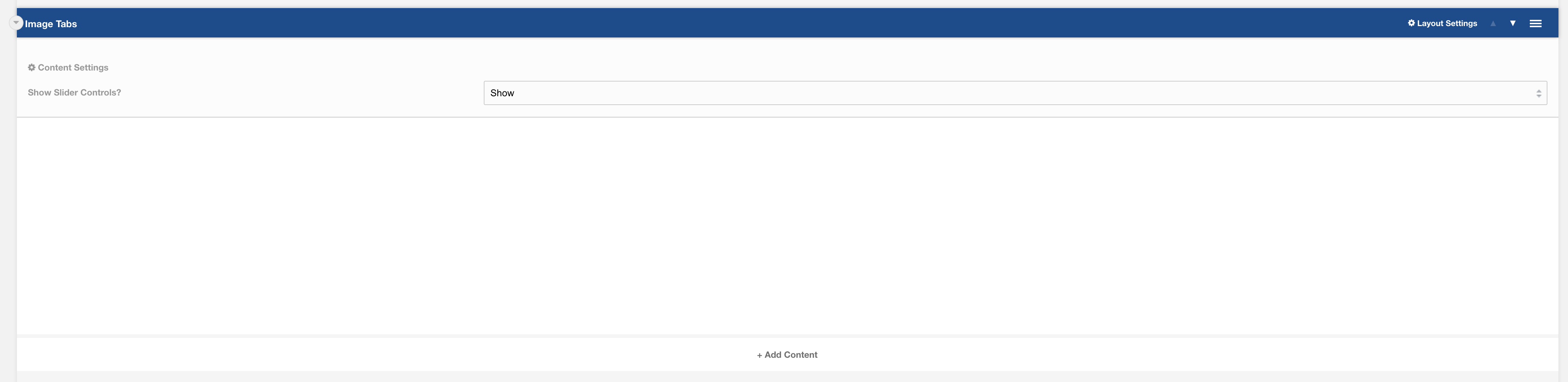
Show Slider Controls? Should the slider controls show within the layout when sliding content? Default to Show.
Additional settings are available by hovering over the field and clicking the cog in the top right
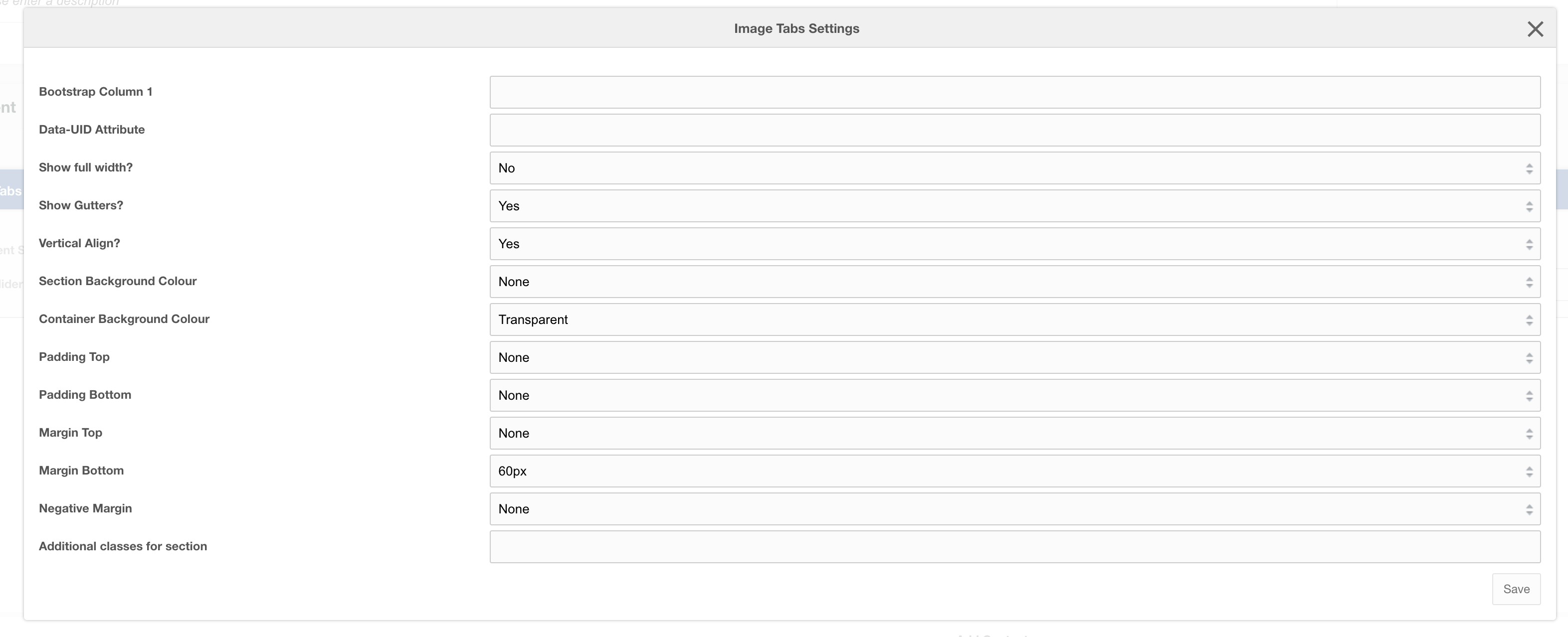
Settings
| Setting | Description | Default |
| Bootstrap Column | Adjust the size of the column using bootstrap classes | col-12 |
| Data-UID | A unique ID of the container for skip to links | |
| Show full width? | Element stretches full width of the page | No |
| Show Gutters? | Show Bootstrap gutters | Yes |
| Vertical Align? | Vertically align the columns | Yes |
| Section background colour | Background colour of the full-width section | Transparent |
| Container background Colour | Section background colour | Transparent |
| Padding top | Section padding-top - Use if you have background colour set | |
| Padding bottom | Section padding-bottom - Use if you have background colour set | |
| Margin top | Add margin to the top of the container for vertical alignment adjust | |
| Margin bottom | Add margin to the bottom of the container for vertical alignment adjust | 60px |
| Negative margin | Add a negative margin to the bottom of the section, useful for adjusting the base padding when using background colours | |
| Remove container and row | Add additional classes to the section | |
| Additional Section classes | Add additional classes to the section | |
| Justify content | Justify the columns horizontally on the page |
Usage
This layout is only designed to work with:
- Field: Image Tab Logos
- Field: Image Tab Content