Site administration
Guides on how to administer the Waterlogic website
- Main Navigation
- Main footer
- Secondary header
- Breadcrumbs
- Geo location modal
- Cookie Modal
- Location Modal
- Creating website Icons
- Quote wishlist
Main Navigation
Contents
Setting up the navigation
Each context will have a 'context settings' resource that sits at the bottom of the context tree. Open the resource and navigate to the template variables tab. Here you will be able to manage both the default navigation and footer.
Step 1

Figure 1
Table 1
| Setting | Description | Default |
| Navigation align | Centre align the Navigation or Left align. Centre align show only be used for the global context | Left |
| Show basket in navigation? | Toggle the visibility of the Wishlist basket. This should be set to No for the global context | Yes |
| Navigation menu | Controls the whole context navigation. To add a new item, click Add Item | unset |
| Single navigation links | Add/ remove single navigation links. To add a new item, click Add Item | unset |
Navigation menu

Figure 2
Table 2
| Setting | Description | Default |
| Navigation dropdown type | Select the type of dropdown that this top-level navigation item will appear as. (see Table 3 for dropdown type examples) | Title only |
| Navigation-link title | Title of the navigation item | |
| Display navigation list as | Select the type of navigation dropdown to show. If you want to use multiple columns then use columns. If the Navigation dropdown type is Megamenu this should be list. |
List |
| Navigation column title | If Navigation dropdown type is Column you can set a title and description than spans the width of the column list If left empty then both title and description will not show |
unset |
| Navigation column description | Adds a description to column below column title | unset |
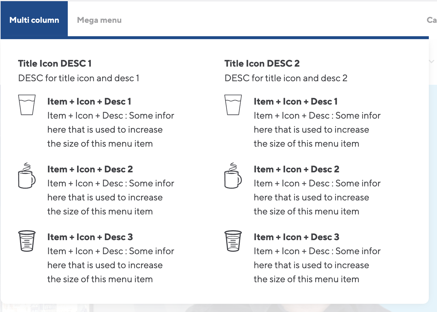
| Navigation columns | Each navigation item needs a column which will hold the dropdown links. If the 'Display navigation list as' is set to column you can add more than one column. If set to list only add ONLY one column. See Table 4 & 5 for how each dropdown navigation will look and what data the dropdowns display |
unset |
| Mega menu text | If Navigation dropdown type is MegaMenu you can define a call to action banner at the bottom of the dropdown. | |
| Mega menu link text | Link text for CTA banner link | |
| Mega Menu Link ID | ID of resource to link CTA | |
| Mega Menu CTA Colour | CTA Banner colour | Orange |
| Link Only Resource ID | Resource id to link to when using the 'Navigation dropdown type' of 'link only' |
Table 3
| Navigation dropdown type | Description |
| Title only | Displays a dropdown with just the navigation item title |
| Title + Description | Displays a dropdown with the navigation item title and a description of the linked resource |
| Title + Icon | Displays a dropdown with the navigation item title and a Waterlogic Icon which represents the resource |
| Title, Icon + Description | Displays a dropdown with the navigation item title, a description of the linked resource and a Waterlogic Icon which represents the resource |
| Mega Menu | Displays items in a row with an Icon and resource title. The bottom of the dropdown has a call to action banner with text and a link to a resource |
| Link Only | Displays a simple link within then menu (no dropdown functionality). Only Link Only Resource ID needs to be populated for this to work. |
Table 4
|
Figure 3 |
Figure 4 |
|
Figure 5 |
Figure 6 |
|
Figure 7 |
|
|
Figure 8 |
|


Step 2
Navigation columns
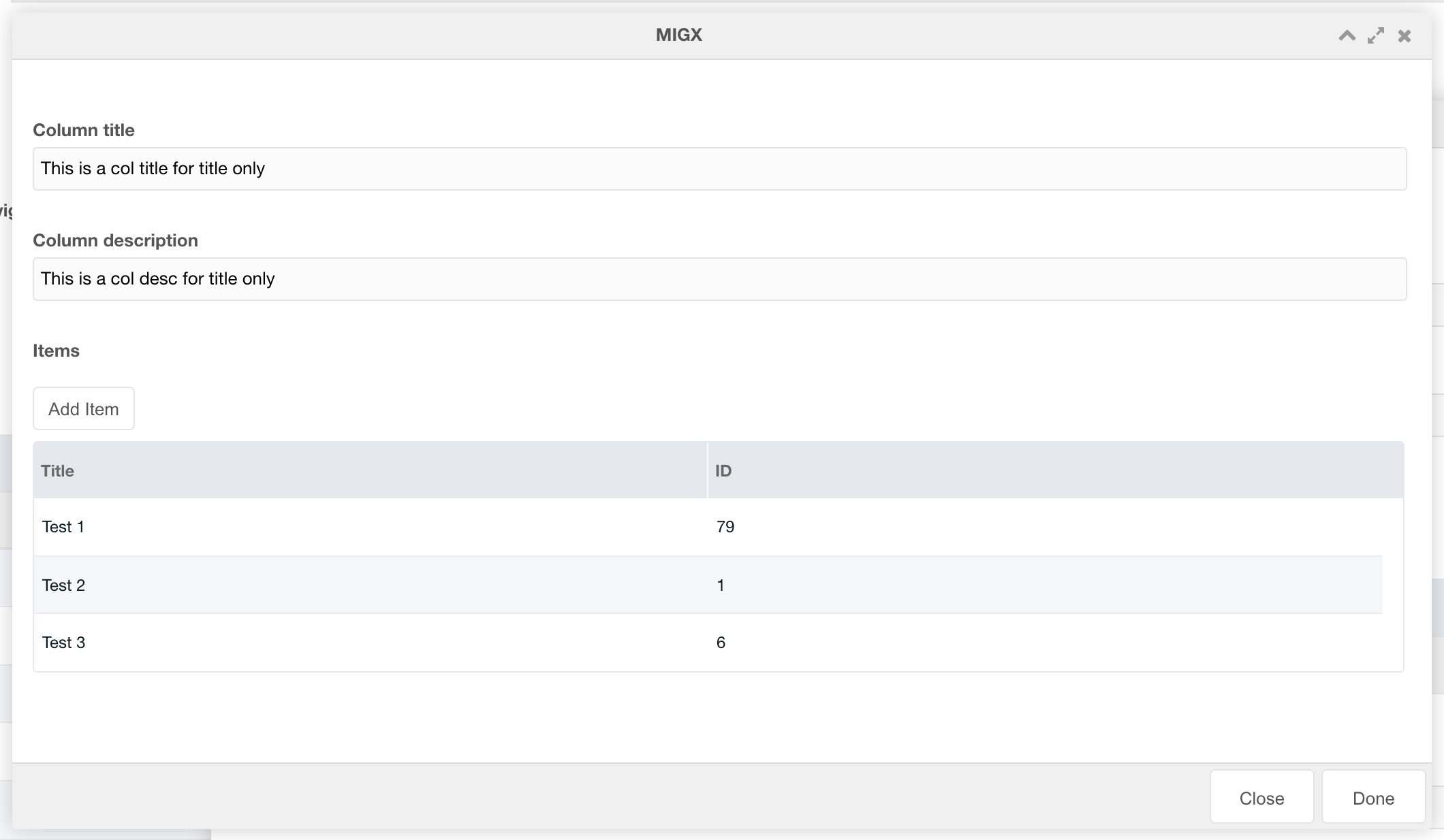
Figure 9
Table 5
| Setting | Description | Default |
| Column title | Add a title to this columns. If the parent Navigation Column title is set then this will not show. See figure 7 above for example of column title + descriptions on individual columns |
Unset |
| Column description | Description for column | Unset |
| Items | Add navigation items | Unset |
Step 3
Navigation Items

Figure 10
Table 6
| Setting | Description | Default |
| Resource title | Menu title for the resource | Unset |
| ID of resource to link to | Enter the ID of the resource that this navigation link will link to | Unset |
| Resource description | If Navigation dropdown type includes a description this description will be shown | Unset |
| Resource Icon | If Navigation dropdown type includes an Icon this Icon will be shown | Unset |
Single Navigation links

Figure 11
Table 7
| Setting | Description | Default |
| Resource ID | Enter the ID of the resource that this navigation link will link to | Unset |
| Link title | Menu title for the resource | Unset |
| Font Awesome Icon | Enter a Font Awesome icon to show instead of the title at smaller screen widths | Unset |
| Show on desktop? | Show this navigation item on desktop or only in the mobile menu? | Unset |
Aux Menu
The AUX menu is represented by a Hamburger menu (3 stacked horizontal bars) on the far right-hand side of the navigation bar.

Figure 12
Table 8
| Setting | Description | Default |
| Show AUX Menu? | Toggle the AUX menu On/ Off | Yes |
| Aux menu | Create AUX menu items |
Aux Menu items

Figure 13
Table 9
| Setting | Description | Default |
| Link title | Title of the menu item | Unset |
| Link description | Description for this menu item | Unset |
| Link resource ID | ID of the resource to link to | Unset |
Locations
The locations section allows you to show different types of links to translated resource.

Figure 14
Table 10
| Setting | Description | Default |
| Select location type | Select the location dropdown type. By default, this is set to Local. But you can choose none to hide the Locations dropdown or Local to show only translated resources that relate to this location | Local |
| Location dropdown title | If the location type is global then this title will be used on the dropdown content (See figure 15) | Unset |
| Location dropdown description | If the location type is global then this description content will be used on the dropdown (See figure 15) | Unset |
The Global dropdown option produces the following dropdown on the navigation bar
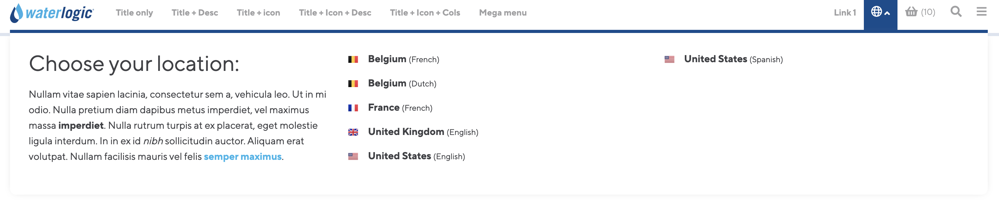
Figure 15
The Local dropdown option produces the following dropdown on the navigation bar
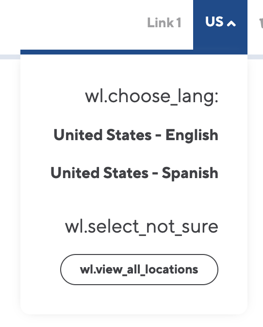
Figure 16
Search
The search section allows you to customise the search popup on the navigation bar.

Figure 17
Table 11
| Setting | Description | Default |
| Show search in navigation? | Show hide the search function in the navigation bar | Yes |
| ID of search results page | Enter the resource ID of the search results page for this context | Pulled from the Search result resource ID on the website Config settings |
| Search input placeholder text | Set the placeholder text to use for the input. By default, this will us a lexicon entry | Lexicon |
| Alternative search link ID | Resource ID of the alternative search link text | |
| Alternative search link text | Text that sits below the search input field and is used to direct users to FAQ sections |

Figure 18
Main footer
Setting up the footer
Each context will have a 'context settings' resource that sits at the bottom of the context tree. Open the resource and navigate to the template variables tab. Here you will be able to manage both the default navigation and footer.

Figure 1
Table 1
| Setting | Description | Default |
| Footer navigation links | Used to created columns to hold footer quick links | |
| Footer base navigation links | Add links to the very bottom of the footer | |
| Small description | The small description that sits under the Waterlogic logo in the footer |

Figure 2
Footer navigation links

Figure 3
Table 2
| Setting | Description | Default |
| Resource ID | ID of the resource to link to | |
| Column title | Title of the footer column link | |
| Items | Column links |
Footer Items
Figure 4
Table 3
| Setting | Description | Default |
| Resource ID | ID of the resource to link to | |
| Link title | Title of the link |
Footer Navigation base items

Figure 5
Table 4
| Setting | Description | Default |
| Resource ID | ID of the resource to link to | |
| Link title | Title of the link |
Footer locations
You can show/ hide a link to a location modal that shows all the different locations set in the Locations CMP.

Figure 6
Table 5
| Setting | Description | Default |
| Show the locations modal link? | Show the link to locations modal in footer? | No |
| Footer location modal title | Title of the location modal | |
| Footer location modal desc | Content for the location modal |

Figure 7

Figure 8
Secondary header
Secondary headers sit below the main navigation and can be set on the context setting resource or on each individual resource with options for pages to inherit the secondary header of another resource.
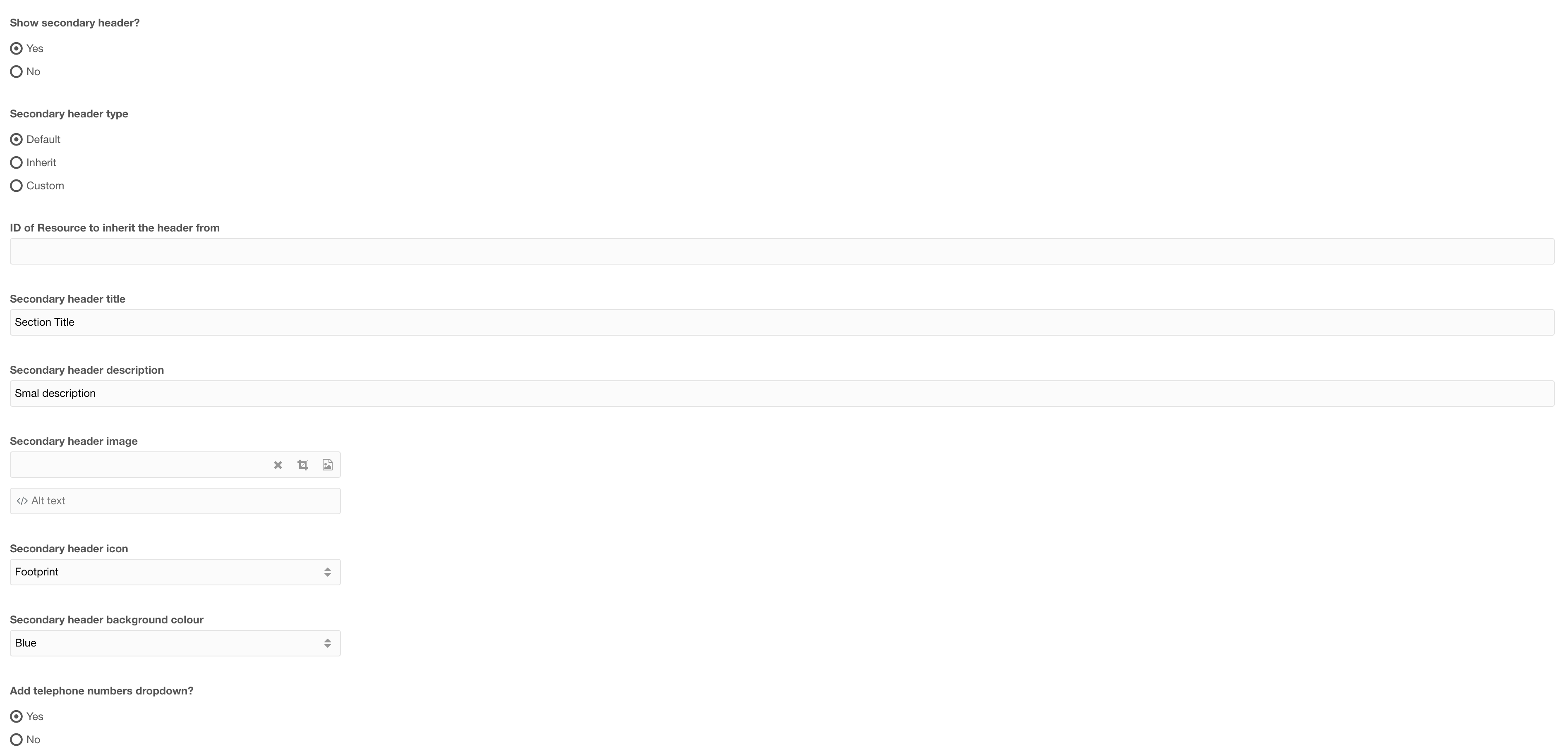
Figure 1

Figure 2
Tabel 1
| Setting | Description | Default |
| Show secondary header | Ability to toggle the secondary header on/ off | No |
| Secondary header type | Select the type of secondary header to use. Default: will use the secondary header set in the context resource Inherit: enables you to define a resource ID (Below) to inherit the header from Custom: Create a new secondary header for this resource |
Default |
| ID of resource to inherit the header from | If the header type is set to inherit, enter the ID of the resource with the custom secondary header that this will show | |
| Secondary header title | Title of the secondary header | |
| Secondary header description | A short description for the secondary header (optional) | |
| Secondary header image | Select an image to show beside the Header Title (optional) | |
| Secondary header Icon | Select an icon to use instead of an image (optional -- If Icon is selected then above setting image, will not show) | |
| Add telephone numbers dropdown | Add a dropdown with telephone numbers (Telephone numbers are defined in the context settings) | Yes |
Secondary header - Navigation
 Figure 3
Table 2
| Setting | Description | Default |
| Secondary navigation items | Add navigation items to the secondary header | |
| Secondary header buttons | Add navigation buttons |
Secondary navigation items

Figure 4
Table 3
| Setting | Description | Default |
| ID of resource | ID of the resource to link to | |
| Nav title | Navigation item title | |
| Dropdown items | (optional) Add a dropdown with additional links |
Dropdown items

Figure 5
Table 4
| Setting | Description | Default |
| ID of resource | ID of the resource to link to | |
| Title | Navigation item title |
Secondary header buttons
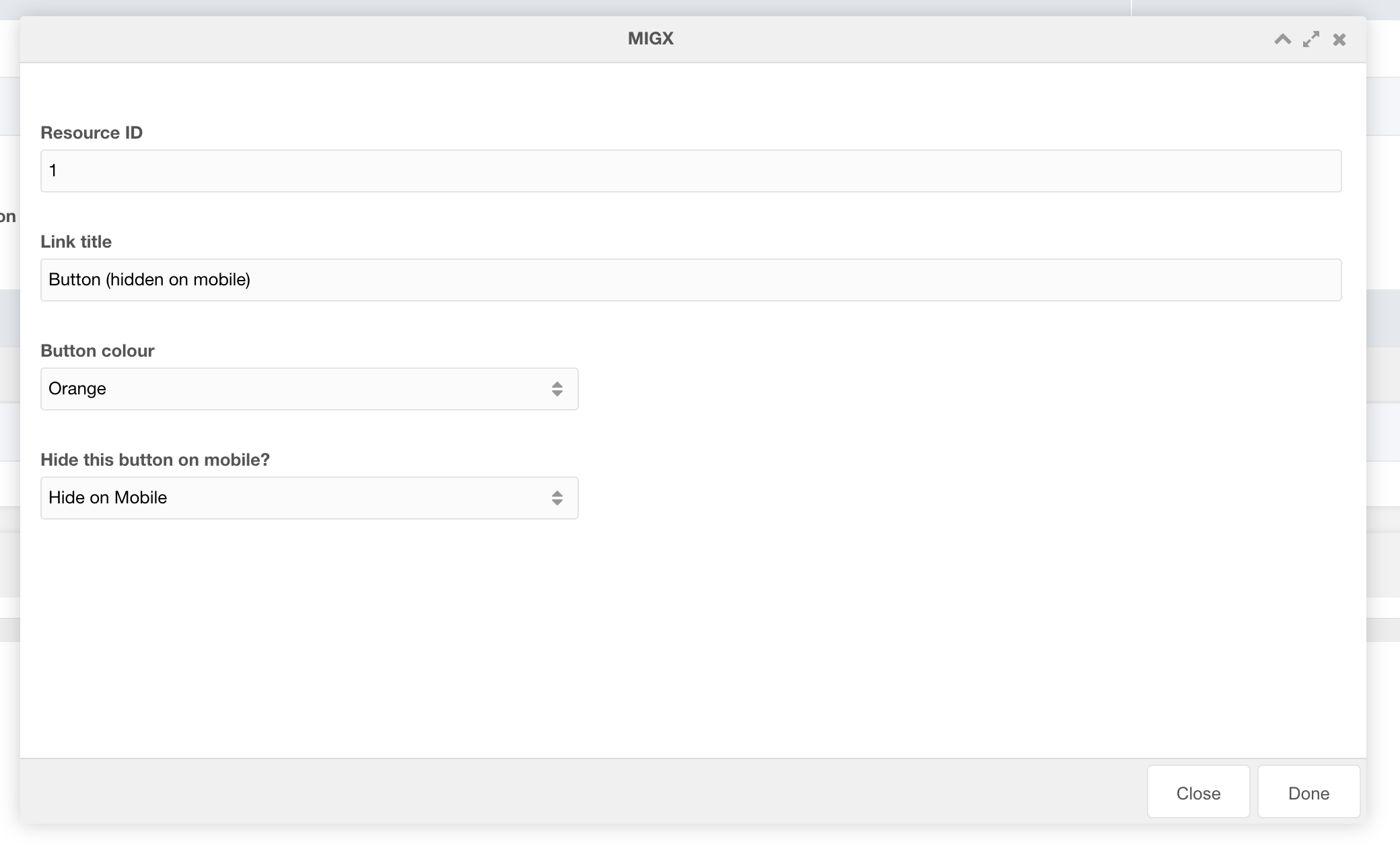
Figure 6
Table 5
| Setting | Description | Default |
| ID of resource | ID of the resource to link to | |
| Modal ID | Select a modal ID to popup when clicked. IMPORTANT: Each resource where THIS secondary navigation is used must contain the modal to work. If modal ID is entered overwrites resource ID link | |
| Is this a call button? | If this is a call button choose "Yes". Modal and resource fields will be ignored. (This setting adds logic to the button to allow the chat popup to appear. Each context must have chat JS applied to trigger chat to open.) | |
| Link title | Title of the button | |
| Button colour | Colour of the button | |
| Hide this button on mobile | Toggle button visibility on mobile |
Secondary Header CTA

Figure 7
Table 6
| Setting | Description | Default |
| Secondary header mobile CTA link ID | ID of the resource to link to for the mobile CTA button | |
| Secondary header mobile CTA link text | Text of the mobile CTA button | If left empty will hide the button |
| Secondary header mobile CTA link colour | Colour of the button |
Breadcrumbs
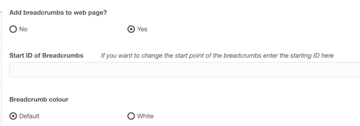
Figure 1
| Setting | Description | Default |
| Add breadcrumbs to web page | Option to show breadcrumbs or hide | No |
| Start ID of Breadcrumbs | Breadcrumbs typically show every parent up to the Home page of the website. You can specify and ID to reduce the number of links in the breadcrumbs if the resource is a deeply nested child. |
Empty (Will use home as start) |
| Breadcrumb colour | Specify the colour of the breadcrumb links, useful for when breadcrumbs sit ontop of sections with a dark background colour | Default |
Geo location modal
The Geo location modal is used on the global context and helps redirect users to the best matching Waterlogic website.
You can select the type of modal to show by updating the settings in the Website configuration

The location modal type can be plain or with an image. If you select the with an image option you can choose the image displayed using the Location modal image setting.
Cookie Modal

Location Modal
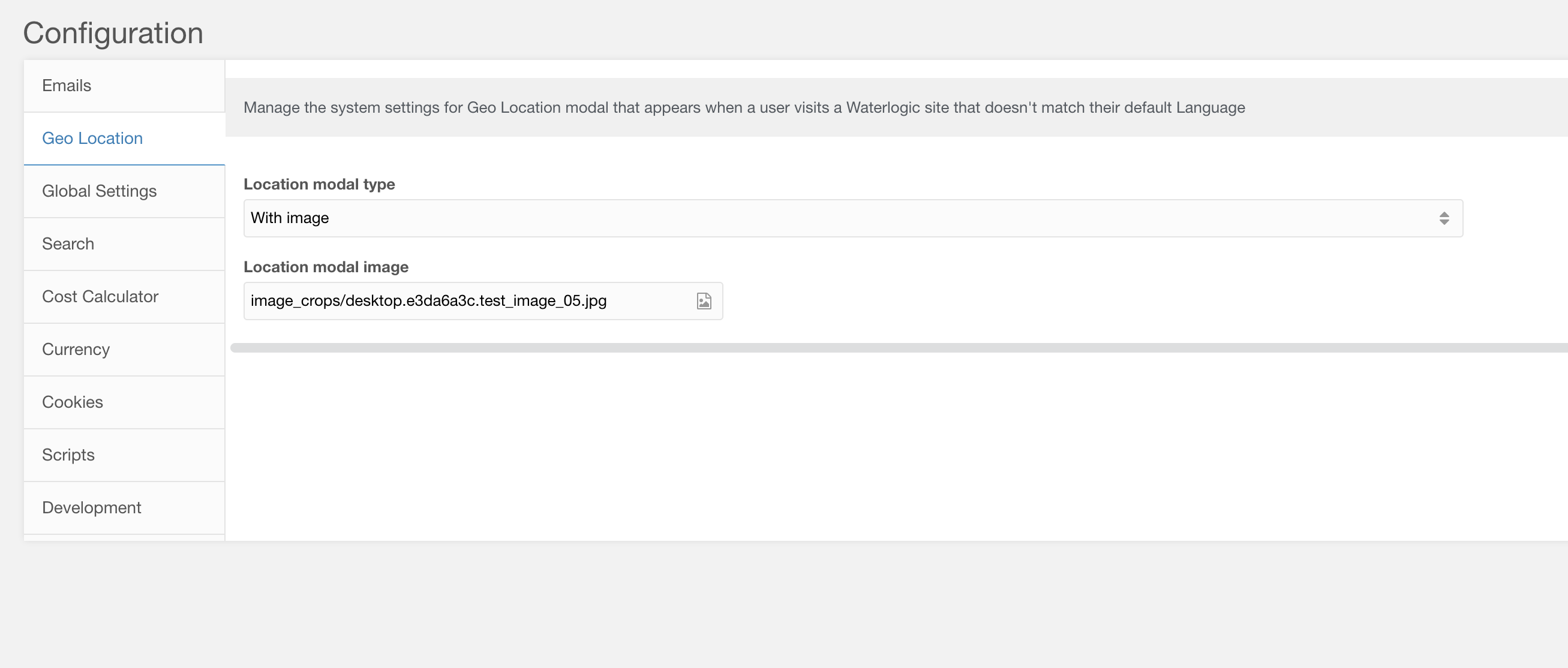
Figure 1
Table 1
| Setting | Description | Default |
| Location modal type | Select the type of location modal to show. Plain is a simple modal with text, while with image shows a modal with an image | plain |
| Location modal image | Image to show if type is with image |
Content is controlled in the geo_ip_modal lexicon settings. To set the global context configuration for the modal you need to update the plugin properties. Edit the geo_location_browser_lang plugin properties with the following details

Figure 2
Table 2
| Setting | Description | Default |
| global_ctx | The context key of the global context | web |
| global_culture_key | Culture key of the global context | en |
| global_locale | The locale of the global context | en_GB |
| global_name | Name of the global website | Global |
| global_site_url | Full URL of the global site |
Preview
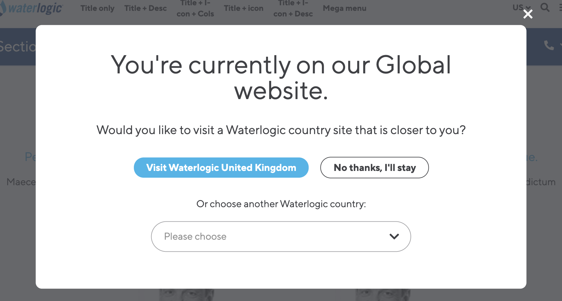
Figure 3
With image

Figure 4
Below is an example of the modal shown when a user with a default browser language of Spanish visits an English website (note that the button visit Waterlogic United States is being shown due to changing the language of the website in the Location CMP for testing. Normally this will show a link to the translated website).

Figure 5