Secondary header
Secondary headers sit below the main navigation and can be set on the context setting resource or on each individual resource with options for pages to inherit the secondary header of another resource.
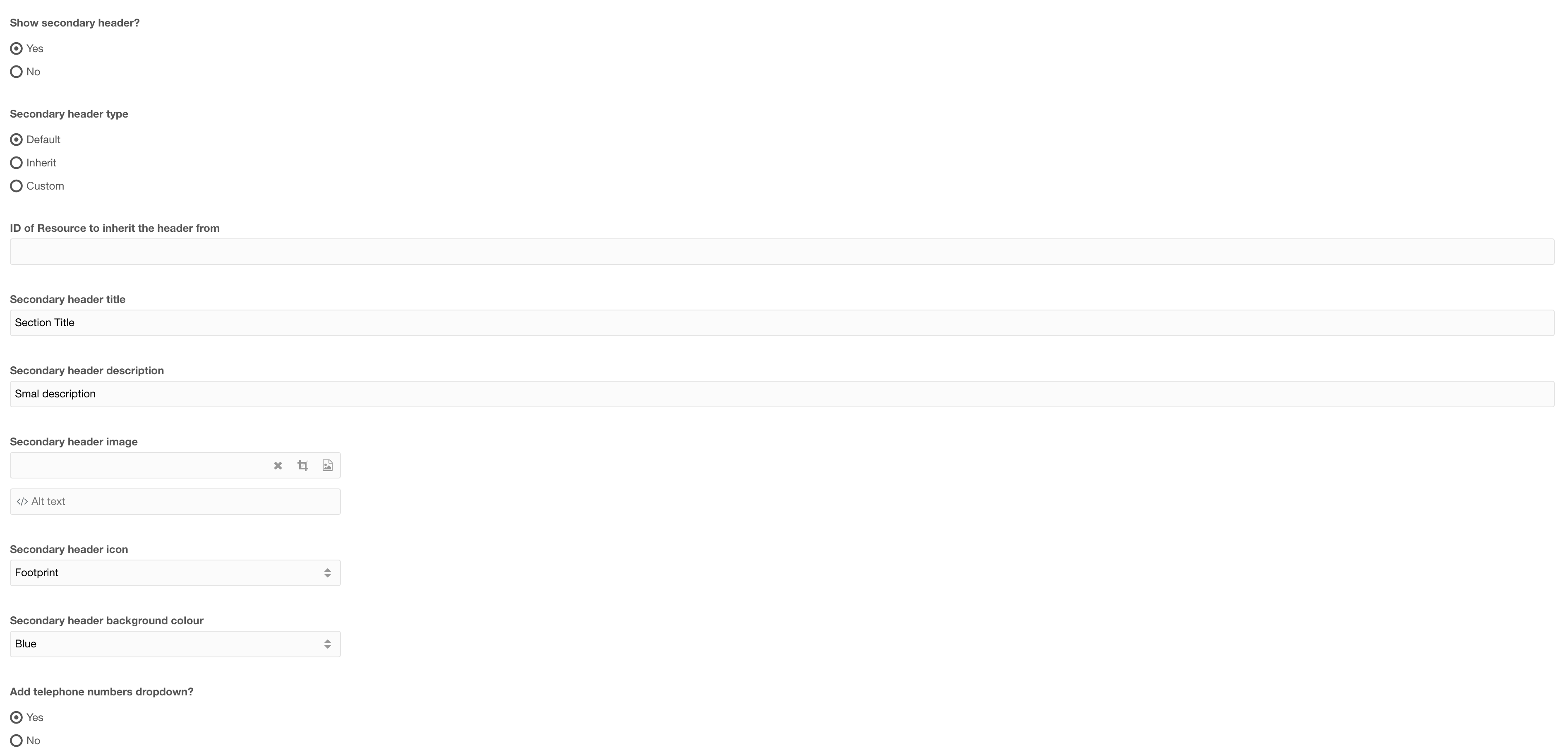
Figure 1

Figure 2
Tabel 1
| Setting | Description | Default |
| Show secondary header | Ability to toggle the secondary header on/ off | No |
| Secondary header type | Select the type of secondary header to use. Default: will use the secondary header set in the context resource Inherit: enables you to define a resource ID (Below) to inherit the header from Custom: Create a new secondary header for this resource |
Default |
| ID of resource to inherit the header from | If the header type is set to inherit, enter the ID of the resource with the custom secondary header that this will show | |
| Secondary header title | Title of the secondary header | |
| Secondary header description | A short description for the secondary header (optional) | |
| Secondary header image | Select an image to show beside the Header Title (optional) | |
| Secondary header Icon | Select an icon to use instead of an image (optional -- If Icon is selected then above setting image, will not show) | |
| Add telephone numbers dropdown | Add a dropdown with telephone numbers (Telephone numbers are defined in the context settings) | Yes |
Secondary header - Navigation
 Figure 3
Table 2
| Setting | Description | Default |
| Secondary navigation items | Add navigation items to the secondary header | |
| Secondary header buttons | Add navigation buttons |
Secondary navigation items

Figure 4
Table 3
| Setting | Description | Default |
| ID of resource | ID of the resource to link to | |
| Nav title | Navigation item title | |
| Dropdown items | (optional) Add a dropdown with additional links |
Dropdown items

Figure 5
Table 4
| Setting | Description | Default |
| ID of resource | ID of the resource to link to | |
| Title | Navigation item title |
Secondary header buttons
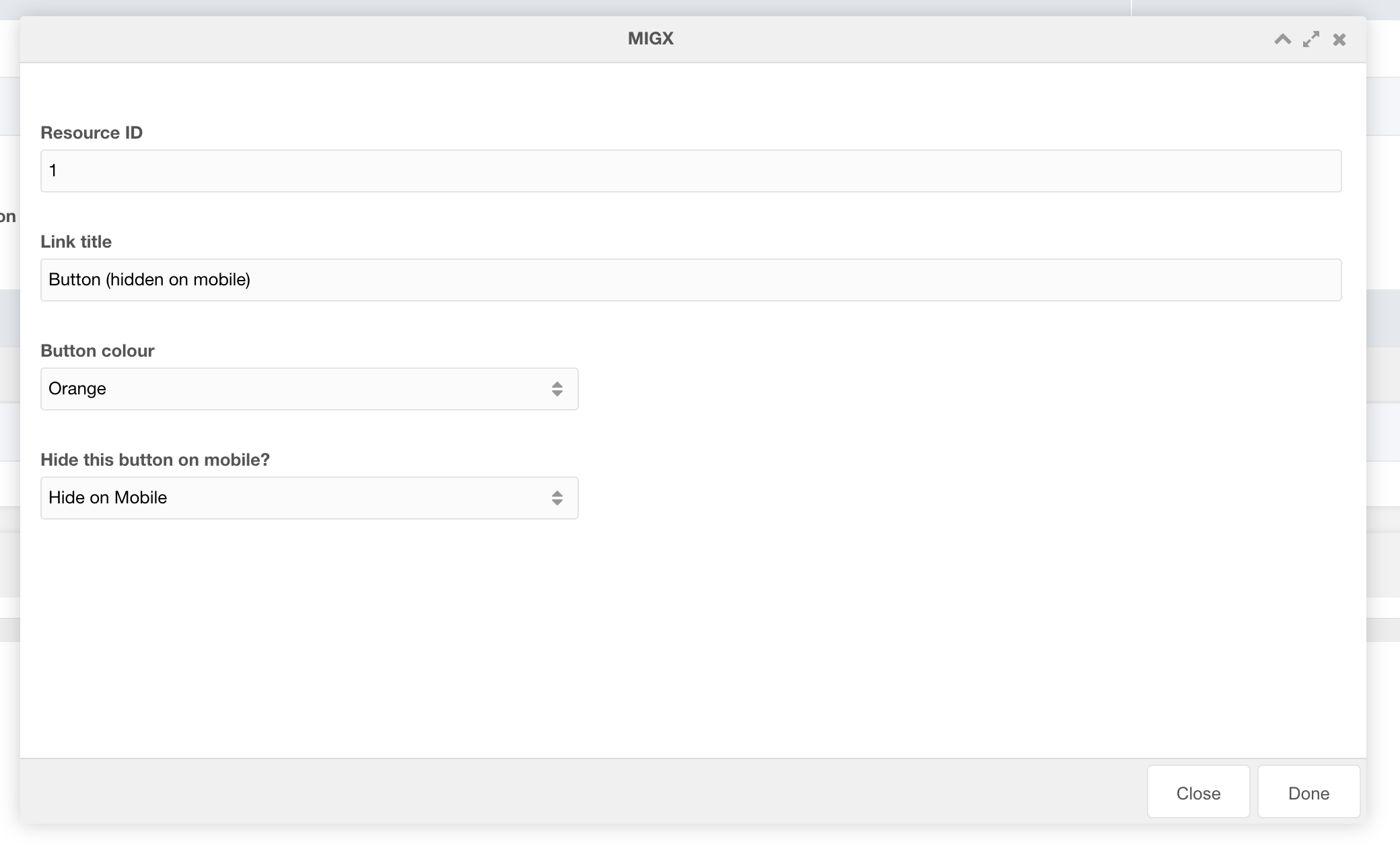
Figure 6
Table 5
| Setting | Description | Default |
| ID of resource | ID of the resource to link to | |
| Modal ID | Select a modal ID to popup when clicked. IMPORTANT: Each resource where THIS secondary navigation is used must contain the modal to work. If modal ID is entered overwrites resource ID link | |
| Is this a call button? | If this is a call button choose "Yes". Modal and resource fields will be ignored. (This setting adds logic to the button to allow the chat popup to appear. Each context must have chat JS applied to trigger chat to open.) | |
| Link title | Title of the button | |
| Button colour | Colour of the button | |
| Hide this button on mobile | Toggle button visibility on mobile |
Secondary Header CTA

Figure 7
Table 6
| Setting | Description | Default |
| Secondary header mobile CTA link ID | ID of the resource to link to for the mobile CTA button | |
| Secondary header mobile CTA link text | Text of the mobile CTA button | If left empty will hide the button |
| Secondary header mobile CTA link colour | Colour of the button |