Field: Form selector
Formalicious form selector
Category: Fields
This field allows you to select a form created in Formalicious by entering the form ID.
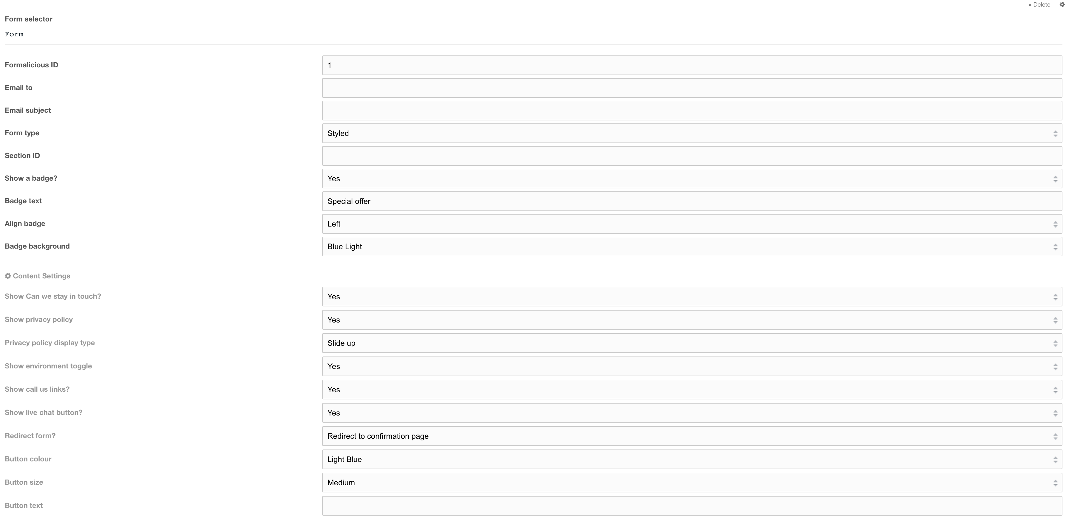
Figure 1

Figure 2
Field options
| Setting | Description | Default |
| Form ID | ID of Formalicious form | |
| Email to | The email address of the person who will receive this form. By default, the email will go to the email will be sent to the address specified in the formalicious form | |
| Email subject | The subject of this email. By default, the subject specified in the formalicious form will be used. | |
| Form type | Select the type of form default: Standard. A styled form adds a blue border around the form | Styled |
| Section ID | Enter the UUID of the section so when the form submits and the page reloads due to validation errors or if Redirect Form setting is set to Show confirmation message the page automatically scrolls to the form | |
| Show a badge | Toggle the form badge | no |
| Badge text | Short content for the badge | |
| Align badge | Aligns the badge top left or top right of the form | |
| Badge background | Background colour of form badge | Blue light |
Content settings
| Setting | Description | Default |
| Show can we stay in touch? | Show the checkbox for users to check to be added to a mailing list | no |
| Privacy policy display type | Type of privacy policy display type: - Link - Slide up - None (hidden) |
|
| Show environment toggle | Shows the environment toggle buttons with an overlay that alerts users who select Home use | no |
| Show call us links | Show call us links at the bottom of the form | |
| Show live chat button | Show a live chat button at the bottom of the form | |
| Redirect form? | Redirect form to ID set on Formalcious form or show confirmation message on form when submission is successful | Redirect |
| Button colour | Colour of the submit button | Light blue |
| Button size | Size of the submit button | Full |
| Button text | Submit form button text, by default will use the lexicon string for Submit form | Submit form lexicon string |
Field settings (cog)
| Setting | Description | Default |
| Form small title | Give this form a small title (Recommended) | |
| Form title tag | Tag to use for the small title | p |
| Form title colour | Text colour of the small title | |
| Form content | Add content to the top of the form. Typically forms have a small amount of text with a blue sub title, heading and description. To add the blue subtitle, highlight the text, click the format button (¶) and select, Light Blue Sub Title in the dropdown. | |
| Align content | Align the content left, centre or right | centre |
| Remove form padding | Remove padding around the form, This is used to remove extra space around the form. If the form is styled it will remove the blue border around the form. This should be set to No when using a styled form. For forms in heroes this should be set to Yes |
no |
| Align form inputs to text start | Removes internal form padding to align inputs with text. Use this field if using the form in page flow, for example when using the form on customer support article pages. | No |
| Form field layouts | Single or double layout. If double, fields are in two columns | Single column |
| Add shadow to form? | Adds a shadow to the form. This should be used for heroes | No |
Example of a form
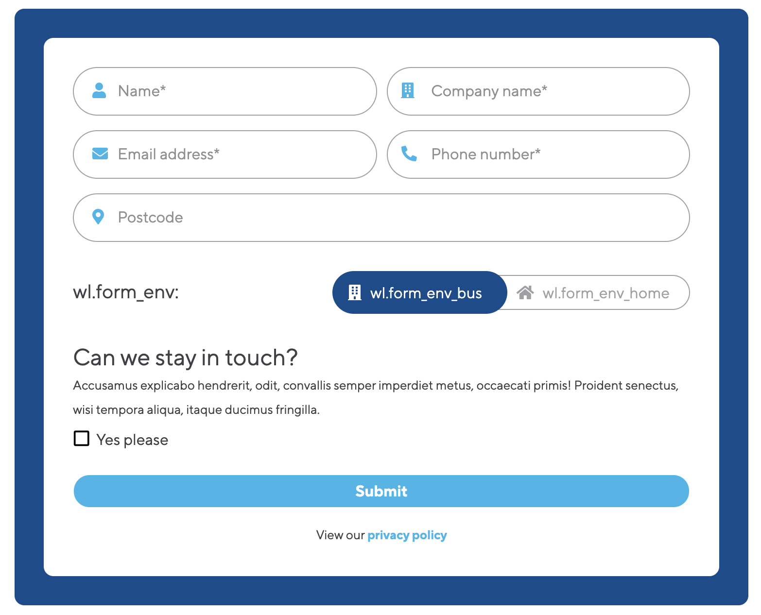
Figure 3