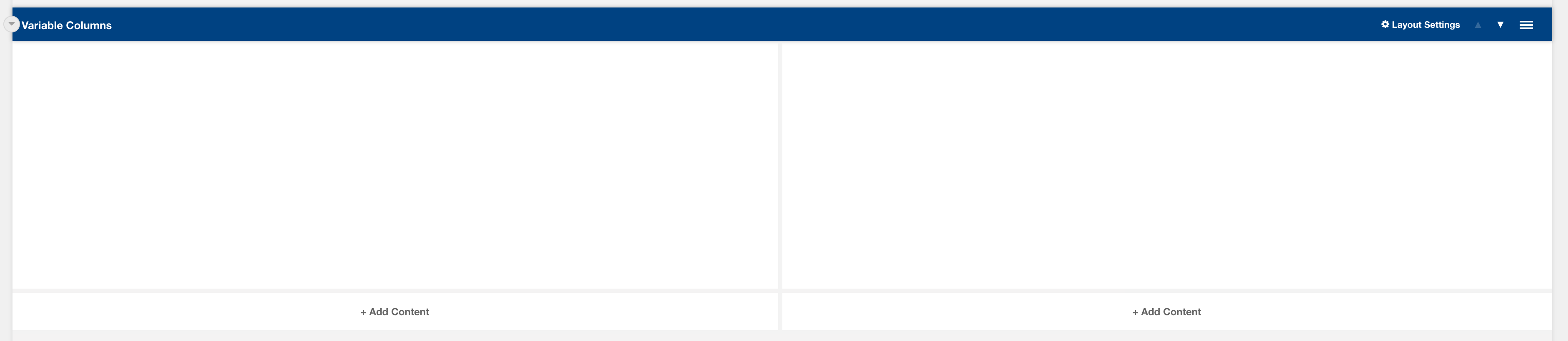
Layout: Variable Columns
Variable column layout
Category: Templates - Sections - Waterlogic Layout.
Content Blocks Documentation: https://docs.modmore.com/en/ContentBlocks/v1.x/Layouts.html
By default, the column widths are 50/50 in width but can be changed using the Bootstrap Column 1 and Bootstrap Column 2 settings. For documentation on changing column widths using Bootstrap classes see http://websitedocs.waterlogic.com/books/content-blocks/page/grid-layout
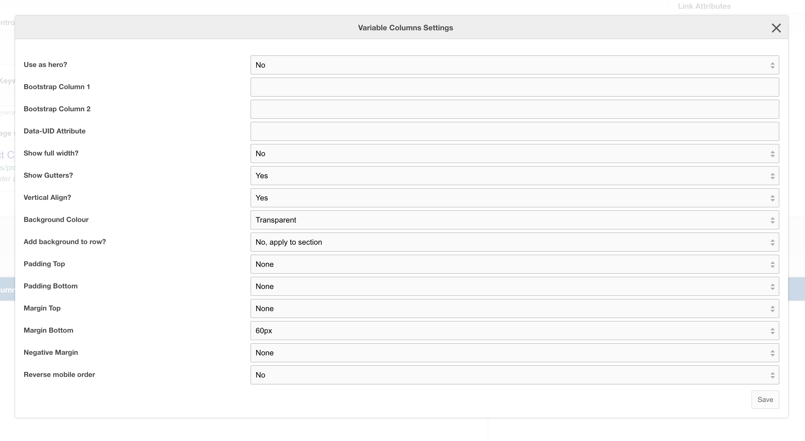
Settings
|
Use as hero?
|
Use this variable column layout as a Hero section, this adds in-hero classes which adjust the look of the layout across mobile and desktop. |
|
Bootstrap Column 1
|
Classes by bootstrap for the grid. Defaults to col- https://getbootstrap.com/docs/4.0/layout/grid/ |
| Bootstrap Column 2 | Classes by bootstrap for the grid. Defaults to col-12 https://getbootstrap.com/docs/4.0/layout/grid/ |
| Data-UID Attribute | Unique data attribute used for referencing the layout. |
| Show full width? | Should the section show full width. Using Bootstrap container and container-fluid. |
| Show Gutters? | Should the gutters show for this layout? Default to Yes. |
| Vertical Align? | Should the content within this layout show vertically aligned. Default to Yes. |
| Background Colour | The background colour of the layout. Default to White. |
| Add background to row? | Add the background colour to the section or to the row, if added to the row then rounded corners are added to the section for a stylised effect |
| Padding Top | Padding top for the layout. Default to 45px. |
| Padding Bottom | Padding bottom for the layout. Default to 45px |
| Margin Top | Margin top for the layout. Default to 60px |
| Margin Bottom |
Margin bottom for the layout. Default to 0px |
| Reverse Mobile Order | Should this layout be reversed on mobile? Useful for alternating 50/50 content layouts. |