Field: WL Button
WL Button.
Ability to select a button with content blocks, for use with resource ID, External URL, Modal or Scroll to ID
Category: Waterlogic Fields.
Content Blocks Documentation: https://docs.modmore.com/en/ContentBlocks/v1.x/Fields/index.html
Additional Settings:

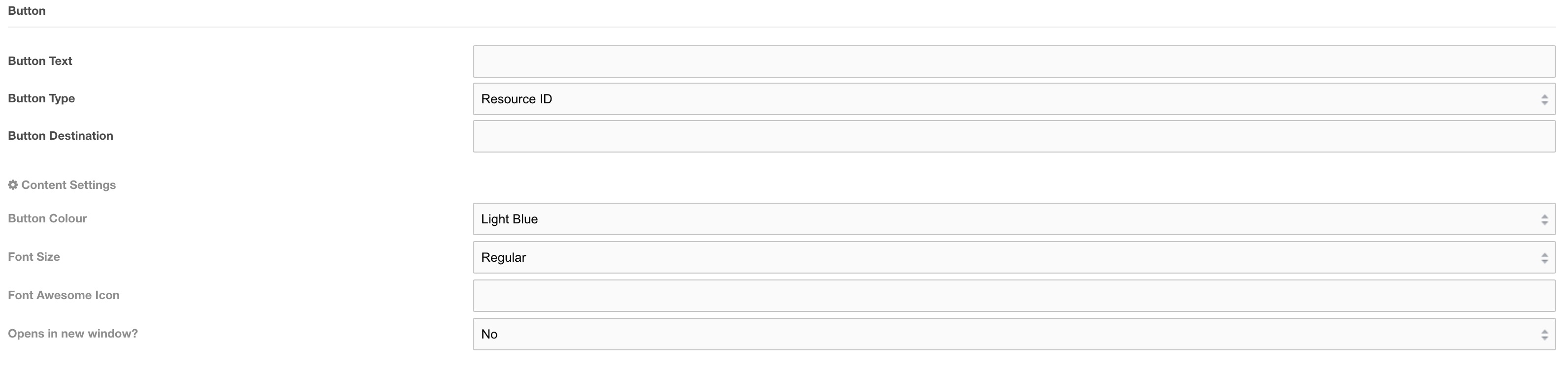
Settings
- Resource ID - The resource ID that the button should link to
- External URL - An external url (e.g. https://www.google.co.uk)
- Modal - The ID of the modal popup as defined in the Modal Popup content block
- Scroll to ID - The section that you would like this button to scroll to. Defined by Layouts
- Add to quote - This setting adds additional data to the button which allows the product to be added to the quote builder. By default, the button will reference the current resource ID to add to the quote, however, if the button is being used on a non-product page this will not work, therefore it is HIGHLY recommended that you always reference the product resource ID in the button destination field when using this setting.
- Chat Popup - This setting adds logic to the button to allow the chat popup to appear. Each context must have chat JS applied to trigger chat to open.
- Relative URL - This will point to a file locally within the server relative to the context base_url e.g. for waterlogic.com/en-gb/ the base url is /en-gb/ and if you wanted to include a link to a pdf in the uploads folder the button destination would be uploads/mypdf.pdf. the final output to the site will be /en-gb/uploads/mypdf.pdf
Font Size: Select the text size from the pre-defined list of sizes. Default Regular
Font Awesome Icon: Font Awesome Icon to use to the left of the button text, see (https://fontawesome.com/icons?d=gallery) for icons that can be used. Note: do not add a Font Awesome Icon if you have pointer icon position set to left.
For Example: Star icon (https://fontawesome.com/icons/star?style=solid) the value to be used would be fa-star.
Open in new window?: Should this link open in a new window?
Show Pointer Icon: Should the pointer icon show for this button. Default no.
Pointer Position: If the pointer is set to show as per Show Pointer Icon setting within this field then, where should it be positioned? Note: if pointer position is left, you should not use a Font Awesome Icon.
Alignment: What position should this sit within the layout. Left, right or centre. Default Left.